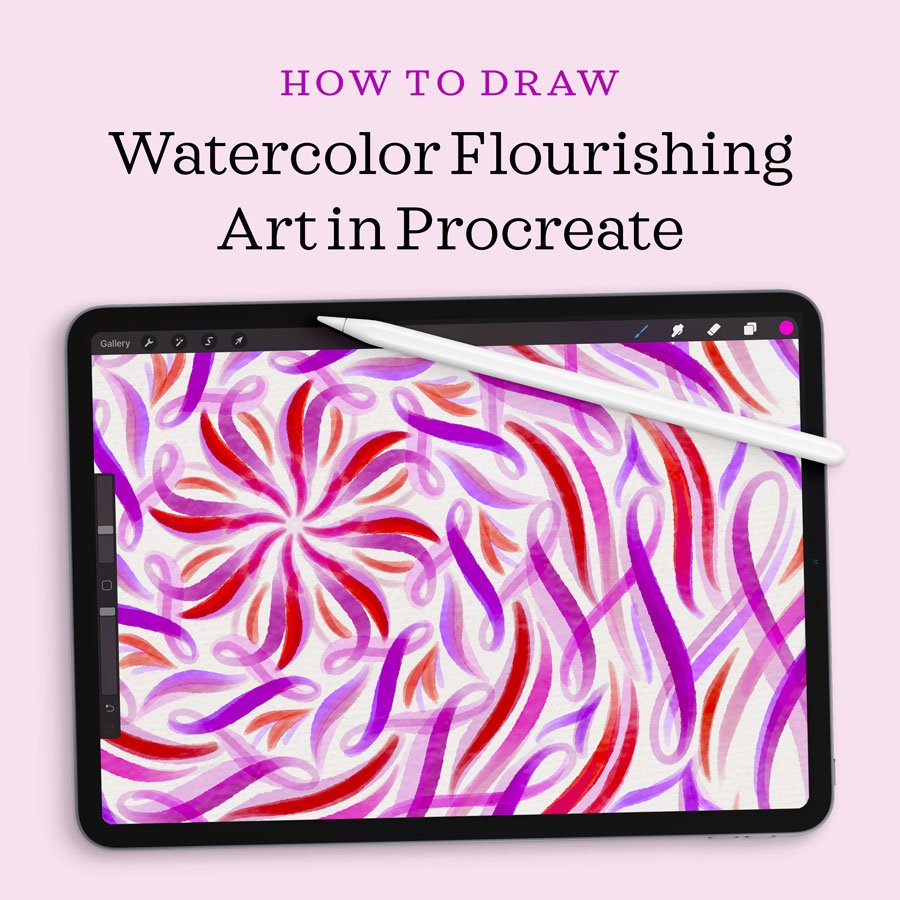
Learn to Draw Flourished Watercolor Mandalas in Procreate
In this tutorial, you will learn to draw calligraphic, flourished, watercolor mandala art in Procreate using radial symmetry guides and various blending modes. For the translucent, painterly effect, I use watercolor calligraphy brushes, all from my Ultimate Lettering and Calligraphy Procreate Kit (linked within each step).
This detailed tutorial is available as a video and as written instructions. You can follow along in either format—or both! Watch the video below, or continue scrolling for the transcript with step-by-step photos and resource links.
The Video Tutorial:

Written Instructions:
(Click an image to enlarge it.)
Create a new square canvas
Mine is 2000 x 2000 px at 300 dpi.
Paint your watercolor paper background
Select the Watercolor Paper Background Brush from my Ultimate Lettering and Calligraphy Procreate Kit. Then choose a very light color and paint your entire canvas. This will give it a realistic paper texture.
Set up your art layer
Create a new layer on top of your background later, and immediately set its blending mode to Linear Burn. To do this, tap the “N” on the far right side of the layer and a list of blending modes will appear. Scroll up until you reach Linear Burn.
⭐ ⭐ ⭐ ⭐ ⭐
“Love the quality! I needed smooth brushes for calligraphy with good control and these are it.”
— Olga Z., letterer & illustrator
Set up radial drawing guides
Go to Settings > Drawing Guide to turn on your guides. Then click Edit Drawing Guide underneath that. Here is where we can set our guide options. Go to the Symmetry setting, then click on Options. Select Radial as the type of guide, then turn on Rotational Symmetry. Make sure that Assisted Drawing is also turned on.
(To change the color of your guidelines, use the color picker bar at the top of the screen.)
Start flourishing!
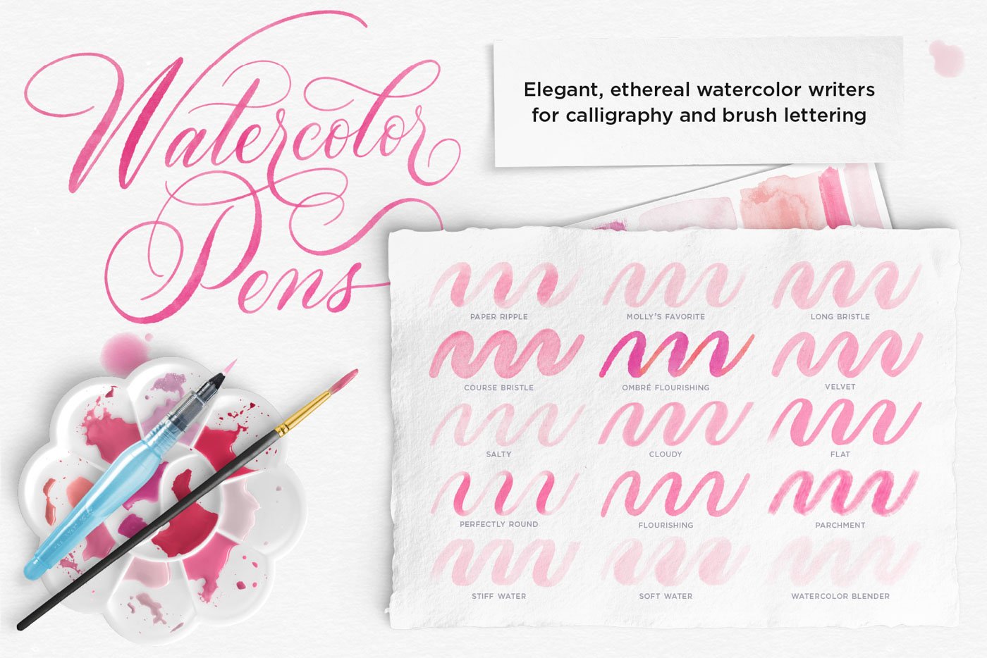
Select the Paper Ripple Watercolor Pen (part of the Ultimate Lettering and Calligraphy Procreate Kit). Then draw a nice, long flourish within any one of the radial slices. It doesn’t matter where you start drawing, because your stroke will be repeated eight times around the center of your canvas!
Stick with a limited color palette
Continue drawing flourishes that overlap and fill in the negative spaces. Select similar colors to do this, sticking with a limited color palette. Here I’ve used shades of red, pink, and purple. Choosing colors that are close together on the color wheel ensures that they will match each other, and that your intricate design won’t become too busy. But this is only my method – you should have fun with your color choices!
Layer your strokes designs
The beauty of watercolor is that it gets more vibrant and lovely as you layer it, and the overlapping strokes create depth. My Procreate watercolor pens are no different. Play around with drawing over your strokes a couple times to darken select regions.
Adjust the overall opacity
When your flourished watercolor mandala is complete, group all the art layers (if you created more than one). Now you can duplicate the entire mandala and, because the watercolor strokes are translucent, this will darken the design. See how you like this brighter, more vibrant version! You can also play with the art’s opacity to make it more or less bright.
And there you have it! A beautiful watercolor mandalas created from flourished calligraphy strokes.
Mandala style no. 2
For my second mandala, I used the Salty Watercolor Pen, which has a really lovely texture. I followed all the exact same steps above, but selected a blue-violet color palette, and made flourishes that were bigger and loopier.
Mandala style no. 3
And finally, for the third mandala, I used a combination of pens, all from my Ultimate Lettering and Calligraphy Procreate Kit: Molly’s Favorite Watercolor Pen, the Soft Water Brush, and the Perfectly Round Watercolor Pen. Here I selected pale pinks and golds, and played a lot with contrast in stroke size. I started with the very thick, pink strokes, then drew the fine gold flourishes on top of them.


click to enlarge
Additional Resources
Brushes used:
Watercolor Pens brush set from The Ultimate Procreate Lettering and Calligraphy Procreate Kit
iPad tools used:
More Procreate Tutorials:
You might also enjoy…

If you found this tutorial helpful, please consider sharing it with others. That’s the best, free way to support artists you appreciate.
You could also buy me a coffee, if you wish.