Learn to Draw 3D Drop Caps in Procreate
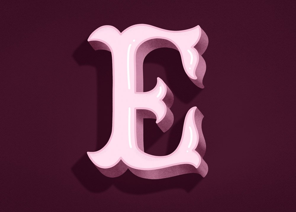
Eager to learn how to draw three-dimensional hand lettering? In this tutorial, I walk through the process I use in Procreate to create textured shading, highlights, and drop shadows, using a decorative drop-cap “E” as the example. If you want to follow along using the same set of hues, download my color palette for free by clicking the big purple button below the video.
This detailed lesson is available in two formats: a video walkthrough and a written guide with photos and resource links. You can follow along in either format—or both.
Watch the video tutorial:
Written Instructions
Click an image to enlarge it.
Sketch your letter in pencil
I have a square art board set up here with a basic square grid. I used my own Graph Paper Pattern Brush for this background, from my Calligraphy Composition Maker for Procreate, but you could just as well use Procreate’s own Drawing Guide function.
With a pencil brush, I start by sketching a basic, geometric E as my starting point. Then I’m going in and turning all the sharp corners and flat sides into curves. This is a quick and easy way to add decoration to any uppercase letter!
Trace the outline with a monoline pen
Now, I'll come over and select my Molly’s Favorite Monoline Pen brush. This is part of my Ultimate Lettering and Calligraphy Procreate Kit. I'm just going to trace around my sketch layer on a new blank layer. You can see that I’m going very slowly and making sure that I really adhere to those curves, smoothing them out as I go.
With my outline complete, I’ll open my layers palette and hide my sketch layer so I no longer see it, because I’m not going to use it again.
Duplicate and recolor
Next, I duplicate that outline layer and select the lower of the two layers.
I’ll fill in the lower layer with black by dragging and dropping my black swatch into it. Then I’ll choose a very light color – light pink – and drag it over as well. This turns the bottom E into solid light pink.
Turning back on my outline layer (the top layer), you can see that the outline now sits on top of my solid layer. I’ll recolor that outline with a slightly darker pink by dragging the darker pink swatch over on top of the outline.
Create offset dimension
Coming back to my layers palette, I will duplicate the solid, filled version of the E, and select the lower of the two.
Then, selecting the transform tool, I’ll drag that lower version of the filled layer down and to the right.
I’ll now choose a slightly darker pink and drag it over to fill that lower layer.
Connect the corresponding dimension points
Now is when the dimension is really going to start to come to life.
I’m zooming in and, with that same monoline brush, I’m drawing on the darker fill layer. I’m connecting all of the places where the lower layer and the upper layer are separated, by using straight lines to connect corresponding points and then filling in the spaces with color.
Add shading to the dimension layer
Now it's time to add some shading so that it really looks like a light source is hitting this image. I want the light to look like it’s coming in from the top, which means that shadows will be cast downward.
So in my layers palette, I’m making sure I’m still on that bottom dimension layer and I’m adding a new layer above it. Then I’m tapping the new layer once and selecting Clipping Mask. That way, when I draw in the shading, it will only affect the dimension layer below it.
Shadow, by definition, has to be darker, so I’m selecting an even darker pink from my palette. In my layers palette, I'm making 100% sure I’m on that clipping mask layer. And in my brushes palette, I’m selecting a grain or texture brush.
The one I’m using today is a brush of my own making that is coming out very soon. It’s still in the beta testing phase, but below this transcript, in the resources section, are some great texture brush I suggest for shading and texture!
You can see that I'm starting with shading the bottom because, again, if the light is coming in from the top, it means that the regions right underneath that dimensional space would have the most shadow (i.e. the least light).
I’m not worrying about being sloppy or getting the texture in areas that aren’t going to be in shadow because I am going to come back with an eraser brush and do some refining in just a minute.
Use the eraser to blend and soften the shading
In my eraser palette, I will now select that same Monoline Calligraphy Pen brush that I used to draw the outline. I’ll come to the clipping mask layer of my shadow and draw crisp lines in the places where, in a real dimensional piece, the regions would come to a sharp edge. I’m going to come back with a much softer eraser in a moment to blur these out a little bit, so I’m not worrying that these look much too sharp at the moment.
Now I’m switching my eraser over to my textured brush tool. Whatever the tool is that you used to draw your texture and shading, use that now with the eraser and come into those points that have sharp lines and really blend them out. You can reduce the capacity of your eraser brush if you want, as well as the size, to get more or less blur here.
Set the shading layer to Multiply
And then finally, to add a little bit more realism and darkness, I'll come back over to my shaded layer, to that clipping mask, and I'll set its blending mode to Multiply. This is to make sure that the blending is really perfect between the colors of the medium pink and the dark pink.
Draw highlight lines
Now, let’s add in some fun light highlights! I'm coming up to my top filled layer and I'm adding a new blank layer above it. Then I select white from my color palette and that same monoline brush from my brushes palette. I’m going to draw in some highlight lines here. I'm choosing to do them up against the right side of my outline layer so it looks like the shine is coming from a consistent angle.
Add the second round of shading
Now, let's add a little bit more shading and texture. Come up above the light pink fill layer and add a clipping mask. Now I'll select a medium pink and come back to my texture brush. My goal here is to make it look like a very faint shadow is being cast by that top outline layer onto the filled layer below it. So I'm making these thin lines of texture underneath the top parts of the outline. And then when I'm done with that, I'm just going to come into the layers palette and dramatically reduce the opacity so it's really faint and subtle. I'll even come back with my eraser and do a little precision erasing to make it a little more realistic.
Create the drop shadow layer
With our dimension complete, it's now time to make a very dramatic drop shadow. So I'm starting by grouping all of the elements of this E so far. I'm just swiping right on each layer to select multiple layers at once, then tapping Group up at the top. I now want to duplicate this new group and select the lower of the two groups. Then tap it once and hit Flatten. Now I have a flattened version of the E sitting right underneath the layered version of the E.
This newly flattened layer is going to become our drop shadow layer, so I want to fill it in with one solid, darker color. To do that, I'll tap it once and hit Alpha Lock. Then I'll select my much darker color, tap the layer again, and select Fill Layer. Then I'll tap once again and turn off Alpha Lock.
With my transform tool, I'm now able to move this new darker layer down and to the left to create the casting of our shadow. Then, over in the layer palette, I can tap the layer and reduce its opacity dramatically. I think you can already see how realistic this drop shadow is starting to look!
Fill in the distance between the shadow and the letter
Coming in with my monoline pen, I'll now repeat the same process that I did when I created the dimensional layer. In other words, I'll connect all of those separate points in between the drop shadow layer and the top dimensional layer, and then I'll fill in all of those gaps with solid color.
Now group everything together by swiping right on the group above and hitting Group. Now I have one group for all of that artwork.
Add a background and multiply the drop shadow
Now I'll tap the background layer to adjust its color to a really dark pink. I'll go back to my dark shadow layer and adjust its blending mode to Multiply. This, just like with the original texture, is going to make sure that that drop shadow blends really realistically into whatever background color you have.
Add a vignette to the canvas
Making sure I'm on the big group with all of the art on it, I'll hit transform and center the artwork roughly in the middle of the canvas. Then I'll make a new blank layer underneath that group and set it immediately to Multiply. I'll come back over now to that same texture brush that I used before. (You will pick whatever texture brush you used before.) In the dark pink color, I will create a vignette all around the artwork. This is a way of really making sure that your lettering is going to pop off of the page and add some shadow all around the border.
Now I'll reduce the vignette’s opacity so it's not quite as dramatic—more like a subtle shadow or texture.
Optional grain texture adjustment
If you're not entirely happy with how grainy the texture is of your original shading, you can do what I did here: Duplicate that original texture, then go to the adjustments panel to Gaussian Blur > Layer. Then blur out that layer dramatically. You can't see it very well here, but if I turn off the bottom layer, you'll see that I have now a really blurred version of the texture right on top of the original texture layer.
Both of these texture layers are set to Multiply, so I then adjust the opacity of each so that what I get is a blended, in-between version of the texture that is more blurred than the original, but still shows the grain of the texture.
Soften the drop shadow with blur
As a finishing touch, I want to add just a little more realism to this drop shadow. Very few drop shadows are truly crisp around the edges, so I'll come back to my adjustments panel and choose Gaussian Blur > Layer. Then add just a very slight touch of blur around the drop shadow’s edge. This just makes it look even more realistic.
Thank you so much for following along!
Click the big purple button below to download the color palette for free.
And as always, tag me in your work on Instagram (@mollysuberthorpe) so that I can see what you make with my tutorials and brushes.
Tools & Continued Learning
Brushes used:
Square Grid Pattern Brush, Molly’s Favorite Letter Sketching Pencil, Molly’s Truest Monoline Pen, Noise Spray Texture Brush, Old Paper Background Brush, Watercolor Wash II Texture Brush—all from my Ultimate Lettering and Calligraphy Procreate Kit.
iPad tools used:
More Procreate calligraphy tutorials:
If you found this tutorial helpful, please consider sharing it with others. That’s the best, free way to support artists you appreciate.
You could also buy me a coffee, if you wish.