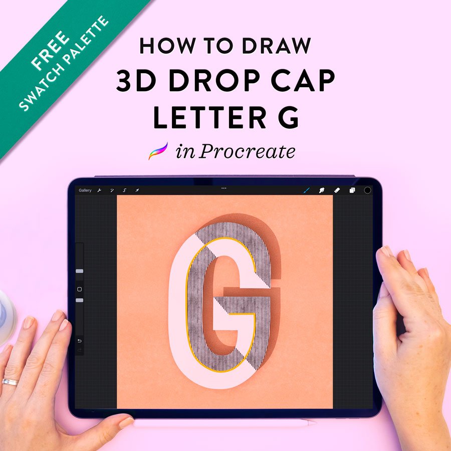
How to Draw a Drop Cap Letter G in Procreate
In this tutorial, I walk you through every step of drawing a geometric, three-dimensional drop cap G in Procreate—one with a retro feel, real texture, and a layered drop shadow effect. The technique uses a combination of monoline drawing, clipping masks, and texture brushes, all from my Ultimate Lettering and Calligraphy Procreate Kit (and linked within each step).
This detailed tutorial is available as a video and as written instructions. You can follow along in either format—or both! Watch the video below, or continue scrolling for the transcript with step-by-step photos and resource links.
If you’d like to follow along using the same color palette that I did, download it for free using the button below the video.
Video Tutorial
Learn how to install swatch palettes in Procreate here.
Written Tutorial
This is a transcript of the video above.

1. Set up the canvas with guidelines.
My canvas is a square measuring 8x8 inches at 300 DPI.
I like to set my background to something other than white, so I'm coming to the swatch palette and choosing a peachy color.
Now I want to create some guidelines for myself and I love to do that with bright contrasting colors. I’m choosing a hot pink and then going over to my Square Grid Pattern Brush, which I just swipe over my whole canvas to create a square graph paper background that I can sketch over and turn off later, so that nobody ever knows I used it!

2. Sketch the letter outline in pencil.
Now, on the new blank layer, I start my pencil sketches. I've come over to my pencil set and selected my favorite pencil brush, which is aptly called Molly’s Favorite Letter Sketching Pencil.
I'll start with drawing a really skinny rectangle in the middle of my canvas, and rather than lifting my Apple Pencil right when I'm finished, I'm going to continue holding it down for a moment so that this snaps to a shape, because I want a pretty even, perfect rectangle. Now we'll reduce the opacity of that rectangle and make a new blank layer on top of it.
Here I'm going to mark roughly the centers of the rectangle – the top, bottom and sides. The reason for this is that now when I'm sketching out this G, I'm able to hit those points, so that it makes a relatively geometric and symmetrical G. That's what I'm going for with this particular lettering style.
You can see that I am somewhat following the grid, but at the same time, I do appreciate things looking hand-lettered and not looking like they were made by a computer! So I tend to keep things optically geometric rather than trying to aim for extreme precision.

3. Trace the G with a monoline pen.
Now I'll reduce the opacity of that sketched-out G and make a new blank layer on top of it.
Coming over to my Molly’s Truest Monoline Pen, and selecting black from my palette, I'm going to make one smooth monoline over the G sketch. And for the crossbar of this G, I'm coming in and snapping a line so that it's perfectly straight. And again, I'm doing that by continuing to hold my pencil down when I reach the end of the line.

4. Create an outline template.
With my monoline drawn on, I'll duplicate that layer then reduce the duplicate’s opacity a little bit. Coming over to my selection tool and making sure I'm on Freeform selection, I'll drag out the top, bottom, and sides to approximately two squares larger on my grid. Basically, I'm stretching the top of the G two squares up; on the bottom, two squares down, etc.
Then again, I'll duplicate that original monoline layer, reduce its opacity, and do the reverse – shrink it inward by two squared.
Now, by tapping the top layer and merging down, I've merged those two new guideline layers. This is my outline template.
Now I can create a new blank layer on top of that and return to my pencil brush. I’ll start by quickly sketching over those new guidelines for myself. Then I’ll go in and draw the rest of the outline freehand: two squares outside of the crossbar and the end point of the top curve. So the end result here, you can see, is that I have a sketch approximately two squares larger on both sides than my original monoline.

5. Complete the enlarged fill layer.
Now I can turn off those guidelines I made and reduce the opacity of my pencil and create a new blank layer on top of that. I’ll change the swatch color to gray instead of black. Returning to my monoline pen, I'm reducing the size a little bit because the smaller the monoline is, the more squared-off the corners I draw can be. I want to have pretty crisp corners here, and that's why I'm going to draw this with the smaller monoline.
With the outline tracing complete, I’ll fill it in. I'll drag the gray swatch over and drop it inside my outline. Now I can just go back in and do a tiny bit of refining. Some of the edges were a little bit wonky, some of the ends didn't meet up perfectly, and some of the curves really needed to be refined.
Now I will move the new gray layer below my original monoline, so that they're layered one on top of the other and I can see the monoline in the center.
I can now turn off my guideline layers.

6. Create the first drop shadow layer.
Making sure I’m on my original monoline layer, I’ll come over to the yellow in my palette and drag-and-drop it on top of the monoline so that it turns yellow.
Next, I'm going to duplicate my gray layer. On the top one, I'm going to drag and drop my off-white color.
Now, selecting the bottom one, I'm going to keep it gray, but select it and move it a bit up and to the right. This layer is going to be serving as the drop shadow. The arrow shows roughly the direction that I'm considering the light to be hitting. So if the light's coming in from the bottom left, the shadow would be going to the top. I'm now going to reduce the opacity of that drop shadow layer to about 60% and make sure I set it to Multiply.

7. Draw the letter shading and dimension.
Next step is to make a new blank layer on top of that white layer, so underneath the monoline and above the white layer. Now I'm going to turn on Drawing Guide and hit Edit drawing guide. Here I can use the green node at the bottom of my grid to change the entire grid's and. I'll turn it to the right – or counterclockwise – a little bit. What I'm trying to do is get the lines to intersect where the arrow is pointing – so in between the corner of the G's crossbar and the outer corner of its corresponding drop shadow.
When I come back to my artwork and I'm on that blank layer that's under the yellow monoline and on top of the white background, I'll tap it and select Clipping mask. Then I can use a gray color and my monoline brush to draw in lines that connect these points. So for example, I'm drawing a line that adheres roughly to the straight lines of the guides and also runs in between the points where the drop shadow behind intersects with the white layer above.

8. Fill in the dimensional spaces.
Now I'll just turn off my drawing guide grip because I don't need it anymore. I'll enlarge my monoline brush and fill in the spaces that you can see here. What we're doing is we're creating a sense of dimension within the G. If you consider where the light source was coming from, from the bottom left, every place that the light would be hitting remains white, and every place that I colored in is where the shadow would fall behind the yellow monoline. Imagine that monoline is like a ridge that's coming upward and creating dimension, and what's behind it would sort of fall into shadow.

9. Add a pattern overlay to the drop cap.
I don't want the dimension parts to remain gray, so I'm going to drag and drop this darker peach color onto them to recolor the whole layer.
Next, I'll make a new blank layer on top of that, tap it once, and hit Clipping mask. This is going to make sure that everything I'm about to draw on that layer only will color in the portions below it. So the gray portions that I colored a moment ago are going to be the only areas that are going to be affected by what I'm about to put on this blank layer.
Now I'm coming over to my Backgrounds brush set and choose my Pinstripe Background Brush. I want to make sure that the direction of my canvas right now is perfectly upright because this brush adheres to the angle of the canvas and I want the direction of these pinstripes to be straight up and down.
I'm drawing over the whole layer and I'm doing it very quickly because again, this is a clipping mask – everything that I draw is limited to only the pixels in the layer below it.
Now I change the blending mode of the pinstripe layer to Multiply and slightly reduce its opacity. And change the blending mode of the peach layer to Screen and reduce its opacity a little bit, too. This pinstripe background brush has some texture to it. It's not like a really crisp pinstripe, so it has sort of a vintage look to it already.
By swiping on all of my layers together, I can select them all and then tap Group so that I can adjust the placement of the whole group at once. I’ll move the entire G to be optically centered on the canvas.

10. Add realistic texture overlays.
Now we have to add texture to the background. So underneath my group, I'm making a new blank layer and I'm immediately setting it to Multiply. I’ll change my swatch color to the same peach as the background color.
I'm coming back over to my background brush set and selecting my Old Paper Background Brush and just sweeping it over the canvas in the background. You'll see that this creates like a really nice vintage texture, almost like gesso.
Now we will add a bit of texture on top of the whole canvas, so that it affects the G as well. Making a new blank layer on top of my group, I'll come over to my Textures brush set and choose my Watercolor Wash II Texture Brush. Now I'll sort of splotch this all over the canvas. I'm not doing one continuous sweeping motion. I'm kind of almost like blotting my Apple Pencil so that it creates these overlapping shapes with translucency. And I'm putting more on the edges to create sort of a vignette effect. Now I'm making sure that layer is set to Linear Burn blending mode, and the opacity is reduced quite dramatically so that I get an overall texture without looking too painted on.

11. Add grain to the drop shadow.
Now let's add some texture to the drop shadow itself, because I don't like my drop shadows to be too crisp – that's a little bit unrealistic. So I'll make a new blank layer on top of my gray drop shadow layer top at once and hit Clipping mask. Then select black from my palette. In my brushes, I'm going over to my Texture set and choosing the Noise Spray Brush. This is subtle, but just keep your eye on the drop shadow itself. You'll see that speckles and some noise and texture appear there.

12. Add a second, blurred drop shadow.
To finish off my drop shadow effect, I'm going to duplicate my gray drop shadow layer and move it slightly down and to the left, so that it's only slightly peeking out from behind the G. Now I want to blur it so that it really looks like the G is sitting on top of the paper, and would then be casting this shadow. To do that, I’ll come up to the Adjustments palette and select Gaussian Blur, and then use my Apple Pencil to slide left and right across the screen to adjust the level of blur of that layer.
I'm blurring it quite a lot because I really just want to create this fuzzy, dark color behind the G to really create a dramatic separation in shadow between the G and the sharper drop shadow.

Thank you for following along!
There you have it. This retro, geometric drop cap G is complete! Don’t forget to click the big purple button below to download the color palette.
As always, tag me in your work on Instagram (@mollysuberthorpe) so I can see what you’re up to.
Learn how to install swatch palettes in Procreate here.
Links to Tools & Continued Learning
Brushes used:
All are from my Ultimate Lettering and Calligraphy Procreate Kit.
iPad Tools Used:
More Procreate Tutorials:


If you found this post useful, consider sharing it. That’s the best, free way to support artists and authors you appreciate. You could also buy me a coffee, if you wish.