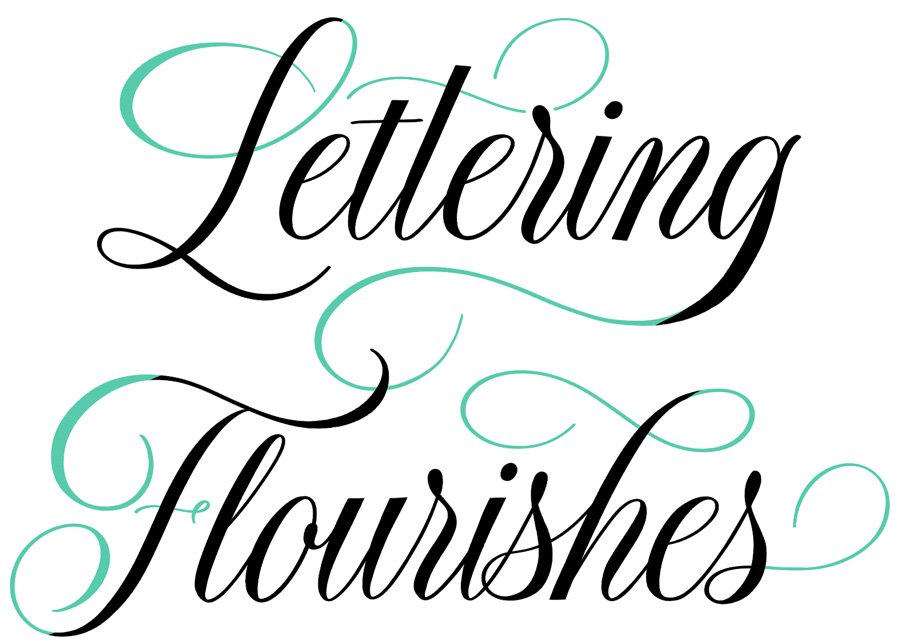
8 Principles of Lettering Flourishes (and a Free Workbook)
The most beautiful flourished calligraphy seems to unfurl as if it were improvised—fluid, offhand, almost accidental. But it rarely is. The ease that makes flourishing look spontaneous is the result of practiced control, and comes from a deep understanding of letter structure and negative space. Beneath the ornament, there are patterns that shape how these decorative lines move, curve, and intersect.
I’ve distilled these patterns into eight key principles for successful flourishing. Together, they explain why certain flourishes balance and enhance a composition, and others detract from it. Letter flourishing is hard to learn from imitation alone. Without a clear grasp of the underlying principles, flourishes tend to look either hesitant or overdone—and it can be difficult for beginners to diagnose exactly why.
These principles do not depend on the writing tool or lettering style. For thoughtful flourishing that looks effortless, the same principles apply whether you’re working with a calligraphy pen, brush marker, chalk, or Apple Pencil; whether your style is traditional or contemporary, restrained or expressive.
At the bottom of this post, you can download my free flourishing workbook covering the eight principles, with more examples and traceable exercises to practice each one.
eight principles of
• flourishing principle 01 •
Intention
Before you put pen to paper, ask yourself: what mood are you trying to convey? Elegance? Drama? Something modern or old-fashioned? The same letter can be flourished in dramatically different ways depending on the answer, and each way will communicate very different sensations.
• flourishing principle 02 •
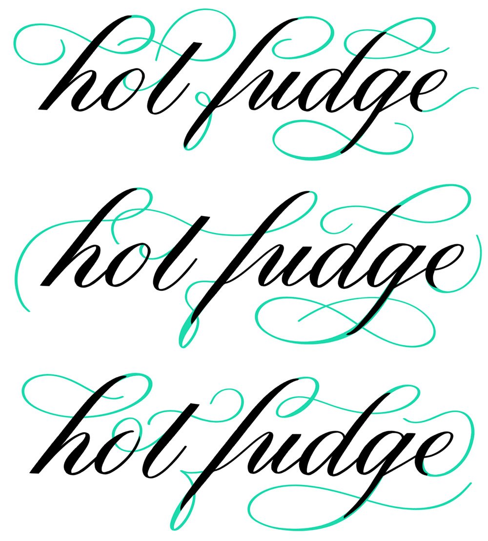
Placement
Where a flourish lives matters just as much as what it looks like. Flourishes belong at natural extension points in a letterform—ascenders, descenders, entry and exit strokes—and should reach into areas of negative space rather than compete with the lettering itself. I like to map out the negative space in a composition first, so my flourishes fill rather than crowd.
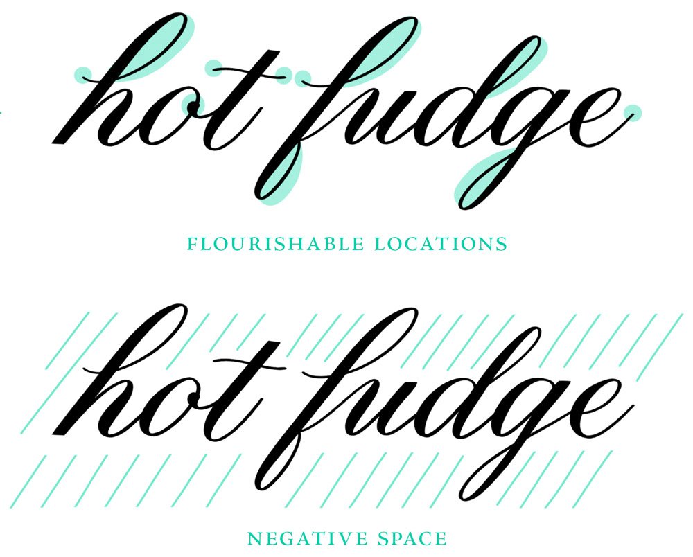
The same locations and spaces still allow for endless variations:
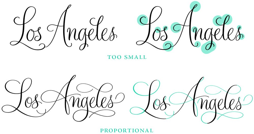
• flourishing principle 03 •
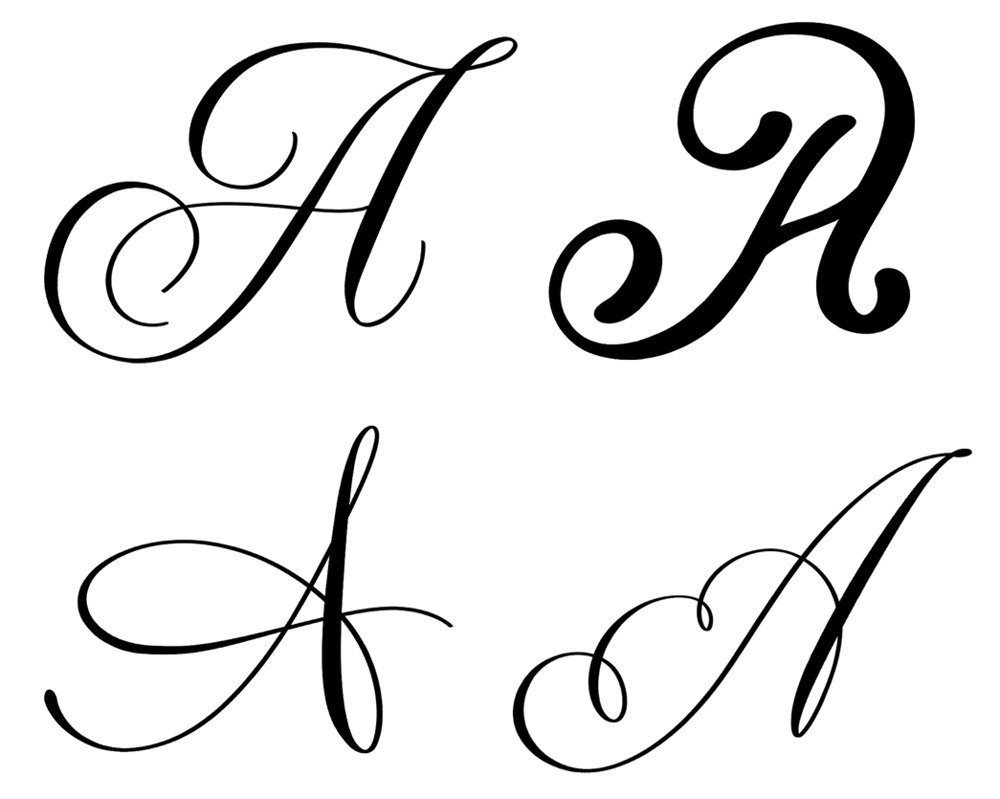
Size
Flourishes that are too small look like afterthoughts. Flourishes that are too large overwhelm the letters they’re supposed to enhance. The goal is proportionality—flourishes that feel like a natural extension of the letterforms in both scale and style.
• flourishing principle 04 •
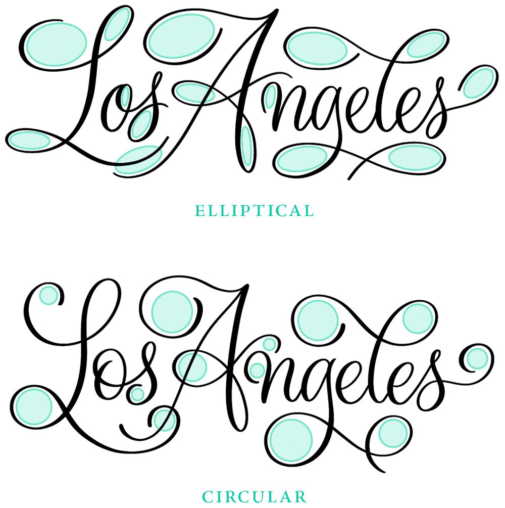
Shape
The shape of your flourished curves determines a lot about the overall feel of the design. Elliptical loops tend to be fancier and more traditional, while circular loops feel playful and modern. Neither one is inherently better, but be aware of your curve shapes because mixing the two within a single word may create visual inconsistency.
• flourishing principle 05 •
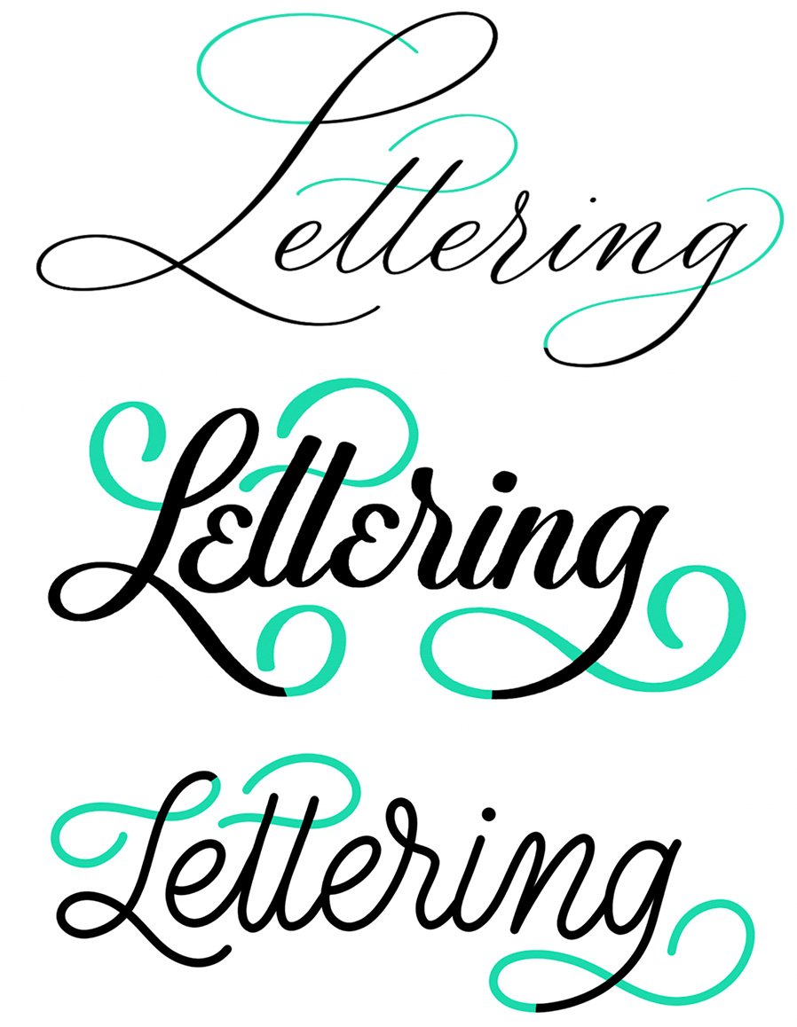
Style
Flourishes should match the lettering style they accompany. Fancy, formal calligraphy often calls for hairline flourishes that feel delicate and refined. Bold, brushy lettering needs dramatic, thick strokes. Modern, monoline script flourishes will have a consistent line weight to match.
• flourishing principle 06 •
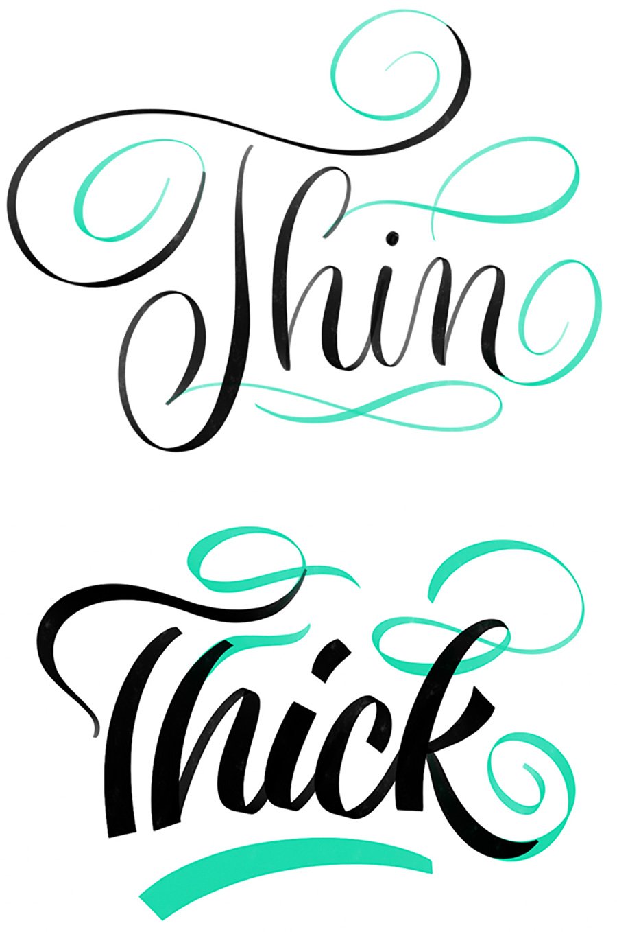
Weight
“Weight” refers to the thickness of a stroke and how its width varies between thin and thick. It follows closely from style. Your flourished stroke should be consistent with the strokes of the letters themselves. A delicate pointed pen script paired with thick, heavy flourishes creates a jarring contrast that overwhelms the letterforms.
• flourishing principle 07 •
Quantity
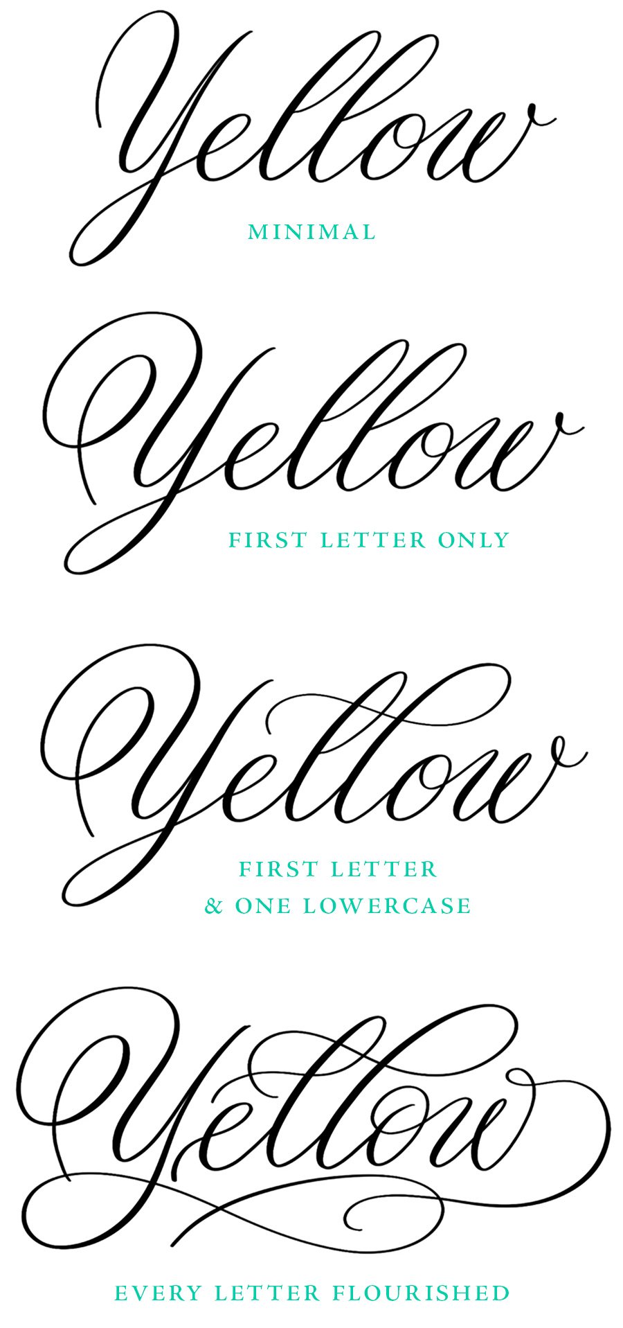
There’s no magic number of flourishes that a word or composition should have, but often it’s fewer than we think. A single flourished capital can be enough to set the right tone. Too many flourishes impede legibility. It’s the rare word where every letter can be flourished and end up looking lush rather than overwrought. When in doubt, pick a few letters to flourish and create contrast by keeping the others plain.
• flourishing principle 08 •
Legibility
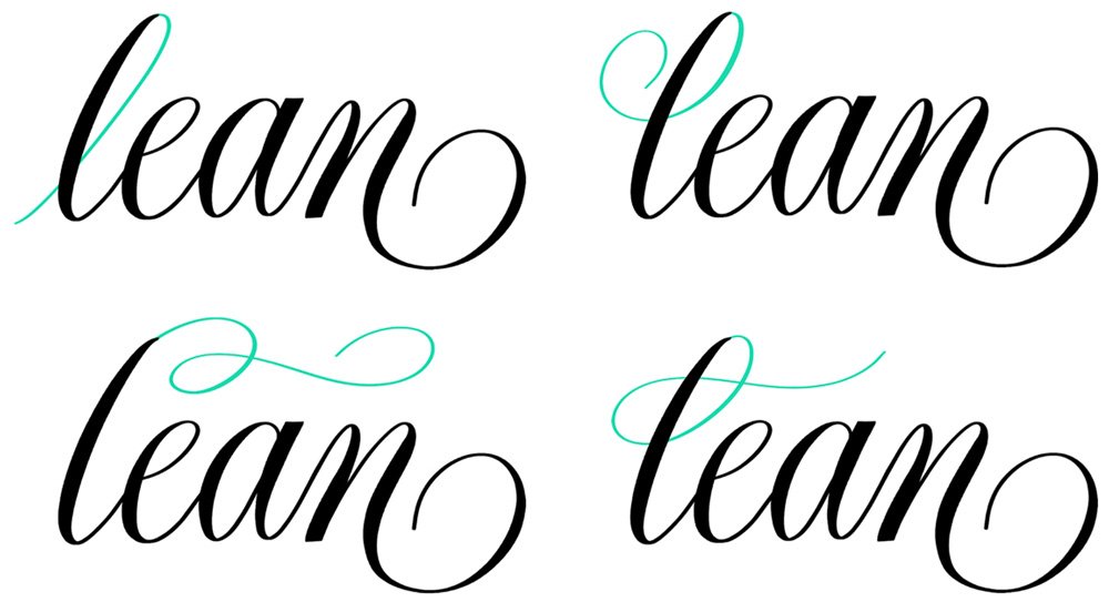
This is the most important principle of words meant to be read, yet also the most often sacrificed in the name of decoration. Flourishes should enhance a word, not obscure it. No matter how beautiful it is in isolation, a flourish that makes a letter ambiguous or unreadable isn’t doing its job.
Does this say “clean” or “lean”?

Here are some better solutions for entry stroke flourishes:
• free workbook •
Download the free workbook

I put together an 18-page workbook that covers all these principles, and includes traceable examples and practice prompts.
It comes in printable PDF and Procreate formats so you can use it on paper or on your iPad.

If you found this post useful, consider sharing it.
That’s the best, free way to support artists you appreciate.
You could also buy me a coffee, if you wish.