How to Get Perfect Calligraphy Strokes in Procreate
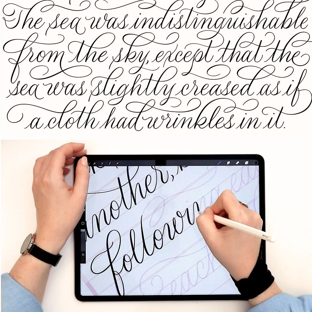
One of the questions I’m asked more than almost anything else about Procreate calligraphy is this: how do you get those beautiful, smooth thick and thin strokes on the iPad? In response to my YouTube videos, I receive dozens of comments from people who see me creating pointed-pen-style script in Procreate and cannot understand how I’m achieving those stroke transitions. If you’re also struggling to emulate the smooth letterforms and dramatic line variation you see other iPad calligraphers creating, this tutorial is for you.
This lesson will help you even if you’ve never learned ink-on-paper calligraphy. But if you are already familiar with it, and feel frustrated trying to translate those pressure changes to a glass screen, it’s for you, too.
When the iPad Pro and Apple Pencil were first released, I immediately began experimenting with flourished calligraphy in Procreate—and I was really, really frustrated. My Pencil was sliding all over the glass. The pressure control and fine motor movements I’d spent years developing with dip pen nibs did not translate. Digital script lettering was still fairly new at the time, so, on the one hand, I didn’t have a lot to compare myself to, but on the other, I didn’t have places to go for help.
My own initial frustration is why I am making this lesson. I’ll walk through the Procreate brush settings, specific techniques, and crucial habits that made iPad calligraphy finally flow for me. Watch the video demonstration below, then keep scrolling for the full transcript, step-by-step photos, and additional resources.
Watch the video tutorial:
Follow the written tutorial:
What’s a pointed pen?
Let’s start from the very, very beginning, with some true basics, to make sure that we’re all on the same page in understanding how thick and thin calligraphy strokes are traditionally formed. Understanding analog pen pressure and speed will help you a lot in the digital realm.
Pointed calligraphy dip pens come in lots of sizes and shapes, but what they all have in common is that they are made from metal, and come to a sharp point. The tip of a pointed calligraphy pen is, in fact, made of two symmetrical pieces of metal that sit flush next to each other, called tines.
Pointed pen strokes are controlled with pressure.
When you press down on a pointed calligraphy pen, those two tines separate. The harder you press down, the further they separate. Likewise, the less pressure you exert, the smaller the gap is between the tines. At rest, of course, with no pressure whatsoever, the tines are flush together, with no gap in between.
Ink flows through the point of a nib.
When you dip a pointed pen in ink and write without exerting any pressure, the width of your written stroke is only as wide as the very tip of your pen nib. This means that writing with no pressure gives you hairline strokes.
As you increase pressure, ink flows like a river between the gap in the two tines. The harder you press down, the wider the pen tip becomes, and the thicker your calligraphy stroke is.
The Apple Pencil is the best digital equivalent.
When Apple created the Apple Pencil, they did an amazing job designing a stylus that emulates the pressure sensitivity of different art tools, from paint brushes to calligraphy pens.
In Procreate, the behavior of this pressure sensitivity depends on the programmed setting of the brush. If you have a well-designed Procreate calligraphy brush, programmed with pressure sensitivity that matches a traditional metal nib, then you will be able to use the same principles that you use in analog calligraphy on your iPad.
Important! Brush settings in Procreate only work with an Apple Pencil. If you use a stylus from another brand than Apple, your Procreate brushes will not work as intended.
Analog and digital calligraphy strokes are made in the same way.
Here I have used my own Fine Point Calligraphy Pen brush to write strokes of varying widths—just as I did above in ink. This image compares ink on paper and “ink” on my iPad screen. My hand was exerting the same pressure that I did with my metal dip pen. You can see that the resulting strokes look very similar in width and shape. This is because of the programming of the brush’s pressure sensitivity, texture, tilt, reference shape, taper, and path adjustments.
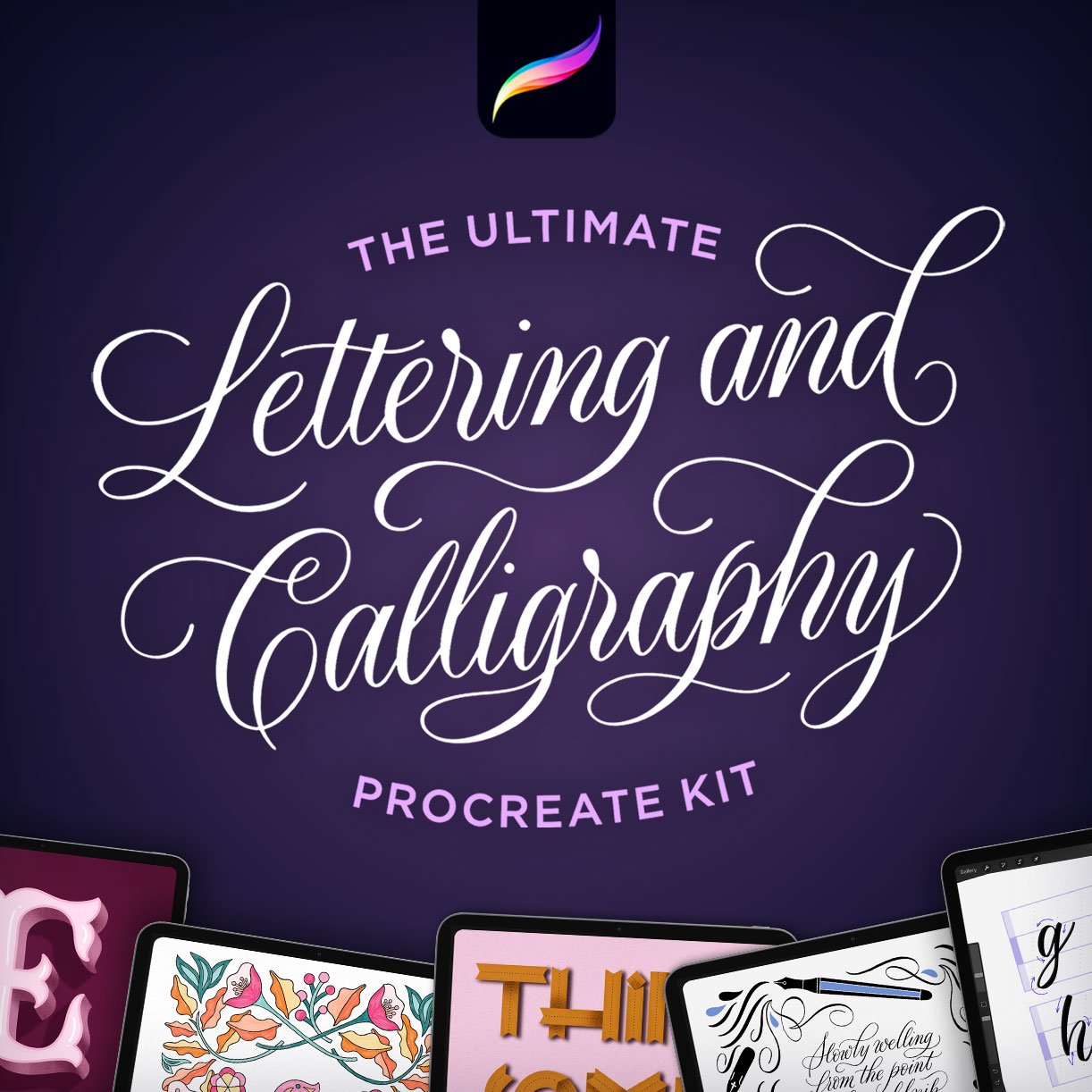
My Ultimate Lettering and Calligraphy Procreate kit has over 150+ brushes and practice files, specifically optimized for fine, pointed pen iPad calligraphy.
Check your brush settings…
Let’s now take a look at one of the most important setting for a well-programmed script calligraphy brush in Procreate.
To view a brush’s settings, tap on the brush name in your brush library menu. This opens the Brush Studio where, on the right-hand side, there’s a Drawing Pad for making strokes to sample your new settings in real time.
Here, I am adjusting the StreamLine setting (Brush Studio > Stroke path > StreamLine). Draw some sample strokes on the Drawing Pad, then turn your StreamLine setting all the way up to “Max.” You will instantly see how this change impacts the smoothness of a stroke. All the shaky edges and wonky pressure will smooth out.
StreamLine was created to counteract the effect of the plastic Apple Pencil tip against the slippery glass screen. While an analog pen is able to grip the paper to stabilize itself, a stylus can’t do that against a glass screen. Streamline was designed as a digital solution.
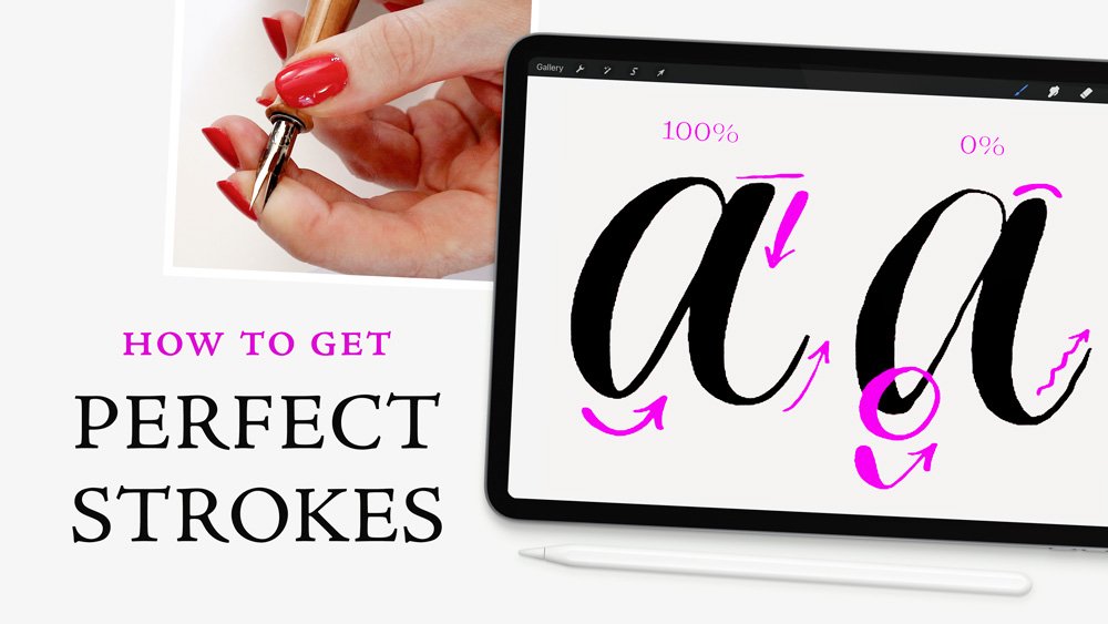
Compare the impact of StreamLine on stroke quality.
Now let’s see how this impacts a real composition.
Here I have drawn an a using maximum StreamLine strength (far left). I drew it again after adjusting the StreamLine strength to zero. And for a third comparison, I used 50%. I wrote these letters at the same speed (i.e. very slowly) using identical pressure. It is very clear that the digital correction that StreamLine provides creates the most fluid calligraphy.
Look at how the transitions from downstroke to upstroke—in other words, the transition from exerted pressure to released pressure—is fluid with StreamLine turned up high, but becomes rough and clumsy when there is no compensation for the slippery screen. Same goes for the thinner upstrokes, which are wriggly without StreamLine, as a result of the plastic pencil against glass.
In my work, StreamLine is essential to achieve the calligraphic strokes that I want. I don’t always use it at maximum strength, but I usually have it set to 50% or higher. No matter the speed I write or how carefully I exert pressure, without it, I cannot properly emulate ink on paper.
Use Procreate brushes optimized for calligraphy.
You can probably see now how important it is to have the right brush for the job. Think of it this way: you can never play a beautiful sonata on an out-of-tune piano. You might have the technical skills, and the practice, and the intuition, but if your instrument is poor, your skills simply cannot shine.
If you are an ink-on-paper calligrapher, you will know that this applies to traditional calligraphy as well. If your poor-quality paper bleeds, or your pen nib is bent, no amount of technical skill can fully compensate for that.
Likewise, you cannot create elegant pointed pen calligraphy lettering on the iPad if you are using a brush which inherently is not optimized to create thin strokes when you reduce your pressure and thick strokes when you exert pressure.
Premium Procreate brushes make a big difference.
I highly recommend getting at least one well-programmed calligraphy brush before you dive into Procreate calligraphy.
I’ve designed hundreds of iPad lettering brushes, but mine are certainly not the only acceptable ones for Procreate calligraphy! Just as different painters prefer different brushes, so too do digital lettering artists. Be open-minded about experimenting with a number of Procreate tools until you find the perfect fit for your own work.
Shown here: samples of the Pointed Pen set from my Ultimate Lettering & Calligraphy Procreate Kit.
I’m giving you a free calligraphy brush to get started.
If you don’t currently have any premium calligraphy brushes, snag the one I give away for free as part of my Lettering Toolkit. This will certainly get you started, and, for all you know, might end up being your favorite!
Go slow!
We’ve talked about tools. Now let’s talk about the next most important thing: speed.
The number one mistake that I see iPad calligraphers making—and lots of analog calligraphers, too—is they write too fast. I know how tempting it is to want to write calligraphy at the same speed as your everyday handwriting, but writing calligraphy should be nowhere close to as fast as your handwriting.
Beginner calligraphers in both analog and digital realms who try to write calligraphy too quickly inevitably feel frustrated that their letterforms looks sloppy, their pressure and stroke weight is uneven, and they can’t achieve the uniformity they’re striving for.
There’s no reward for writing faster.
I write at the exact same speed on my iPad as I do when I am writing analog calligraphy, and by that I mean very very slowly. Calligraphy is more akin to drawing than to handwriting, in the sense that the creation of letterforms requires precision and care. There is no reward for reaching the end of the word any faster.
There are so many considerations when forming a calligraphic letter, in terms of stroke direction, shape, and pressure changes throughout. When writing quickly, it is not possible to make the smooth pressure transitions required for elegant calligraphy.
To summarize:
If you find yourself struggling to create smooth, elegant thick and thin strokes in your iPad calligraphy, remember three things:
1. You should have a well-programmed brush optimized for calligraphic pressure sensitivity. Without that, no matter your technical skill, you won’t be able to overcome the brush’s shortcomings.
2. Make sure StreamLine is turned on to compensate for a plastic stylus that cannot grip the glass screen the way a metal pen can grip paper.
An aside: Lots of people ask me about iPad screen protectors, specifically ones that emulate paper texture. I do not use these because I simply don’t like them. I find they reduce the clarity of my screen, they don’t help me make nicer calligraphy, and they wear down Apple Pencil tips very quickly. If you want to read more of my reasoning behind not using a screen protector, here’s a blog post where I discuss it.
3. Write extremely slowly, taking care with every pressure increase and decrease, especially around curves.
Practice with intention.
Now that you understand the techniques and considerations for smooth upstrokes and downstrokes, how do you go about practicing? I’ve tried to make this easy and free for my subscribers.
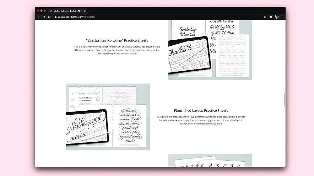
I offer a whole archive of free, downloadable Procreate practice files that allow you to trace my calligraphy. Just like my free calligraphy starter brush, this is part of Molly’s Lettering Toolkit. I have dozens of practice files available for calligraphy flourishing, fancy alphabets, beginner strokes, cursive, and more.
Remember, practicing stroke thickness is as important as the letter shape itself!
Here you can see me tracing one of my free letter exemplar practice sheets—“Whimsy Script”—using care to emulate the width of each stroke just as much as the shape of the letter itself.
If you practice slowly, and with care, you’ll find that in addition to learning new letterforms and flourishes, you’ll be practicing your up and down, thick and thin strokes as well.

Resources
Procreate brushes used in this tutorial:
Fine Point Calligraphy Pen – Smooth from my Calligraphy Nibs Procreate Brush Pack
Free Flourishing Brush & Practice Sheets from Molly’s Lettering Toolkit
Calligraphy tools I used in this tutorial:
Zebra G Calligraphy nib
Calligraphy pen holder by Inkatable
Moon Palace Sumi Ink