6 Tips & Tricks for Mastering Procreate Calligraphy
It’s no secret that I’m a fan of calligraphy on the iPad—whether it’s fancily-flourished Spencerian or bold-and-brushy lettering. No matter your preferred style, there are a number of key considerations to bear in mind as you learn hand lettering on the iPad with Procreate. I’m sharing my top six tips for making the most out of your Procreate calligraphy and lettering practice.
Jump to a section:
Brushes & Tools • Practice Sheets • Stroke Practice • Speed • Letter Guides • Drills & Warmups
— № 1 —
Use the right brushes and tools.

The pressure sensitivity of the Apple Pencil Pro is unparalleled.
Apart from the iPad and Procreate app themselves, some other tools are crucial for Procreate lettering success.
First and foremost, invest in an Apple Pencil. The art apps and brushes designed for all iPad software—from raster apps like Procreate to vector ones like Affinity Designer—are specifically optimized for the Apple Pencil, rather than a third-party stylus.
Second, make sure you’re using well-designed Procreate brushes, specifically for lettering.
A great digital art brush is about a lot more than the texture it produces. Brush designers spend a long time meticulously programming a brush’s interaction with the Apple Pencil, from pressure sensitivity to opacity, stroke correction to pen angle. While these settings are “invisible” in the finished artwork, they are absolutely essential to the art-making experience. The Apple Pencil is currently the only writing tool that can make the most of all these drawing app settings, allowing you to use the brush precisely as the brush creator intended.
As a designer of Procreate lettering brushes myself, I can attest that the majority of the programming process revolves around perfecting the pressure and angle settings, to achieve the closest possible approximation of a “real” analog pen.
Trying to figure out which iPad to buy? Read my blog post about iPad recommendations.
Related article: Thin and Thick Calligraphy Strokes in Procreate: My Top 3 Tips
Is it possible to create Procreate lettering with any brush?
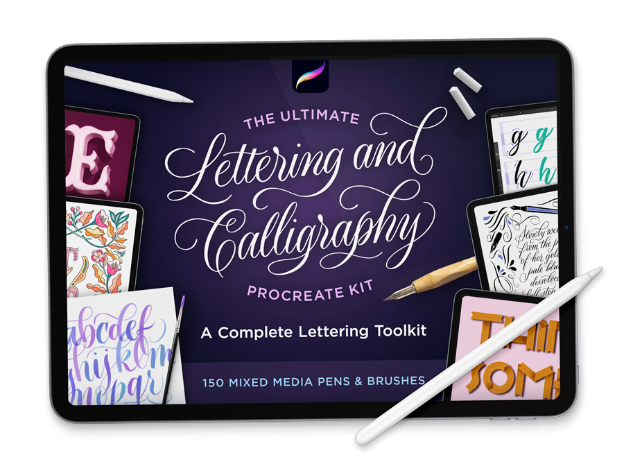
My The Ultimate Lettering & Calligraphy Procreate Kit contains 150+ brushes for dozens of lettering and calligraphy styles
I see this question a lot, in various Procreate forums and social media comments. The short answer is no, unfortunately.
For the longer answer, I’d respond with a question of my own: Is it possible to write calligraphy with a sign painting brush? Or paint a sign with a calligraphy pen? The answer is quite clearly no, if your aim is to emulate the classic characteristics of those lettering styles.
Likewise, Procreate brushes are optimized for specific uses. They have this in common with analog art tools. Creative, unorthodox uses are certainly possible, though. Experiment! Have fun! But if you’re trying to learn conventional lettering or calligraphy in Procreate, you will have a much easier time when using a brush designed by a lettering artist for lettering artists.
The good news is that there are lots of fantastic Procreate lettering brush packs on the market. Procreate comes with a small selection of calligraphy brushes, but they merely scratch the surface of the variety of offerings out there. Buying some premium brush packs is a worthwhile investment in your lettering practice. (The difference really is night and day!)
I can’t resist including one of my own: The Ultimate Lettering & Calligraphy Procreate Kit. I designed these brushes for dozens of different lettering styles, and I personally use them in my work every single day.
— № 2 —
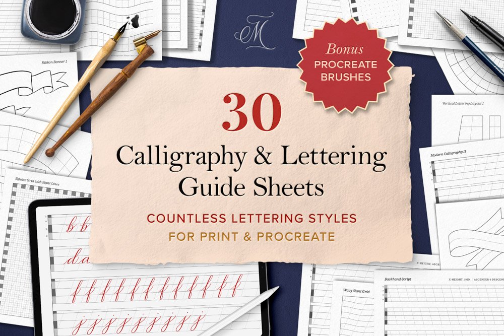
Download traceable practice sheets.
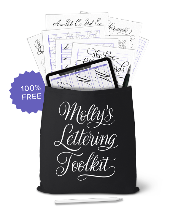
My Lettering Toolkit has dozens of free Procreate and printable practice sheets
The best way to learn a lettering style is through drills and repetitive practice of strokes and letterforms. And there is no more convenient, structured way to do this than with practice sheets.
Procreate practice sheets usually come as layered files with light-colored letters that you can trace on a blank layer with a lettering brush. Unlike ink-on-paper practice, when you run out of room on these pages, you can just make a new layer and start over!
Not only will a good practice sheet teach you the shapes of each letter in a particular style’s alphabet, but tracing them is a great way to test drive different Procreate lettering brushes. Which brings me to the next point…
I have a whole collection of Procreate calligraphy and lettering practice sheets that I give away for free to my subscribers. Check out Molly’s Lettering Toolkit to preview what’s inside, and sign up for instant, lifetime access. (I add new freebies regularly!)
— № 3 —
Practice pressure and angle, not just letters.
Whether it’s flourished calligraphy or funky brush lettering you’re writing, the pressure sensitivity and pen-to-screen angle of brushes vary from one to the next. When drilling a letter over and over, your hand and arm will internalize the small movements required to move from one stroke to the next. But equally important, the pressure and pen angle required to make each stroke’s characteristics match that of the lettering style.
For example, one thing that makes pointed pen calligraphy so elegant is its movement between thick downstrokes and thin upstrokes. This stroke width contrast is created by exerting pressure when drawing your pen down, and releasing all pressure when moving up.
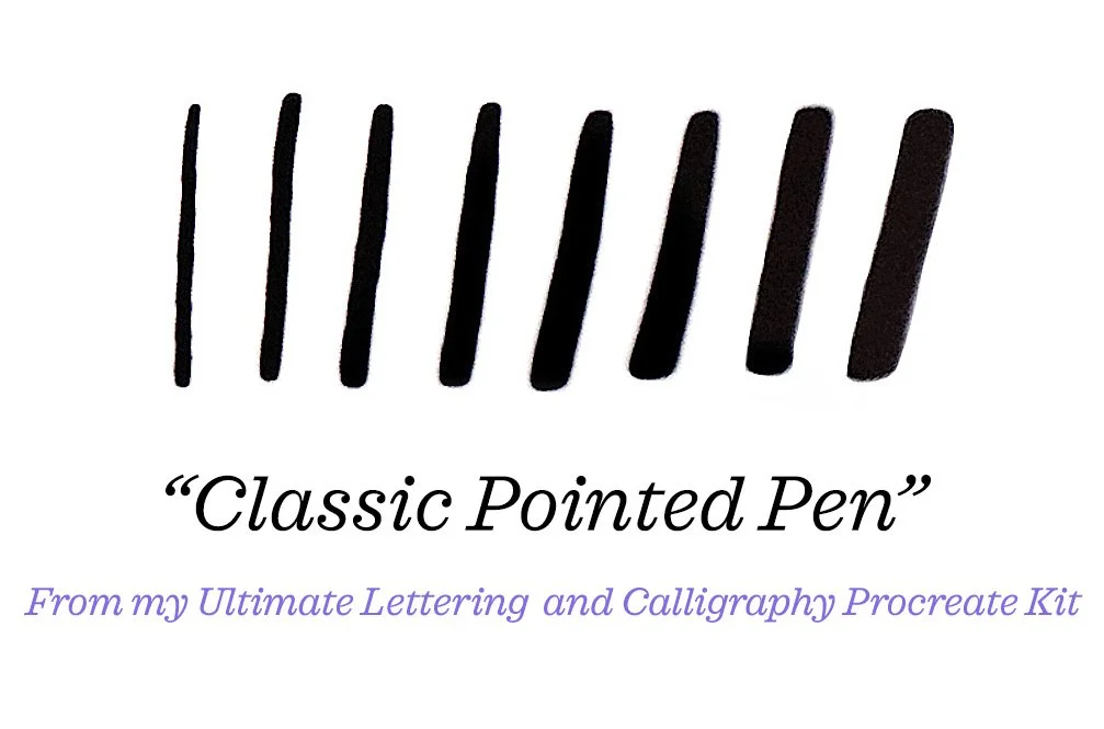
In the image above, you can see the impressive variation created simply by exerting more or less pressure on the pen. This example uses my own Classic Pointed Pen from my Ultimate Lettering & Calligraphy Procreate Kit.
By contrast, broad tip calligraphy relies on a pen’s angle, rather than pressure, to create thick and thin strokes: keep the nib perpendicular to the baseline for thick strokes, and turn it on its side, at a 45-degree angle, for thin strokes.
Video tutorial: Thin and Thick Calligraphy Strokes in Procreate: My Top 3 Tips
— № 4 —
Write slowly!
“Write hand lettering and calligraphy very, very slowly. And not just when you’re learning. All. The. Time!”
Write hand lettering and calligraphy very, very slowly. And not just when you’re learning. All. The. Time! There is no benefit to drawing letters fast. In fact, if you watch professional lettering artists write in real time, you will see that they all write very slowly.
Possibly the number one mistake that I see Procreate calligraphers and lettering artists making is writing much too fast. This results in sloppy, uneven lettering, without the nuance and smooth stroke connections that slow writing allows. Thus, writing too fast inevitably leads to frustration because it’s so hard, if not impossible, to achieve the desired look.
It’s really tempting to write hand lettering at the same speed as your everyday handwriting. However, the reality is that artistic lettering shouldn’t be anywhere close to as fast!
There are so many things to consider when drawing a letter: stroke direction, shape, pressure changes, etc. In this way, lettering is a lot more like painting than writing. When you dash off a shopping list or thank you note, you’re thinking about what word comes next. But this is not the case with lettering! When creating a lettering composition, you always know the text in advance, so the process becomes about what letter comes next, what that letter should look like, and how to form it as beautifully as possible.
Here are some videos where you can watch me draw Procreate calligraphy in real time, to see just how slowly I write my strokes:

— № 5 —
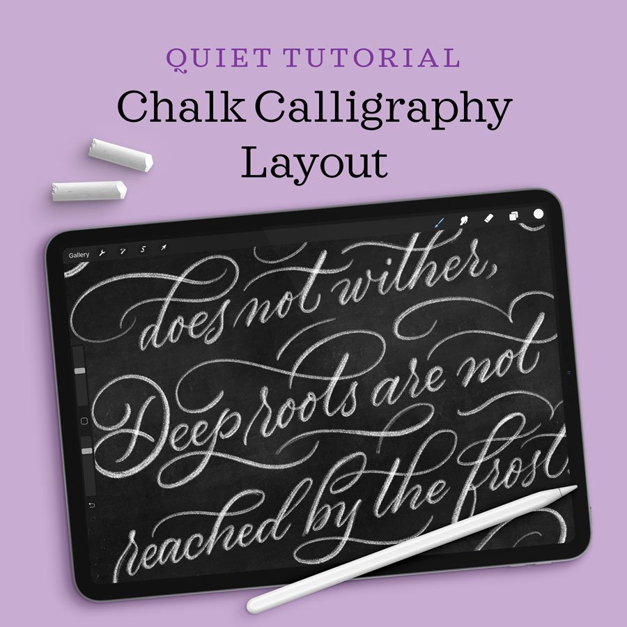
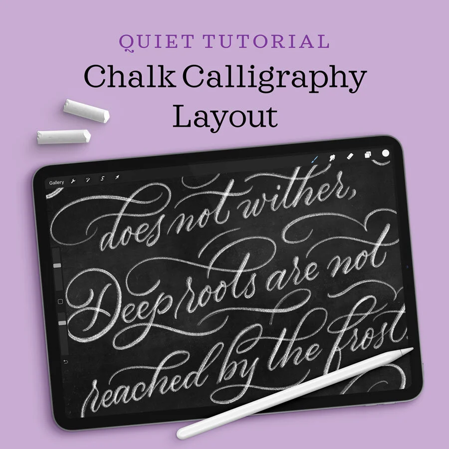
Use guidelines for spacing and slant.
Lettering guidelines are the unsung heroes behind well laid-out, uniform lettering and calligraphy compositions. But since they are used during the composition process, then hidden from the finished piece, lettering guidelines are often overlooked!
In addition to providing a straight baseline for your letters to sit on, a good lettering guide shows you how tall, how long, and how slanted your letters should be. Some letter guides come in fun shapes, like arcs, and others are multi-line guides for creating entire composition layouts. They also really help in the learning process. Adhering to guidelines is great practice for writing with a consistent italic slant and keeping your letters at even heights.
Professional calligraphers and lettering artists use lettering guides all the time, and many draw their own custom guides to suit their style and composition. I highly recommend that you experiment with a number of lettering guides as you learn lettering, with different slants, proportions, and layouts.
If you’re looking for Procreate or printable guideline sheets, I’ve published a couple options for you. My Calligraphy Composition Maker is the most robust Procreate calligraphy guideline bundle you can find, with 65 Procreate stamps and pattern brushes, layout templates, free practice sheets, and a video tutorial to teach you everything you need to get started. And my 30 Calligraphy & Lettering Guide Sheets bundle contains all the essential guide sheets you’ll need for countless lettering styles and layouts. You can print them for analog practice or install them in Procreate or any other app!

— № 6 —
Do stroke drills and warmups.

Free stroke drill practice sheets are available in my Lettering Toolkit.
Don’t start writing cold. Do drills and warmups first to get your muscles moving! Pay attention to your form, like posture, height over the table, etc. But move slowly through your warm-ups—it’s not a speed test!
Practicing calligraphy drills is a wonderful way to isolate just your hand movement by removing the technical considerations that come with shaping letters and words.
I even recommend that digital artists pick up a good old-fashioned pencil and do drills on paper. The muscle movements are the same whether you’re moving your arm over a screen or a notebook. Use a dull pencil with soft graphite so that you can practice pen pressure as part of your warm-ups, too. The pencil’s dull tip will glide more easily across the page and its soft graphite will make light hairlines and thick, dark lines the more you exert pressure, emulating the stroke weight of a real pointed pen.
Drawing a large figure eight in pencil is a classic exercise and almost unbeatable in these respects. The long, back-and-forth stroke pattern is perfect for warming up the arm and training the muscles.
Here are some more of my Procreate tutorials:


If you found this post useful, consider sharing it. That’s the best, free way to support artists and authors you appreciate. You could also buy me a coffee, if you wish.
This post contains affiliate links, which support the free content I write on this blog, the free downloads I offer in my Lettering Toolkit, and the ongoing work of maintaining Calligrafile.com. I only recommend tools and resources I actually use and love, and my suggestions are never influenced by these affiliate associations.