The Art of the Backslant: Mastering Negative Italics Calligraphy
Script handwriting that slants to the left rather than to the right goes by several names: backhand, backslant, reverse italic. Given that the angle of the axis to the baseline is negative (measured counterclockwise from an upright, perpendicular axis), it’s sometimes even called negative slant or negative italics. When handwriting was connected script, and most of it had a traditional, right-slanting axis, left-leaning backhand was sometimes used intentionally, as a contrast—just like we use right-slanting italic today.
Click to enlarge. Giovanni Antonio Tagliente, Lo presente libro insegna la vera arte de lo excellente scriuere…(1547). View the book online here on Archive.org via Biblioteca Nazionale Centrale di Firenze.
While left-leaning handwriting may appear very modern—even wonky or “wrong”—it has been documented in Europe since the sixteenth century. It was relatively rare, often appearing in broad-tip calligraphy styles. The example above by Italian penman Giovanni Antonio Tagliente dates to 1539.
Click to enlarge. Various examples of backslant handwriting. Clockwise from top left: Undated letter by President Abraham Lincoln to Major General David Hunter during the American Civil War; Book page from The Penman-Artist and Business Educator; addressed envelope from the Horace G. Healey Penmanship Collection; “Candy Alphabet” exemplar by George E. Goldie via IAMPETH Scrapbook Vol 2 (p.93); Western Union telegraph using backhand to contrast the right-leaning lettering below it (highlighting my own), 1865 via New York Public Library.
Backhand script was popularized in English in the nineteenth century. I take inspiration for my modern backhand calligraphy from a handwriting system called “Library Hand,” invented at the turn of the twentieth century by librarians Melville Dewey and Caroline Pierce. It’s a simplified dual-alphabet style with cursive and print, designed to make the writing on card catalogs and book spines easy to read and uniform across the United States.
.jpg)
Click to enlarge. Two examples of Library Hand using left-leaning script and monoline pens. Left: c. 1912 via University of Michigan Library, here. Right: date unknown, via Atlas Obscura.
In this video and written tutorial, I design a layout on my iPad using a grid with axis lines that go to the left and watercolor calligraphy brushes of my own design. For my text, I chose an excerpt of a beautiful poem by Amanda Gorman: The Hill We Climb.
Watch my video tutorial below and keep scrolling to read the transcript.
Backhand Calligraphy on iPad Video Tutorial
Written Tutorial
Click an image to enlarge it.
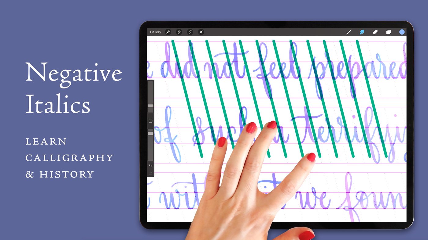
Set up backhand guide brushes.
I have a set of backhand slant guide brushes in my Calligraphy Composition Maker. I like to use them in a contrasting color (in this case, pink), then reduce the capacity of the layer they’re on. This allows me to have high contrast between my guides and my letters when I work with black brushes. To create an entire guide sheet to cover my page, I duplicate my guide layers and adjust them to fit the canvas.
Sketch line one with a pencil brush.
Selecting black from my color palette, I choose my favorite pencil brush. (You can choose any pencil brush you like, including the ones that come with Procreate.) Then I begin sketching my quote on a new blank layer. Make sure not to sketch directly onto your guideline layer—you want to be able to turn your guidelines off later without turning off your lettering.
You can see in the photo how I adhere to the backhand guidelines, which make the negative italic slant. It can be really fun to practice like this, but since it’s so different than what most of us are used to, it takes a bit of practice. Some of my left-handed students, however, have told me over the years that this axis comes more naturally to them. If you’re left-handed and you agree, let me know in the comments!
Resize the first line to fit together.
I’ve just completed the first line of the poem. Since I know that it is the longest line, I reduce the size of the text, sizing it so that it will all fit together on one line. Then I resize the guidelines accordingly, so that the letters in the next lines will be the same size as this first line.
As I move from one line of text to the next, I always make sure to make a new blank layer.

My Calligraphy Composition Maker Kit puts countless lettering guides and layouts at your fingertips.
Continue sketching the remaining lines.
When all of my sketched lines are complete, I group them together by swiping right on the layers and tapping Group.
Since I drew every line on its own layer, that makes it easy for me to go in later and adjust word spacing and center each line on the canvas.
Edit and refine the calligraphy with another color.
Now I select a contrasting color—hot pink here—and I return to my pencil brush. On a blank layer above my initial pencil sketch layer, I draw refinements to my sketch. Oftentimes, this means extending ascenders up to hit the ascender line, extending descenders to hit the descender line, adjusting letter slants so that they better adhere to the slant lines, and other little improvements things like that. This gives me a more refined sketch to work from when I do my calligraphy.
I’ll be reducing the opacity of both of these sketches so that, when I use my inking brush over top of them, I’ll be able to use both sketches in combination as my template.
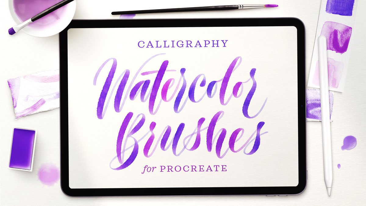
Choose a watercolor calligraphy brush.
With my sketches and my refinements complete, I come over to my own Watercolor Calligraphy Script Brush Pack, and I’m selecting an ombré color brush that will work really nicely with this composition: Watercolor Script 04 Ombré. (My Watercolor Pack includes twenty watercolor script brushes, so have a peek if watercolor lettering interests you.)
I always start out by testing my brush to see if the stroke size is right for my letter size.
Slowly trace your sketch in watercolor calligraphy.
My mantra of “new line, new layer” still applies—perhaps more so when you’re making your final composition. In fact, as I go in this composition, I’m selecting every line when I’m done with it and centering it on the canvas. Later, I’ll be making more refinements to the distance between the lines. But for now, I’m just focused on centering them on the page.
Oops—typo!
If you’re familiar with this poem, you might notice that I made a major typo on this line by writing the word “we” instead of the word “catastrophe.” I’ve left it in the video so that you can see how I fix my mistakes—because making typos is a common error for lettering artists, and nothing to be ashamed of. After I noticed this, when I was nearly done with my composition, I went back and fixed it—I’ll show you that part in a moment.
Adjust the spacing of the words and lines.
When all my lines are complete, I group them, then go line by line, adjusting the distance between the lines. I select the next line as I go so that I can move multiple lines at the same time and slightly reduce the spacing between them.
Importantly, I make these adjustments optically—not mathematically—because I always trust my eye when it comes to centering and spacing more than I do exact measurements. Because of flourishes and ascenders, and descenders, very often optical spacing looks more natural than mathematically-calculated spacing.
Blend watercolor stroke overlaps.
With my line spacing complete, I want to make some further refinements. I select my smudge tool (the little finger icon next to the paint brush). From my brush palette, I choose my Smudge Brush for Blending Stroke Overlaps (also part of my Watercolor Calligraphy Pack). Smudging allows me to add even more realism to my watercolor so that the colors blend together the way that watery, wet paint really would.
If you’re interested in an in-depth video demonstration of how I do any kind of watercolor script in Procreate, especially the ombré colors, check out this video.
My Watercolor Script Procreate Brush Pack has twenty pressure-sensitive calligraphy brushes including ombré effects and smudge tools.
Go back and fix your mistakes.
Now it’s time to fix that typo. I select the layer with the mistake and select the word “we.” Swiping down with three fingers, I’m able to Cut my selection, which quickly and easily deletes the word. Then I select the next word and move it over considerably to give myself a lot of space, because I don’t exactly know how long my new word is going to be.
Remember that I slightly changed the size and spacing of our lines already, so the calligraphy no longer perfectly adheres to my original guideline. So I duplicate my guide layer, slightly resize it, and move it around.
Next, I choose my pencil brush. On a new blank layer, I sketch in the word “catastrophe” and adjust the spacing. On yet another new blank layer, I return to my watercolor brush and write in the new word. Voilà!
Show me your work!
Thank you for following along with this watercolor poetry layout. I hope you enjoyed it. If you create one yourself and post it on Instagram, please tag me so I can see what you create. I always love to see what you’re up to.
In the resources section below, you will find links to more helpful videos to keep you going on your calligraphy and Procreate journey, as well as links to all of the brushes used in today’s video.
Click to enlarge.
Additional Resources
Procreate brushes used in the video:
Backhand 104° – 5:4:5 Stamp Brush from my Calligraphy Composition Maker
Watercolor Script 04 Ombré and Smudge Brush for Blending Stroke Overlaps from my Watercolor Script Procreate Brush Pack
Related videos:


Flourishing looks effortless when it’s done well—and obvious when it’s not. Learn how I sketch and polish a highly-flourished manuscript.