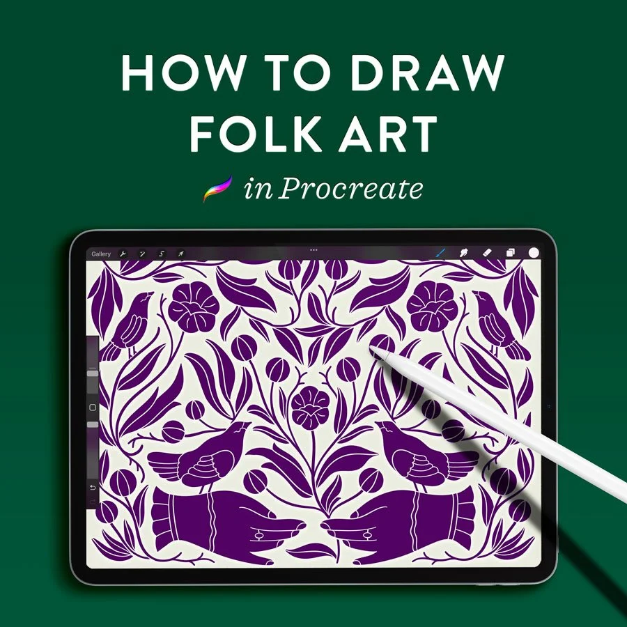
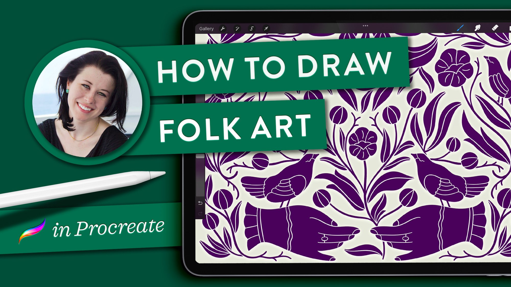
How to Draw Folk Art in Procreate
Folk art is a celebration of the natural world, distilled into iconography and rhythmic patterns. In this tutorial—available in both video and written formats—we’ll be creating our own, using simplified forms in a symmetrical arrangement. By working with a single-color palette, you’ll find it allows for a deeper focus on negative space, line weight, and silhouette. I’ll teach you how to use Procreate’s symmetry guides to draw intricate, mirrored arrangements that evoke the folk tradition.
Video Tutorial
Written Tutorial
Canvas setup:
I am using a 5x7-inch canvas at 300 DPI. The pencil and monoline brushes I use are part of my Ultimate Lettering & Calligraphy Procreate Kit.
Click on the images from each step below to enlarge it.
1. Sketch some simple motifs.
Start with 6 to 8 very simple line art sketches. These can be original drawings or motifs that you repurpose from a previous piece of art you made. This small collection of designs will be rearranged and expanded to create the entire, full-page design.
Here are the pencil sketches I created to start with: seven really simple pieces of line art. I have a hand, two birds (medium and small), a simple flower with some odd-shaped leaves, two abstract leaf shapes, a circular flower bud, and fan-shaped flower blossom. As you can see, these are pretty amateur drawings! We’re not talking about much detail at all.
2. Merge artwork layers.
Start by making sure that all the sketches are on the same layer together. To quickly merge multiple layers, one method is to group them and then flatten the group. Do this by swiping right to select all the layers you want to merge and tap Group. Then tap the group once and select Flatten. Now you will have a single layer containing all of your line art.
3. Set up symmetry guides.
Now turn on the symmetry guides so that you can actually see the center axis that divides the canvas.
Go to Canvas > Drawing guide. Turn it on and you’ll see a square grid to start with. Then tap Edit drawing guide. Go to Symmetry options > Vertical. Do not turn on Rotational Symmetry, but do make sure you have Assisted Drawing on.
4. Arrange sketches on one side of canvas.
Now arrange your sketches along one side of the canvas. The reason you only need to work with one side is because, when drawing the final illustration, it’s going to be duplicated over to the other side of the axis.
Use the selection tool to select and move each sketch, then drag and drop them along the border, relatively close to the edge. Your small sketch collection will not fill up the entire right or left side of the page, but that is fine because we will fill in the gaps in the next step.
To use the same sketch multiple times, select it and choose Copy and paste from the bottom toolbar. Then you’ll get a duplicate of your selection on a new, separate layer. To keep everything on one easily-selectable layer, drag the duplicate off the top of the original and then flatten your layers again. (Just tap the new layer and hit Merge down.)
It is okay to cross the center axis at the top and bottom – like my flower does here. These items will not end up being symmetrical, but we’ll get to that!
5. Add placeholder text.
If you plan to make this design into a greeting card or a book cover or anything else, you will want to save space for the title. Add a bit of placeholder text now, slightly above center.
Go to the wrench icon and select Add text, then type in your text of choice. (I’ve typed the text “Thank You” since I believe this would make a beautiful thank you card.) Open your text styling palette by tapping the icon in the top right of the keyboard. You can easily change the text, font, and other style settings later. For now, I picked Didot. I made it all caps, pretty small size, and increased the kerning a lot.
By placing this in the center of your canvas, you can now work around it knowing that will now have a space for any title you want to use down the road. (Other ideas you could use would be “Happy Birthday” or simply the word “Notebook”.)
6. Fill in the gaps of the sketch.
To complete the sketch, draw in modified versions of your original motifs until there are nearly no blank areas left. You do not need to create new motifs – just stick with the original collection.
I primarily added more circular flower buds to the larger spaces, then used stems and leaves to fill in the gaps, curving the stems around the other elements of the art. There was still a bit of space left in the center when I was done, and I chose to wait until the silhouette step – coming up next – to finish that region.
My artwork looks like this after Step 6. The pencil sketches nearly completely fill the right size of my canvas, and a few motifs overlap the vertical axis.
7. Select a brush for drawing shapes.
Create a new blank layer above your pencil sketch layer, and reduce the sketch layer’s opacity considerably. Then select a fun color for your artwork. You can certainly change the color later, so just pick something relatively dark for now. I chose purple.
To create silhouettes of each shape, you will want a very smooth line with just the slightest amount of pressure-sensitive taper at the ends. I select my Almost Monoline brush (from my Ultimate Lettering & Calligraphy Procreate Kit).
Tap the new blank layer once and turn on Drawing Assist. Because you set up those symmetrical drawing guides before, when you draw over the pencil side of your canvas, the drawing will be repeated and reflected on the other side!
8. Create silhouettes of every shape.
If your artwork includes lines that are not part of fill-in shapes (such as flower stems), then adjust the size of your brush to whatever size you want those lines to be. In my case, I wanted pretty thin stems, so my brush was pretty thin.
Go around your artwork and trace over the edges of each and every shape. Fill in the shapes as you go using the drag-and-drop fill method. Simply drag the color from your swatch icon in the top right over your empty shape, release, and the shape will fill with color.
You do not need to refine the interior spaces of these shapes yet, such as the petals of the flowers or wings of birds. We will create those parts later using a masking technique. You might be thinking this looks really strange so far, because there's no distinction between overlapping shapes! This will all get fixed in the next phase.
9. Snap and edit basic shapes.
If you want to make a perfect circle, rectangle, or triangle, then when you finish drawing a rough outline, don’t lift the pen. It will snap to the closest basic shape, which you can then edit. Here, I drew an oval and snapped it into a perfect ellipse. You can hit Edit shape up at the top and change your snapped shape into a related shape. For example, turn an ellipse into a perfect circle, or a rectangle into a square. To edit the shape further, use the blue nodes that appear around it.
This is how my artwork looks so far, with most of the symmetrical silhouettes completed.
I recommend zooming in and out as you work to double check that your Drawing Assist reflection is working!
10. Color in the asymmetrical motifs.
In Step 4, I mentioned that any asymmetrical sketches placed on the vertical axis would be handled differently.
I could not, for example, draw this bird when assisted drawing is turned on. Since the left and right sides are not symmetrical, I have to draw it with Drawing Assist turned off. because this bird is not symmetrical. On your silhouette layer, tap once and deselect Drawing Assist. And now you have turned that off, you can continue creating the silhouettes of the non-symmetrical items. Those are really just the ones that fall over the vertical axis.
11. Fill in the last remaining gaps.
Your asymmetrical shapes likely produce small gaps on either the left or right side, but not both. If you did not fill those in during the pencil sketch phase, now is the time. When in doubt, add a leaf or a curved stem!
Continue to turn Drawing Assist on and off as needed, to draw symmetrical and asymmetrical shapes, until your entire canvas is full.
12. Set up a layer mask.
The illustration is pretty full at this point, which is nice, but it doesn’t look very good because it’s missing all the elegant details.
Duplicate your silhouette layer and turn off the lower of the two. (You don’t really need to do this, but I always copy my art layers before adjusting them, just in case I will need to go back to them later.)
Tap the new silhouette layer once and select Mask. (Be sure to choose the regular mask and not clipping mask. Those are two entirely different things!) Anything you draw on this mask using pure black is going to look like it’s being erased from the artwork. In reality, it’s just being hidden (“masked out”), but the effect is the same as erasing.
To set your swatch to pure black, double-tap in the general black region of the color wheel and your swatch is going to snap itself right down to pure black.
13. Mask in the details.
Turn on the visibility of your pencil sketch layer. Decrease the opacity of the silhouette layer until you can just see the pencil lines through it. Select the same brush you did for the silhouettes (in my case, Almost Monoline).
On your silhouette layer, turn on Drawing Assist if you plan to start adding your details to the symmetrical regions. Then tap on the Mask layer to select it, and being to draw along your pencil lines. It should look like you are erasing your silhouette. You may want to reduce the brush size slightly to create finer lines for your details.
Draw mask lines in between every overlapping shape, and along every shape detail. If you turn off the pencil layer, you should see that your silhouettes are being cut into nice crisp shapes, and the detail lines are your background color.
Continue around your canvas and do this with every single element. When you get to the asymmetrical parts, just remember to turn off Drawing Assist!
14. Fix mistakes on a mask.
Now let’s say that you mess up and it’s too late to hit undo. Since this is a mask and you were not actually erasing, all you have to do is unmask your mistake by drawing over it in the mask with white instead of black. On the color wheel, double tap the white region to get pure white, and then just unmask that region.
15. Add finishing touches.
Now it’s time for finishing touches. I like to turn off my pencil layer and turn up the color opacity to 100%. This way, I can look at the nearly-finished artwork and evaluate any spaces that are a bit empty or wonky.
Zoom around the canvas to see if you missed any masking – anything that's left as a silhouette rather than a cut-up shape. Make sure to unmask any mistakes, or smooth out shaky edges. Add last-minute items, like small, asymmetrical shapes to fill in the gap that can remain along the vertical axis.
16. Finalize the title text.
Now, of course, you can edit your text, if you want. Tap on the text layer and hit Edit text. I did not think that my original font was quite bold enough, so I changed it to Baskerville Bold.
You may also consider making your text a brighter or contrasting color. I made my “Thank You” text gold so that it really stands out from the illustration.
And there you have it – a completed greeting card or notebook cover design! I hope that you can apply this technique to many other designs in the future!
The Finished Artwork
Resources
Brushes used:
“Molly’s Favorite Sketching Pencil” and “Almost Monoline” from my Ultimate Lettering and Calligraphy Procreate Kit.
iPad Tools Used:
More Procreate Illustration Tutorials:

If you found this post useful, consider sharing it. That’s the best, free way to support artists and authors you appreciate.
You could also buy me a coffee, if you wish.