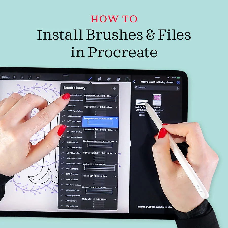
Calligraphy Flourishing Process in Procreate
I earn small commissions for purchases made through links in this post. Proceeds help me to continue producing free content.
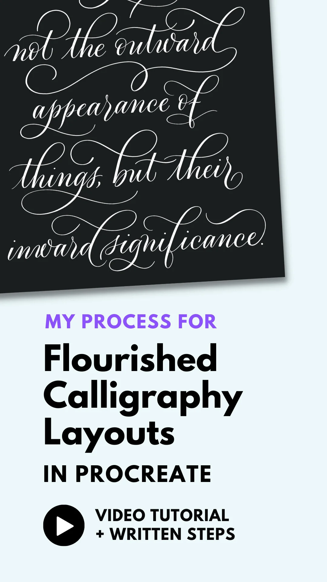
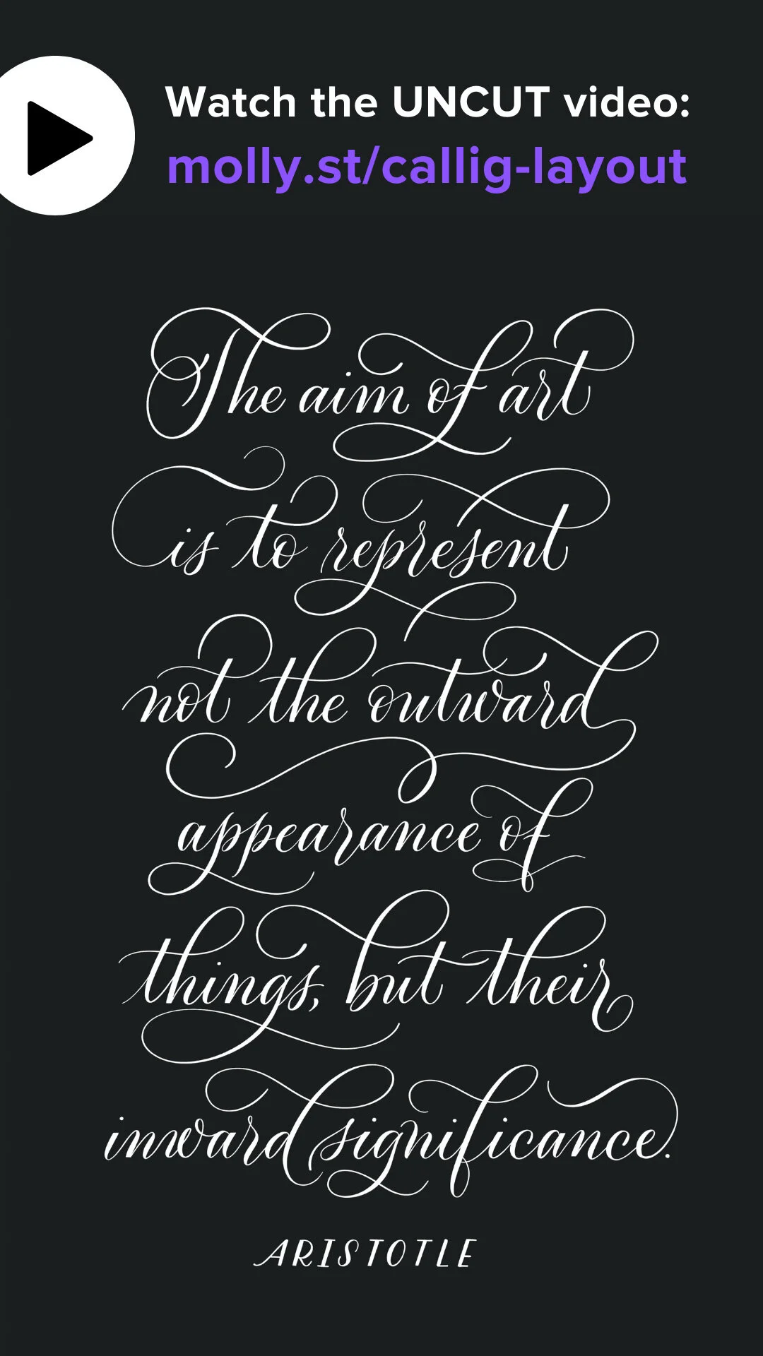
Today’s video is something of an experiment. I’ve gotten a lot of feedback from you, that you find it soothing just to watch me doing calligraphy. So today I’m posting an uncut video of a start-to-finish flourished layout design, all in real-time.
I’m such a perfectionist that I have always hesitated to show long stretches of footage where, for example, I am experimenting with the letters shape. But it seems like some of you might find it interesting, if not useful as well.
If there is one thing I hope you take away from this video, it is to see how slowly I write, and how much refining I do. I have addressed this in some previous videos, but one of the most common struggles I see with calligraphers, both analog and digital, is that they are inclined to write much too fast, and can get frustrated when a letter doesn’t look right after the first, second, or even third attempt. Take solace in the fact that we professional calligraphers, with years of practice and experience, work extremely slowly, often erasing our work many times before we are satisfied. Calligraphy should be a meditative process, not simply to watch, but also to do.
Steps
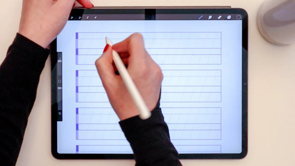
Set up calligraphy guide lines
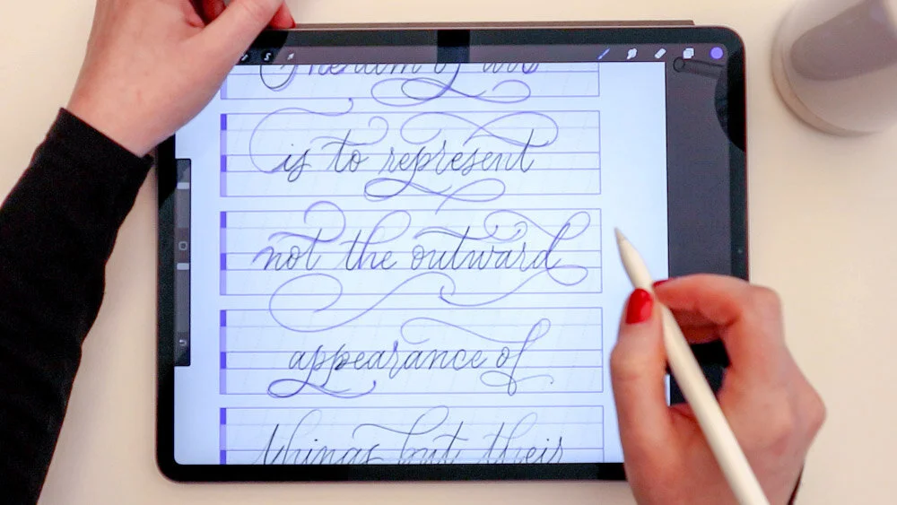
I’m using the Modern 72° 2:3:2:3 brush stamp from my own Calligraphy Composition Maker for Procreate. I knew that my quote had six lines, so I set up all six line guide bars in advance.
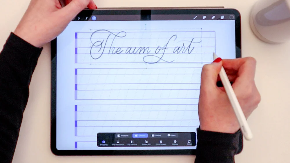
Sketch the calligraphy layout in pencil
I always sketch my calligraphy in pencil before going over it in calligraphy – especially when I’m making a multi-line layout. This allows me to work out the height of the letters, number of words per line, and total number of lines. As I write each line, I use a new Procreate layer so that I can easily center the lines on my canvas as I go.
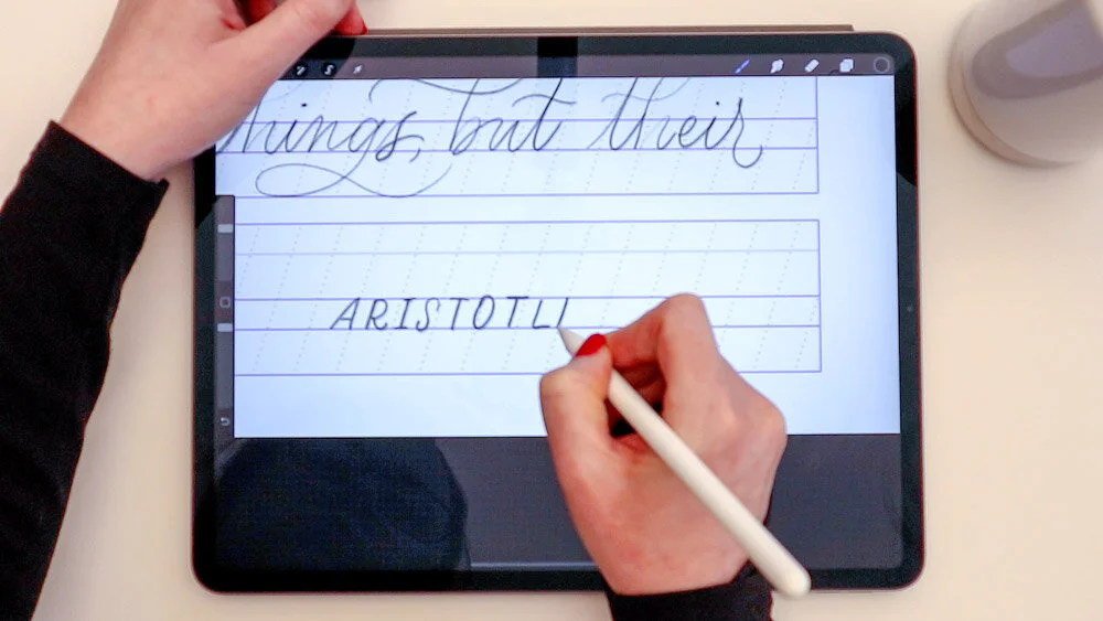
Incorporate a contrasting lettering style
As this is a quote, I chose to write the byline in an all-caps lettering style. For some cohesion, I still adhered to the x-height and slant lines from my guides.

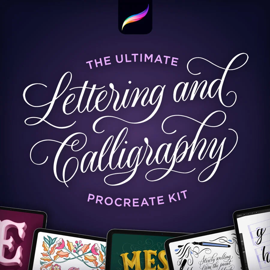
Calligraphy Composition Maker
Countless calligraphy styles and layouts. Stamps, patterns, and practice sheets.
Refine and flourish!
Make a new blank layer over your pencil sketch. With the same pencil brush, but in a contrasting color (I’m using purple), loosely refine the shapes, curves, and loops of your calligraphy. For a very flourished composition, try to fill in all negative space between the lines of text, and add flourishes to letters wherever you can. Ascenders, descenders, and the ends of lines are natural places to add flourishes.
Sometimes you won’t have an immediately obvious place to add a flourish. In that case, consider adding a “free floating” one, such as the large curl I placed under “not the out” in the picture to the left.
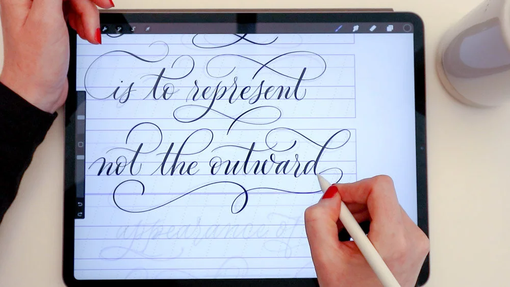
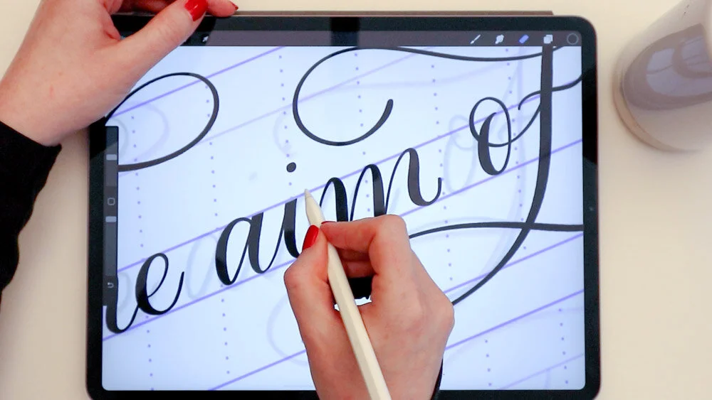
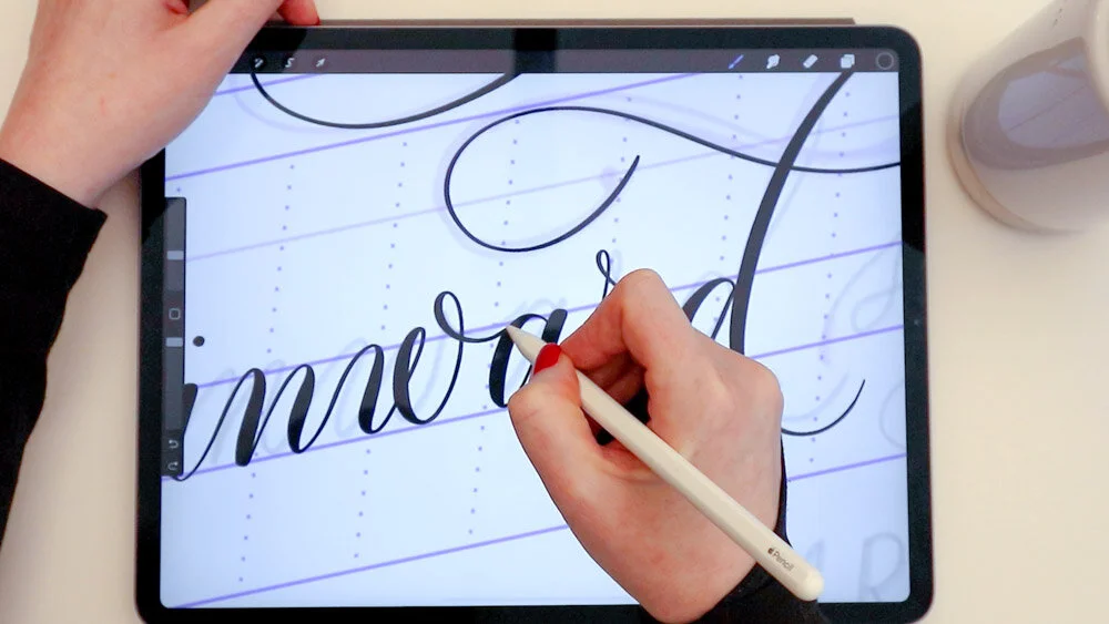
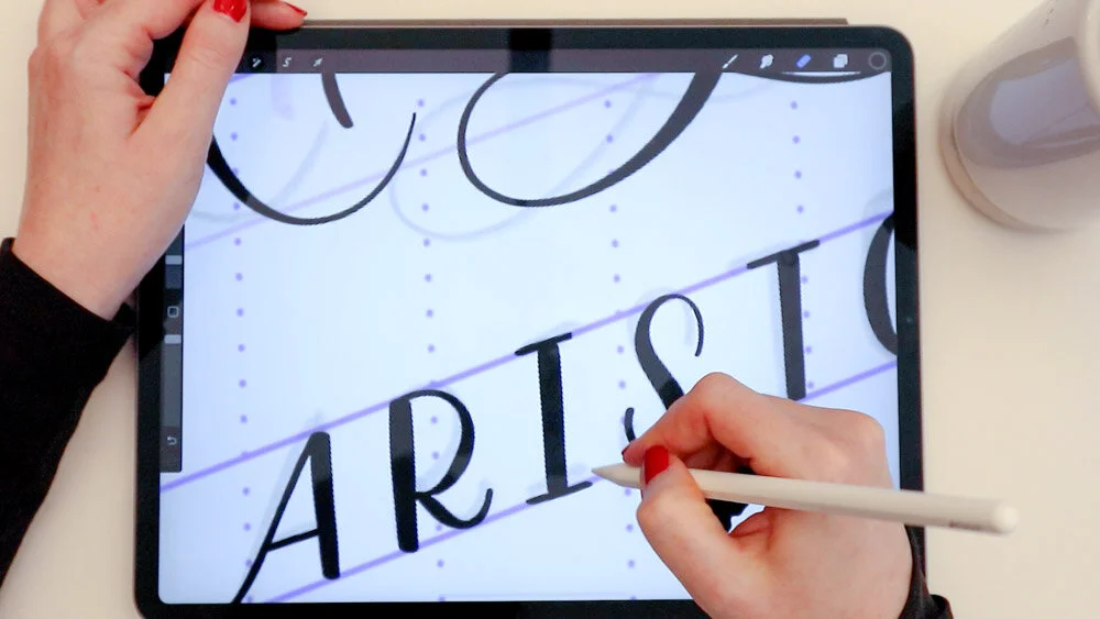
Trace your sketch using a pointed calligraphy pen brush
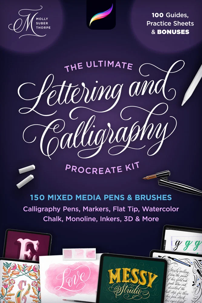
I’m using my all-time favorite Procreate brush, the “Fine Point Calligraphy Pen – Smooth” It is part of my Ultimate Lettering and Calligraphy Procreate Pack.
You can see in the video that I am writing very slowly! I write at exactly this speed in all my calligraphy. There is no benefit in writing fast! Moving very slowly helps me really adhere to the curves, creating smooth, uniform calligraphy strokes.
As with the pencil sketch, I’m using a new layer for each and every line of text, so that I can easily adjust the spacing at the end.
Flatten the thick stems of the calligraphy letters
This is an optional step, and whether you do it comes down to personal preference. For more formal compositions, I like to go back with a smooth eraser brush and flatten the tops and bottoms of thick letter stems. This lends the calligraphy a more refined, uniform appearance.
Fix awkward spacing and wonky letters
When I’m done with all the calligraphy, I always zoom out and examine the composition as a whole. I look for awkward spacing, strokes that are too close together, and letters that don’t match the style of the rest. When I find such a letter, I simply erase it and redraw it until it works!
⭐ ⭐ ⭐ ⭐ ⭐
“Absolutely perfect. I’ve been looking for smooth, natural-feeling calligraphy brushes, and these are it.
— Angela Southern, lettering artist
Draw your byline to match
In this layout, I used the same calligraphy brush (Pointed Calligraphy Pen) for the all-caps byline. I like to do this because it further incorporates the contrasted style with the entire composition, since the stroke widths match.

Recolor your calligraphy layout
I love the look of crisp white calligraphy on a black background. To recolor my lettering, I started by grouping all the calligraphy layers. Then I made a copy of the group and flatten it, so all the art was on a single layer. Adding a blank layer on top, I tapped it once and selected “Clipping Mask.” Then I picked pure white from my color palette, tapped the blank layer again, and clicked “Fill Layer.” Voilà! You’ve got white calligraphy!
Click to enlarge
Resources
Brushes:
Calligraphy guidelines:
Modern 72° 2:3:2:3
from Calligraphy Composition Maker for Procreate
Classic Pointed Pen
from The Ultimate Lettering and Calligraphy Procreate Kit
iPad Tools Used:
Procreate App
12.9" iPad Pro
Apple Pencil
Touch screen glove
More Procreate Tutorials:
Procreate for Absolute Beginners – 2-hour Skillshare class!
10 Procreate Pro Tips for Artists
How to Get Perfect Strokes in Procreate
How to Illustrate Lettering in Procreate
iPad Calligraphy: Recommended Tools