Video Tutorial: Calligraphy Composition Maker for Procreate
I earn small commissions for purchases made through links in this post. Proceeds help me to continue producing free content.
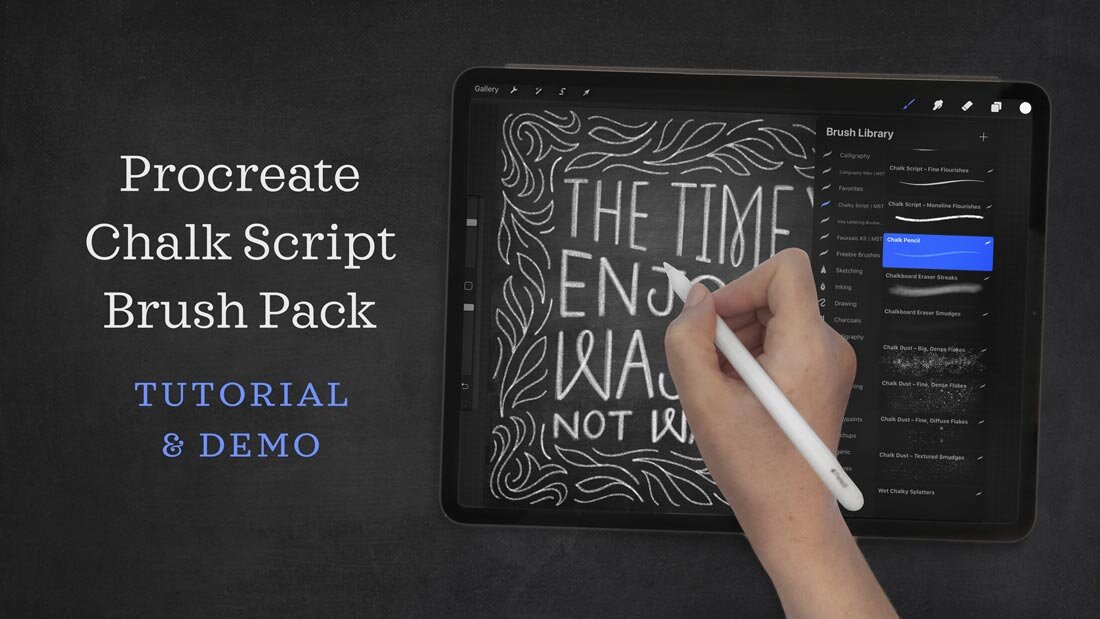
My Calligraphy Composition Maker is a powerful kit containing 65 Procreate brushes so that you can make calligraphic compositions of your own and practice calligraphy on the iPad.
The calligraphy brushes used for the lettering in the video are all part of my Calligraphy Nibs Brush Pack.
Watch the video to learn all about it, or read the transcript below!
In this video, I give you a preview of everything that's inside this kit and how to use the different types of brushes, whether they're the stamps, the layout templates, or the pattern brushes. As an added bonus, I've included a layered Procreate file that contains three different calligraphic alphabets, and you can practice your flourishes with a filled-in flourish practice sheet.
If you already own this kit, I hope this video helps you make the most out of it, and if you're just thinking of buying it, I hope it helps you make the most informed decision possible.
I am a calligrapher who's been doing calligraphy and teaching calligraphy for over 10 years, so one thing that I really craved, and that I felt was missing from the market, was an iPad set that made it easy for calligraphers to learn different styles and learn some of the really technical aspects of ink-on-paper calligraphy. I didn't see that translated into the iPad yet.
Written Instructions
Getting to know your brushes
Degrees & Slants
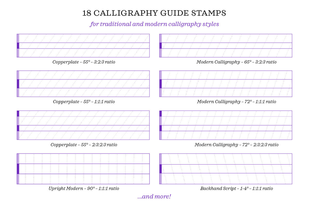
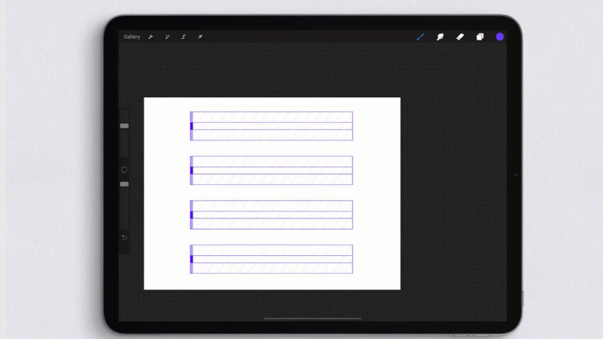
The first thing you're going to notice when you open up this brush palette is that each of the brushes has a really descriptive specific title, so I'm actually going to start by breaking down the information in each brush title. So let's come here to the very top one: Copperplate 55°.
Well, Copperplate is a very traditional calligraphic style, and so this letter guide (which, by the way, is the first one that you see here on your screen as a sample) is a traditional ratio and slant for Copperplate calligraphy. So the 55 degrees here literally refers to the 55-degree slants that run through the guide.
This Modern 72° brush has a 72-degree angle slant, and you can see down here on this one that we have a completely upright 90-degree slant. So these three examples on your screen represent three very different slant lines.

Ratios
The next thing you'll notice in the titles is the ratio. So this top one is a 3:2:3 ratio. This one here is 2:3:2:3, and this one here is 1:1:1. So let me explain to you what that means.
Let's start with the easiest to understand. That's the 1:1:1 ratio. These ratios refer—from top to bottom—to the ratio of the heights of these bars. So this is called the ascender height, this is called the x-height, and this is called the descender height. So 1:1:1 means that the height of the ascender and the x-height and the descender are all equal to each other.
Now let's move up here to this top one, the Copperplate, that was a 3:2:2 ratio. You can think of this in two different ways: that either means that the x-height is two-thirds that of the ascender height, or you can think of it as the ascender and descender—which are the same height—are one-and-a-half times the size of the x-height.

All you have to know when it comes to this is that when you see a ratio where the x-height height is shorter than the ascender and the descender, your lettering is going to be a little bit more elegant, a little bit more formal, a little bit more traditional looking. You can see immediately that this region, being a smaller ratio compared to this height and this height, yields a much fancier, more formal style.
And now, lastly, we have the style that has four bars, but again we just move from top to bottom. But what is this top bar? Here we still have ascender, x-height, and descender, but this top bar is called a cap height—“cap” as in “capital letter”.

So any letter guide that you see like this is giving you directions for how to create lettering that has a different height for the uppercase letters than for the ascender letters. So here we have our uppercase letter coming up to the cap height; we have an ascender letter—this “t”—coming to the ascender line; letters “a” and “y” that come up to the x-height; and we have a “y,” which is a descender letter, coming down to the descender line.
Here I have written the word “Calligraphy” three times using basically the same letterforms, but the words look completely different, and the only reason is because the ratios are different and the slants are different. When I turn off the grid you can see it even more. All that I did was use three different guides and I yielded three completely different looks and styles.
Stamps, guides, and brushes
Guide Sheet Stamps
One other thing I want to point out is that for every calligraphy guide bar brush that I've given you, I've given you a brush right beneath it that has four in a single stamp so that basically if you want to create a practice sheet for yourself, you can just stamp once and you have a whole practice sheet right here!
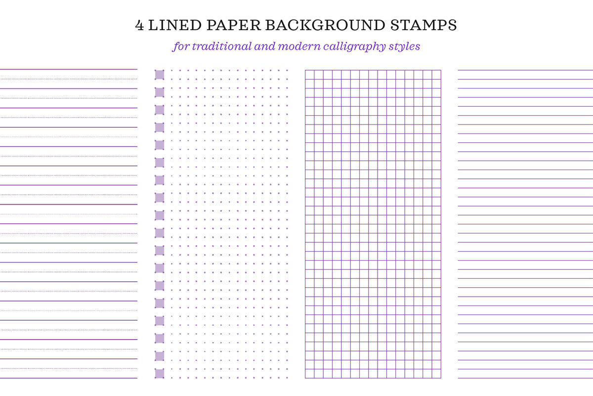
Lined Paper Stamps
The next type of stamp I have given you are these types of paper line stamps. So we have Schoolhouse Cursive, Notebook Paper—which is just baselines, basically—Graph Paper, and Dot Grid. (I called this type of guide Schoolhouse Cursive because when I was in elementary school and we were learning cursive, we all got notebooks that were lined just like this!)

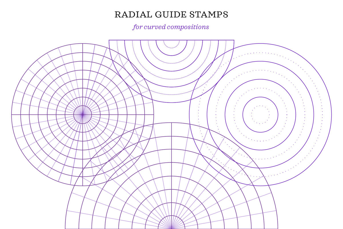
Radial Guides & Flourish Frame Drills
After the different types of lined papers, I've given you all sorts of radial guides, and these are great for making round calligraphy, or even mandalas.
And after that, there's a set of four different flourish frame drills. So let's do a demonstration using the elliptical ones. This is a great way to train your hand with some muscle memory to create flourishes in your letters or just decorative illustrative flourishes, whether it's on the iPad or ink-on-paper.
So I have my calligraphy brush and what I'm going to do is create flourishes that fill these frames and make sure that the extreme points of my flourishes touch the edge of each shape. And I can have a lot of fun and make all sorts of different flourishes, really challenge myself to make different shapes.

Dotted Line Maker
Next, after the flourish frames, I have my Dotted Line Maker, and this is a really cool brush that you're going to be able to use to customize or make your own guide sheet. So this is a brush that draws in dotted lines, and the dotted lines adhere to the size of your brush. But what's especially cool is that because of Procreate's snapping feature—where if you draw a line and then you don't lift your stylus—you can move the endpoint of your line, either condensing and shortening the line, lengthening it, or giving it a slant of your choice. And if I do that on a blank layer, then what I'll be able to do is create, let's say a slant line that I prefer, and then I can just duplicate it for myself. And here you can just have a lot of fun, like I say, making your own grid lines.

Shapes
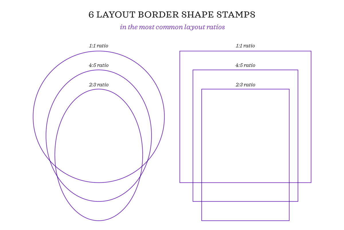
Next, you have here a bunch of shape stamps: a circle and two ovals, and a square and two rectangles. These fit into the ratios of 1:1 (that's a circle), or 4:5 (which is the same as 8x10), and 2:3 (which is the same as 4x6): the three most common composition ratios. So I’ve given them to you pre-made because it can be hard in Procreate to get perfect shapes like that.

Now the next set is probably my favorite, and these are the layout templates. I have them here with different ratios again to fit in a square or to fit in 8x10 composition, and you can see that I've provided them with slanted lines so that you can create real calligraphy in these shapes.
So I didn't get very creative in this, I just wrote the numbers one through ten, but I wanted to show you that you can use slanted calligraphy, you can use entirely lowercase calligraphy, you can make a different lettering style combined with your calligraphy, you can do upper- or lowercase—anything that you'd like under the sun. This is just a great jumping-off point for your composition layout.
Ribbon Brushes
After all of these fun layouts, I have all of these ribbon brushes for you. One way that I actually like to use them is to trace on a new layer the actual outline of the ribbon banner so that the outline itself can become part of my final design and then write inside of it my own calligraphy.

Pattern Brushes
Next up are pattern brushes, and while all the brushes in this kit are fun for me, there's something almost magical about painting with patterns in Procreate.
Here I have my first pattern brush and I have it set to the largest possible size that a brush can be because, when you're painting with patterns, you don't want to lift your pen as you go. If I lifted now and I kept going, like here, you can see that basically the pattern starts again and you get an overlapping pattern. So if you're trying to paint an entire canvas with the same pattern, just put your pen down in one place and don't lift until you've covered the whole page.

Now I can hit my selection tool, and I can still enlarge this to have larger baselines. Or, if I tap and hold the blue dot in the center top of my design, I turn on what's called shearing, and I can move this to the left to decrease my slant, move it to the right to increase it, I can move it up, move it down to condense the grid. Basically I want you to understand that, even when you paint with a pattern, it doesn't have to result in a grid right out of the box—you can still customize it even further.
Let's paint one more so that you can get another idea. This is my Wave Baseline Brush, and one cool thing you could do with this is create really long, wavy, loose, simple calligraphy. And now, if I turn off the wavy baseline, you see that I have this really cool, funky sort of ribbon-like look. And if you keep going and make multiple lines of waves, you can get these really intricate, beautiful patterns that I can imagine being absolutely gorgeous for a layout, like a wedding invitation, or a manuscript.
Before you go...
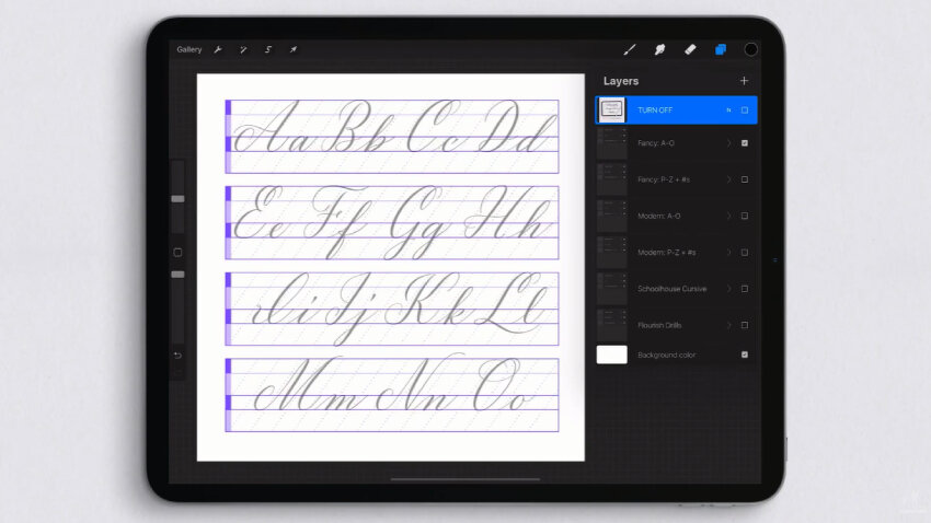
For those of you looking to use this kit to learn new calligraphic styles, I've also provided you a layered Procreate file of practice sheets which include three different calligraphic alphabets. Each folder contains my own calligraphic alphabets, plus a layer for the guidelines used, and then a blank “Draw Here” layer for you to do your own calligraphy.
I've provided a fancy style, a more modern casual style, my “Schoolhouse Cursive” uppercase, and one filled-in sheet of flourish drills so that you can have some direction as you get started.
The very last thing I want to bring to your attention is that, along with your download, you're going to receive this layered Procreate file of exemplars of every single brush in the kit, all 65 of them, so you'll be able to go through and get a preview quickly of what every single brush looks like.
Thank you so much for following along. I hope this kit provides you endless hours of fun, and if you create any calligraphy compositions that you share on social media, please tag me (@mollysuberthorpe) because I always love to see what people create from my brushes, my tutorials, and my books.
What will you create?
HAVE FUN AND TAG ME ON INSTAGRAM IN YOUR CREATIONS: @MOLLYSUBERTHORPE
65 Procreate Brushes:
18 Letter Guide Stamps
11 Seamless Guideline Pattern Brushes
4 Lined Paper Guide Stamps
4 Flourish Drill Frame Sets
6 Shape Frames
17 Pre-made Layout Stamps & Banners
4 Radial Grids
1 Dotted Line Maker Brush
2 Layered Procreate Files:
Calligraphy and flourishing practice sheets: trace the letters and flourishes to learn new styles, or use them for inspiration in your work.
Previews of all 65 brushes, so you can quickly browse the collection and quickly find the one you need
Included Files:
1 .brushset file containing 65 brushes for Procreate (version 5 or later)
1 layered Procreate file of calligraphy and flourish practice sheets
1 layered Procreate file showing samples of all 65 brushes
1 PDF guide to installing the brushes and layered files
Free access to my 12-minute YouTube tutorial
Software Requirements:
Make sure you are using Procreate version 5 or later, which is required for these brushes' functionality. These brushes are not compatible with Photoshop, Illustrator, Affinity Designer, or any other program.
Installation:
Review "Installation Instructions.pdf" included in your download for complete steps.