The Elements of Modern Calligraphy Style
Calligraphy becomes an art of habit, just as everyday handwriting does. No matter how hard we try, it is difficult to change the lettering style we’ve become most comfortable writing. However, with targeted adjustments aimed at pushing you out of your calligraphy comfort zone, you can develop a unique, modern calligraphy style that represents you.
Unlike practicing a historical calligraphy style that has preset letter shapes, proportions, slants, and stroke weights, modern calligraphy is all about deciding what you like best. The most effective way to do this is by questioning every stroke you make—but this requires an understanding of the architectural components of letterforms and the overarching design principles that combine to give a calligraphy style its particular look and feel. This article I lay out those key design principles for modern calligraphy, from the choice to adhere to or ignore your baseline to variations in axis slant that can change everything.
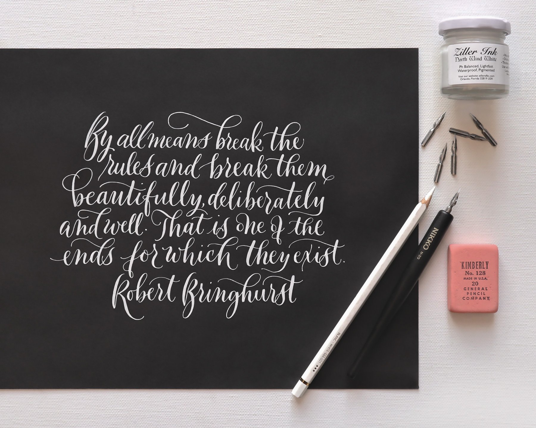
In his landmark 1992 book The Elements of Typographic Style, typographer and poet Robert Bringhurst expressed that, while fundamental principles hold our alphabet together, testing the push and pull of those principles in pursuit of new forms and styles is the task of a good typographer:
“A typographer determined to forge new routes must move, like other solitary travelers, through uninhabited country and against the grain of the land, crossing common thoroughfares in the silence before dawn. ... By all means break the rules and break them beautifully, deliberately and well. That is one of the ends for which they exist.”
I carry these beautiful words with me in my own practice and urge you to do the same. Cross the “common thoroughfares” of calligraphic tradition into your own “uninhabited country.” There you may find an artistic style that is truly yours.
How to Break Calligraphic Rules
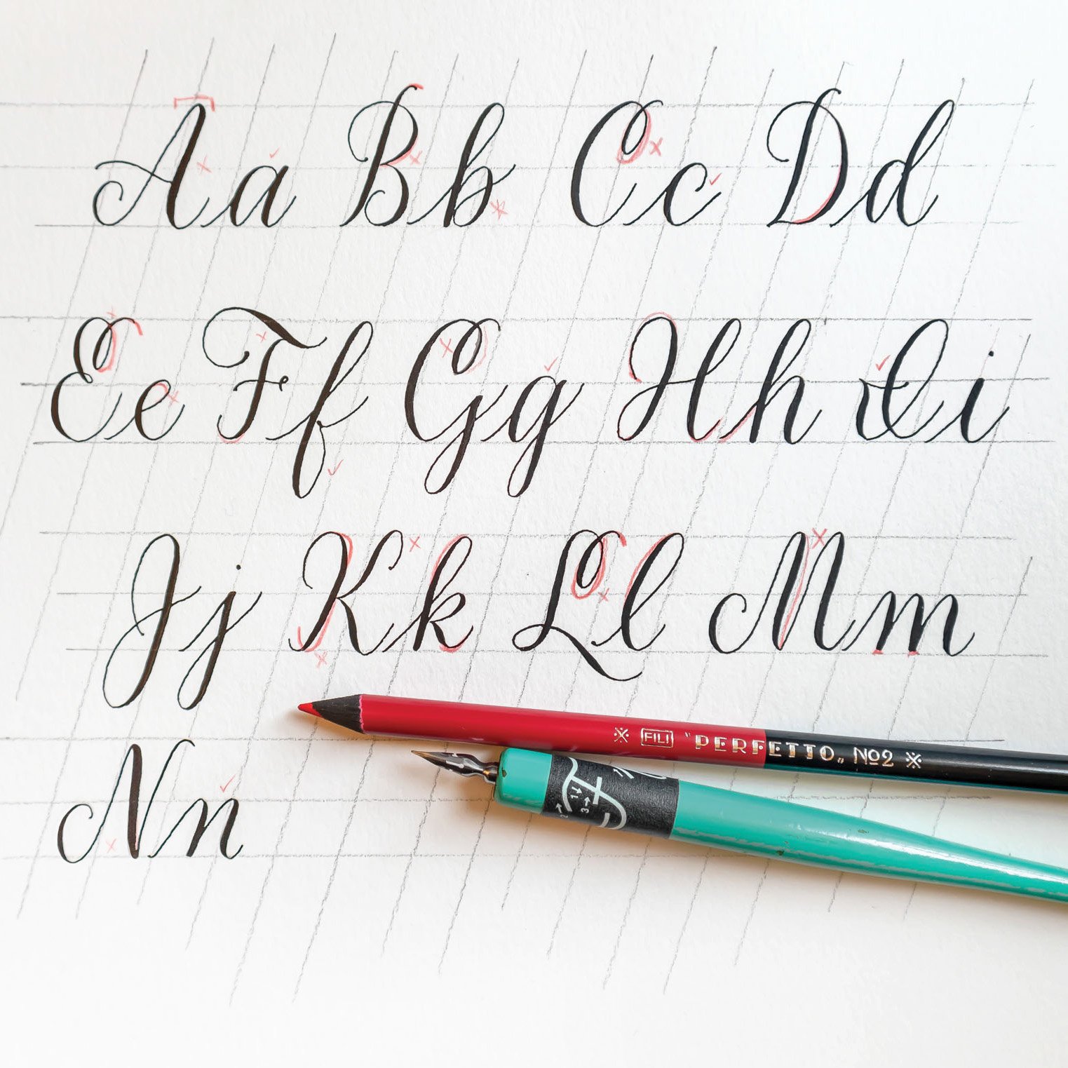
The first step in developing your modern calligraphy into a distinctive style you love is analyzing the way you already write.
Find a sample of your recent calligraphy and break it down letter by letter. Describe the shape of each letter to yourself, and compare the letters to one another. For example, you might find that the overturns of your m tend to be different heights, and the width of spacing between your m’s strokes varies dramatically. Maybe the cross stroke of your t looks different every time, or maybe it always looks the same. You may notice that some of your lowercase letters are consistently smaller than the rest, or that your uppercase letters feel too big in proportion to their lowercase counterparts.
Next, step back and define your existing, overall style on both technical and stylistic levels (even if you’re still a beginner). Maybe it’s narrow, heavily slanted, or closely based on a traditional style. Maybe the downstrokes are uneven thicknesses, the baseline is bouncy, or the letters don’t seem to complement one another. Perhaps it just looks uninspired and you’re looking to infuse it with character. Still, pinpoint what it’s lacking by asking yourself questions about the style. Do I write on a consistent baseline or do my words feel like they dance across the page? Does my calligraphy have a formal air? If so, why do I feel that? Does it look playful? Again, why?
Do this exercise until you have evaluated your current calligraphy style as much as you possibly can. You’ll probably come to understand that the formation of your letters is dictated by unconscious habit just as much as by conscious choice.
I recommend doing this exercise again with the work of calligraphers you admire. Don’t settle for merely loving the work of others when you can figure out why you love it. This will train your critical calligrapher’s eye to notice nuance and inform your future creative decisions. Do all this and you will be ready to practice with greater purpose than before, consciously implementing changes that contrast the technical and stylistic habits you’ve become comfortable with over time.
If you want to break with tradition (a term I far prefer over “break the rules”) then do so with intention. Presented below are the key components I’ve identified as the most important in modern calligraphy styles. Choose just a couple at a time to experiment with as you search for your own unique style.
But before diving into the exciting world of tailor-made letterforms, I suggest two guiding principles:
When bending the rules, bend them a lot. Shove yourself out of the nest. You can always circle back to where you started, but you might be surprised by just how much you like something completely new and different. When you make these big changes and find a new style you love, then you can go back and finesse the curves and proportions.
Don’t be afraid to make ugly calligraphy. When you take the time to reconsider each and every element of a letterform, it’s inevitable that some of the results will be unappealing. But that is as important a part of the process as figuring out how to write letterforms you do love.
The Elements of Modern Calligraphy Style

1.
Overall Letter Size
Enlarge or shrink your writing to break out of your comfort zone. If you’ve stuck with the same letter size since the very beginning, make yourself a new baseline grid (or use one from my Free Lettering Toolkit) and push yourself to draw much larger or smaller letters than you typically do.
2.
Baseline Bounce
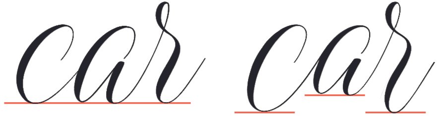
Shift some letters above the baseline and some connector strokes below it. This single change, when done with intention, has a dramatic impact, creating a dancing effect across the page.

3.
Varied Double Letters
Break up uniformity by experimenting with double letter pairs that are markedly different.

4.
Letter Width
Widen or narrow letters that appear out of proportion to the rest of the alphabet. Making bowls too wide is a common problem for beginners, but narrowing these letters (especially a, b, d, g, o, p, q) until they harmonize with the rest of the alphabet will give your whole style more elegance.

5.
Parallel Strokes
Try doing away with parallel downstrokes in individual letters that have multiple straight strokes, such as H, h, m, n, u, and y. Rather than change just the slant of these strokes, try curving at least one of them.

6.
Stroke Weight
Thicken or lighten the swells of downstrokes to instantly infuse any style with new flavor. This can be achieved either through adjusting your pen pressure or changing to a more or less flexible nib.
7.
Ascender Height
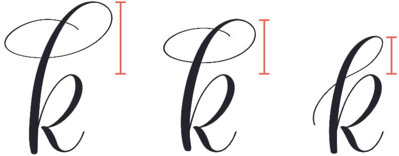
Vary the heights and styles of your ascenders. Remember that lowercase letters’ ascender height and uppercase letters’ cap height do not have to be the same as each other, so you can vary those, too.

8.
Descender Length
Vary the length and styles of your descenders. If you already mix up your descenders (or ascenders), try the opposite: make them all a uniform length and style.

9.
Axis Slant
Change the main slant of your whole alphabet (or vary it from one letter to the next for an especially playful look). Without changing the stroke pattern of a letter, a change in its axis has an immediate impact on its character. You can even experiment with a negative slant, called a “backhand” or “backslant.”
I have a video tutorial and written history of backhand lettering here on my blog: Mastering Negative Italics Calligraphy.

10.
Letter Proportion
Have fun with letters’ internal proportions, especially in uppercase. Some letters have repeated elements that can either be enlarged at the top or at the bottom. Others can be wider on the left or right. Some good examples to play with include B, E, f, K, k, M, m, N, n, P, R, S, W, and w.

11.
Ratio of x-height to Cap Height
Simply by changing the ratio of your uppercase and lowercase letters, you can immediately change the style’s overall tone. The larger the difference between the two heights, the more formal the style tends to look; the smaller the difference, the more whimsical.

12.
Curve Shape
Focus on the roundness of your curves and loops. Circular ones are playful and modern, whereas elliptical ones are more traditional and tend to increase formality.
For more about how small changes in flourishing can affect lettering style, see my blog post on the 8 Principles of Lettering Flourishes, which comes with a free workbook.

13.
Flourish Size
Just because they’re decorative doesn’t mean flourishes should be discreet. Most of the time, flourishes and loops can afford to be even bigger than we instinctively want to make them. A common issue I see in beginners’ work is that their flourishing is too small, resulting in imbalanced letterforms (like the first and second examples above).
Again, my blog post on the 8 Principles of Lettering Flourishes dives deeper into the nuance of flourish shapes and sizes.

14.
Connector Stroke Length
Extend your connector strokes, even without changing the shapes of the letters, to transform a dense style into a loose, airy one. Shorten them with a steeper slant for a compact style.
I love really expanded modern calligraphy and have a video demonstration of it here.
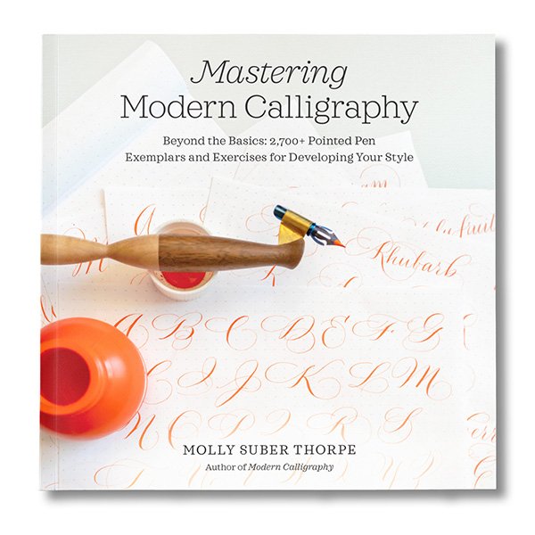
This article has been adapted and expanded from my bestselling how-to guide, Mastering Modern Calligraphy.
Free Modern Calligraphy Practice Sheets:
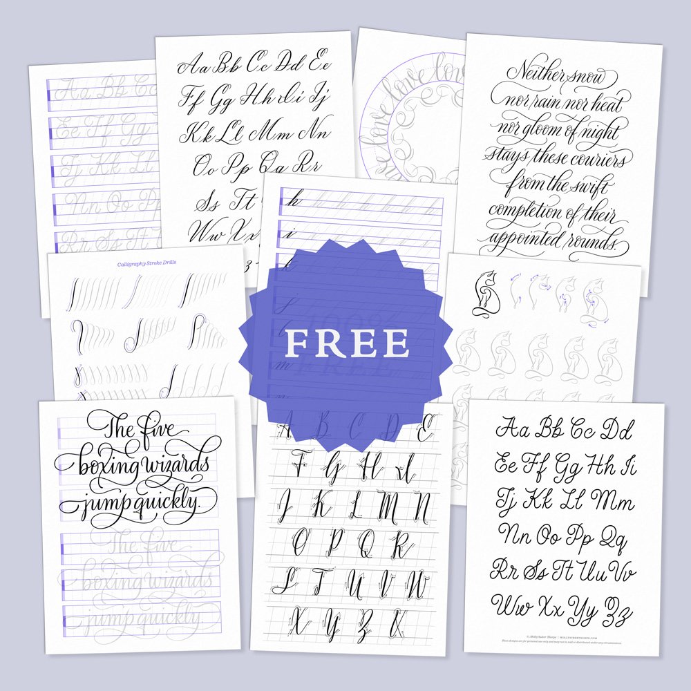
Subscribe to my newsletter to access free practice pages in various calligraphy and penmanship styles.
Molly’s Lettering Toolkit is an archive of free hand lettering worksheets, calligraphy alphabet pages, and Procreate brushes.