Modern Calligraphy: A Beginner’s Alphabet
When learning any calligraphy style it can be helpful to view the alphabet as a series of repeated shapes and strokes, rather than twenty-six entirely unique characters to be mastered separately. If you’re at an early stage in your practice, or you just want to revisit the fundamentals, this is the place to start.
In the lesson below, I break down every letter of a simple modern calligraphy alphabet. While it is a lovely alphabet in its own right, it also makes the perfect starting point for customization. Having a simple, straightforward alphabet under your belt lays the groundwork for letter variations, flourishing, and exploring your own unique style.
The Building Blocks of A Lowercase Calligraphy Alphabet
The basic strokes of a simple modern calligraphy lowercase alphabet. Click to enlarge.
The 31 shapes above are the building blocks of the simple lowercase script alphabet shown below. You will notice that most of the strokes are quite similar and used in more than one letter. Breaking letters down into their essential forms allows us to identify where shapes get repeated, which in turn makes for more efficient practice. No matter the lettering style you’re learning, close examination will reveal that practicing one letter overlaps the practice of many other letters.
A lowercase modern calligraphy alphabet broken down into its essential strokes. Click to enlarge.
Notice that the round part of a (called the “bowl”) is the same as the bowls of d, g, and q, and the straight side of a (called the “stem”) is just an undotted i. Once you learn u, you can extend its stem to make a y. And if you draw y’s stem by itself and add a dot, and you’ve made j. Note that the stem of d is actually just an l—and the stems of b, h, and k are too.
These are just a handful of examples of repeated characteristics that many calligraphy styles share.
I am not suggesting that because a stroke can be repeated it always should be repeated. As an artist, you will add nuance to the letters, adapting and customizing the fifty-two letters of the upper- and lowercase alphabets to your liking. In understanding the building blocks, though, you will be able to make these adaptations intentionally and intelligently, lending your style cohesion and harmony. (Once you’re ready for that step, see my post on The Elements of Modern Calligraphy Style.)
The Basic Modern Calligraphy Alphabet
A basic modern calligraphy alphabet with directional arrows. Numbers lead to keyed notes below. Click to enlarge.
arrow key
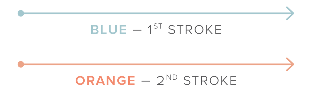
Arrows around the letters indicate the strokes’ starting point, direction, and order. Dotted ends show you where to begin. Color shows the order to write them: blue first, orange second.
number key
①
You can lift your pen at any point between strokes, but if you want the top curve of the letter to be a fine hairline then it is mandatory to lift before a, c, d, g, and q.
②
It is common to lift after the entry stroke of the e so you can make an upstroke curve that forms a more rounded eye (the enclosed ellipse at the top).
③
If you want the top bar of uppercase F or T to be a shaded stroke rather than a hairline (which is a matter of personal preference), then turn your arm slightly when drawing it so that you aren’t exerting pressure on the pen while it’s moving horizontally.
④
The only lowercase letter with both an ascender and a descender is f.
⑤
Traditionally, nearly straight, vertical strokes within an alphabet style are parallel to one another, no matter what their slant. The letters H, h, M, m, N, n, U, u, Y, and y are letters that contain two straight strokes (or three, in the case of m) which are customarily parallel.
⑥
When dotting i and j, follow an imaginary line with your eyes up the axis of the downstroke, then place the tittle (a.k.a. the dot) along that imaginary line.
⑦
There are three lowercase letters with exit strokes that come out at the waistline rather than at the baseline: o, v, and w. While this doesn’t make these letters inherently more difficult, it does mean the letters that follow need to be adjusted, since their entry strokes will start high instead of low. Combinations such as or, os, vr, and wr can be especially tricky, since r and s rely heavily on their entry strokes for legibility.
⑧
The top points of r and s should come slightly above the waistline so that they’re optically proportional to the other lowercase letters. For some styles, the same is true for the top point of p.
⑨
All letters should contain at least one upstroke and one downstroke. This contrast is what gives calligraphy its beautiful flow. In the case of X and x, if you write them in a style like this, which has crossed downstrokes, then be sure the crossbars are upstrokes.
This article has been adapted and expanded from my bestselling how-to guide, Mastering Modern Calligraphy.
Free Modern Calligraphy Practice Sheets:
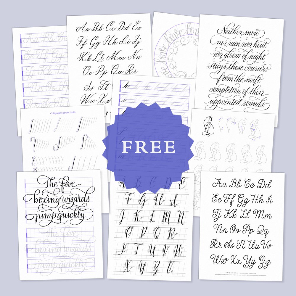
Subscribe to my newsletter to access free practice pages in various calligraphy and penmanship styles.
Molly’s Lettering Toolkit is an archive of free hand lettering worksheets, calligraphy alphabet pages, and Procreate brushes.