Merry Christmas Calligraphy & Wreath Frame Tutorial
I earn small commissions for purchases made through links in this post. Proceeds help me to continue producing free content.
Happy Friday!
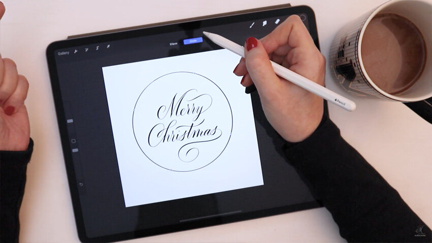
Today we’ll be creating a calligraphy design of the greeting “Merry Christmas,” then illustrating a festive, calligraphic Christmas wreath around it. I show you my detailed process from start to finish, with commentary along the way.
This tutorial uses Procreate 5X. This is perfect if you want to design your own Christmas cards, or create spot lettering for other DIY applications.
Read the transcript version below!
To get started, I have this blank square canvas. I’m going to give myself some letter guides that I can just use as a good basis for my lettering. So here in my Calligraphy Composition Maker, I'm choosing my “Modern 65°” pattern brush. Let's enlarge it somewhat. And now, without lifting my pen, I'm just quickly coloring in the whole canvas so that the simple letter guide can be used in the background here. I’ll reduce the opacity somewhat and make new layer.

Let’s switch over to black. We'll use a pencil brush. I have my own favourite, but you can use any of the pencils that actually come with Procreate as well. I'll just write out the classic “Merry Christmas,” and I'll start by sketching it out just to have a look at the basic composition, the spacing – things like that.
I don't usually spend a lot of time on these sketches. It's more like the equivalent of an illustrator's thumbnail sketches. I really just work out proportion, ratio, stacking, and how the lines are going to work together – what allowances I may or may not have to make.

They fit together well! I use my selection tool quite a bit to make adjustments. So I'm looking, for example, here at how the tail of the ‘y’ and the cross that I made on this ‘t’ are not intersecting well, so I'm going to erase the tail of that ‘y’. And I think I'll make it come above the word “Merry” and then I will adjust the cross of the ‘t’ to sort of hug – or almost mirror – the curve of this ‘y’.
Then, to even out the proportions – sort of to make a shape ultimately like a diamond (knowing that I'm going to make a wreath around it, which is going to be obviously circular) I don't want to have too much blank space down here. So I'm going to work on this tail for a little while just to get it exactly as I want.

Thankfully, since this is a festive message, those flourishes are very appropriate and they're going to look really fun and really add to that festive look and feel.
Here, “Ch” is a wonderful opportunity to make a ligature. And by that I mean two letters that are connected – sort of inextricably linked, drawn in a way where you wouldn't be able to really easily separate one from the other, almost like Siamese twins of letters. You see how the ‘C’ merges into the ‘h’? So now that I know that's the type of ligature I want to make, it’s just a question of proportion. How do I want this angle to go, and how far out do I want this loop? Yeah, okay, I like that.

Don’t be afraid in your work to make really big flourishes. Very often I think that people want to make small flourishes just because they don't want to distract from the overall composition. But in reality, if a flourish is too small, it can actually be more distracting than a large one, because it's out of proportion with the letters. Let me just show you what I mean by that.
So these are two ‘C’s and, you know, the height of the ‘C’s are the same, but the size of the flourishes on the top – these curls – are different. Personally speaking, I prefer this one.

Let's just like draw a few more letters. The proportion of this flourish to the overall size of the ‘C’ is much better, in my view, than this small little flourish that feels too insignificant. Worse yet, actually would be flourish like this on the ‘C’ that really feels insignificant. This would just be so much better if we drew that down a bit. Actually, a lot. You see? Now, proportion wise, ratio wise, this fits much better and honestly, if we enlarged this flourish even more, I think it would look even more realistic. So you can do really fancy things.
OK, I know I'm getting off track here, but. Something I'm asked about a lot is is flourishing, and I think that this is a helpful thing to keep in mind: the smaller the flourish, the more you need to check the ratio in proportion to the overall word.

Back to our Merry Christmas! So you can see how quickly I sketch here. I put very little effort into polishing and perfecting at this stage. I'm really, really just looking at proportion and how the words sit with each other.
Now, I'm going to go over this one more time, again with a pencil, and refine it just a little bit more. I'll reduce the opacity quite dramatically, make a new layer. And now when I go over this, I'm still not spending too, too much time. But all of those little redos that I had done previously with the pencil are going to be taken care of now because I'm just going over this once more.

I'll make a new layer for the word “Christmas” so that I can easily move it in a moment if I need to.
Another little rule of thumb with flourishing is that the rounder – or more circular – a flourish is, generally, the more playful and modern it is. And the more elliptical or elongated your flourish’s curves are, the more formal, the more traditional, and the more old fashioned it is.
I have quite a circular flourish going on here and that's specifically what I wanted. I want to take up a lot of the space in this region, but a more formal version would have been like that, more elliptical, elongated.

So let's take this “Christmas” word, moving it slightly down into the right now. I will merge it down with the word “Merry” and I'm going to move it with snapping turned on. I'm just going to loosely center this on the page, which means I drag it until I see these two golden lines.
So let me reduce the opacity on this. And now I get out my calligraphy pen and I really refine this. In my Calligraphy Nibs Brush Pack, I have this fine point calligraphy pen (smooth stroke), which I use for the vast majority of my work.
I'll make a few strokes on the page to really try to figure out what brush size I want. I will use a couple of strokes with different pressures to figure this out. Zoom out. Yeah, I think the thickness of that downstroke is roughly what I'm going to want.

When you’re done with the first word, new line, new layer!
What I'm going to do, starting here with “Christmas” (because I'm already on this layer) is, with a very small eraser brush, just zoom in to where the letters hit the baseline. I want the ends to be more crisp. This is a personal preference, but I just like it. I'm also going to round off that ‘r’. Let's see, I could have the ‘i’ be flat or I could have the ‘i’ be kind of curved or angled. Kind of like that, why not? I don't know, but for some reason it feels kind of festive!

I'm happy with this so let me turn off my guides. Now let's make our wreath.
Make a new layer. Now we're going to turn on radial guides, so coming over to Canvas, turn on Drawing Guide, then immediately click, Edit Drawing Guide. By default, you get this 2D grid. So I'm coming to Symmetry Options > Radial, and I'm making a radial guide. I want to turn on Rotational Symmetry and make sure that Assisted Drawing is turned on as well.

To work with this, you can see that I have the guides visible, but I don't have to have the guides be visible for me to adhere to them. So I'm actually going to turn them off because they're a little bit distracting. And I just know that, because the word “Assisted” appears here under my layer, when I write, it will adhere to my guides.
I can turn that on and off at any time, by the way, by tapping the layer and choosing Drawing Assist. If I make a brand new layer, Drawing Assist won't be turned on, so I'll have to manually turn it on by tapping and clicking Drawing Assist, so that that new layer can also adhere to my guides.

What I am going to do is draw a circle first. So I'm going to make a layer for myself that's blank and not set to Drawing Assist. I create a circle, then I'll snap it, then I'll click Edit Shape. Because I made a quick shape, which is to say that I drew a shape and I didn't lift my pen until it snapped to be perfect, I can hit Edit Shape and I adjust this right away to be a circle. I can hit my selection tool here and that goes away. Then I can hit my selection tool again and I have snapping still turned on, so I'm going to snap this circle to the center of the canvas.
Now if I reduce the opacity on this a lot, I have sort of a guideline ring to go around. I want to be on my assistant layer. Let's start with a color like green just because it'll be more fun. I'm still on my calligraphy pen because I like the illustration to sort of match the stroke characteristics of the calligraphy. So we're just going to make some really nice, cute florals here.

I'm going to turn off my circle because I don't need that anymore. I'm going to make a new layer, tap once, and turn on Drawing Assist. That's because I want to use a different color and I want to be able to easily keep those colors separated on two separate layers so that I can recolor them easily later. So we'll get our classic red out.
I'm going to use a little trick by using a monoline brush as a stamp. So I'm coming down to my monoline brush and I'm going to tap it once to see roughly the size it is right now. And then using the brush sizing, I can increase and decrease the size of my berries. Now those are going to be cute little perfect circles, which I think are nice in a more minimalist way. So put let's make that smaller. Put some of these around.

The cool thing about symmetry guides is that the erase tool also works around the circle. So if I erase this dot, it will erase all of the same similar dots.

Now, what I want is for the “Merry Christmas” to feel more centered. This is where optical centering really comes in. If something is perfectly centered, like mathematically, that doesn't mean it looks centered to the eye. So first, I think it needs to be smaller. So I'll come to my calligraphy layer and I'll make it a bit smaller. Now I'll turn off snapping so that I can get really tiny movements.

And now, to recolor the text, the way that I like to do that is to make a blank layer over my art layer, tap it once, and hit Clipping Mask. When you tap it again and click Fill Layer, and the film only affects what's underneath it. If I unclip it, you'll see that it covers the entire canvas, but as soon as I clip it, it only affects the calligraphy in that layer.

So I think I like this being red as opposed to green. Definitely better than black, but it's still not centered in the way that I would like.
Now let's just change the background to something a little bit creamier, because this stark white is not very festive to me. It's subtle, but I like that!

If you make any kind of artwork following along with this tutorial, I would love to see it. So if you tag me in your work on Instagram, I will be able to. I always do appreciate that. I'll see you back here next week!
Resources
PROCREATE BRUSHES USED IN THE VIDEO:
Grid Brush:
“Pattern Brush: Modern 65°”
from my Calligraphy Composition Maker for Procreate
Calligraphy & Illustration Brush:
“Fine Point Calligraphy Pen – Smooth”
from my Calligraphy Nibs Procreate Brush Pack
TOOLS USED:
Procreate App
12.9" iPad Pro (4th Generation)
Apple Pencil
Touch screen glove
MORE videos using Procreate symmetry guides:
Calligraphy Symmetry Art in Procreate
Flourished Calligraphy Circles in Procreate
Flourished Calligraphy Border
Calligraphy & Illustrations Time Lapse
Download my FREE Lettering Toolkit


Molly’s Lettering Toolkit is my free hand lettering bundle that’s always growing. I release a new free download roughly once a month, and add it to the ever-growing toolkit. This is an exclusive perk for my subscribers, so use the button below to register today and gain lifetime access.
NOTE: If you are already my subscriber and just need the download link again, re-registering will not work. Please reply to any of my Saturday newsletters to request a new link.