A Book Cover Story: The Design Process of Mastering Modern Calligraphy
I didn’t have much say over the cover of my first calligraphy book, Modern Calligraphy. I understand why, too: I was a first-time author and my publisher was taking a gamble on me. The cover design and interior layout were left almost entirely up to my publisher’s special marketing and design departments, whose job is to know what sells. They did ask my opinion, and sought my feedback on a number of cover options. But contractually, they didn’t have to involve me in the process at all—which makes me very grateful that they did. Ultimately, however, the final design of the cover and the interior was entirely theirs.
Publishing a book with a publisher is, by definition, a collaboration.
I won’t lie—as a graphic designer, it was really hard for me to give up any control over this massive creative endeavor. I’m a perfectionist, so to not have a hand in every single aspect of a design project that bore my name was a difficult but important exercise for me. I had worked for a year on every detail of the text, calligraphy, illustrations, and photos in Modern Calligraphy. Writing a book is an all-consuming process, and when it’s finally done, and you hand over all the material to the publisher, you have the weird sense of not knowing what to do with yourself. (I actually stood in the shower and bawled from relief after hitting send on that final submission email.)
Since Modern Calligraphy’s release in 2013, the book has done better than I ever imagined in my wildest dreams.
An Amazon Favorite Craft Book in its first month. Translations into Spanish and Complex Chinese shortly thereafter. A re-issuance by a U.K. publisher for the British Commonwealth. On its sixth edition and growing. I pinch myself, even to this day.
So in 2017 when I hatched the idea for Mastering Modern Calligraphy (my third book, having released The Calligrapher’s Business Handbook in 2016), I knew I wanted to ask my publisher for more design control this time around. I also knew I’d have more sway, since they were no longer taking a gamble on an unproven, first-time author.
I wasn’t unhappy with my first book! But I knew that this next one was going to be bigger, fancier, and more time-consuming, and the perfectionist side of me wanted to oversee every detail from start to finish. My publisher, St. Martin’s Griffin, agreed to give me full creative license, and I was over the moon. The only caveat was that the cover design would have to be approved by their special marketing department, which I was more than happy about since I knew their team would be able to provide invaluable feedback.
I was also thrilled that my request for lay-flat spiral binding with a wrap-around cover was also approved in Mastering Modern Calligraphy’s initial proposal, too. That meant I knew the format and page size up front—another big difference from my first book. I was able to take every photo and draw every calligraphy composition according to the pre-set margins.
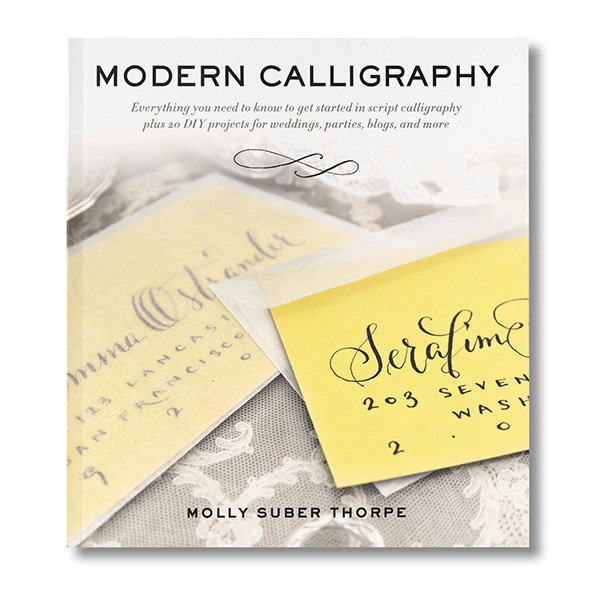
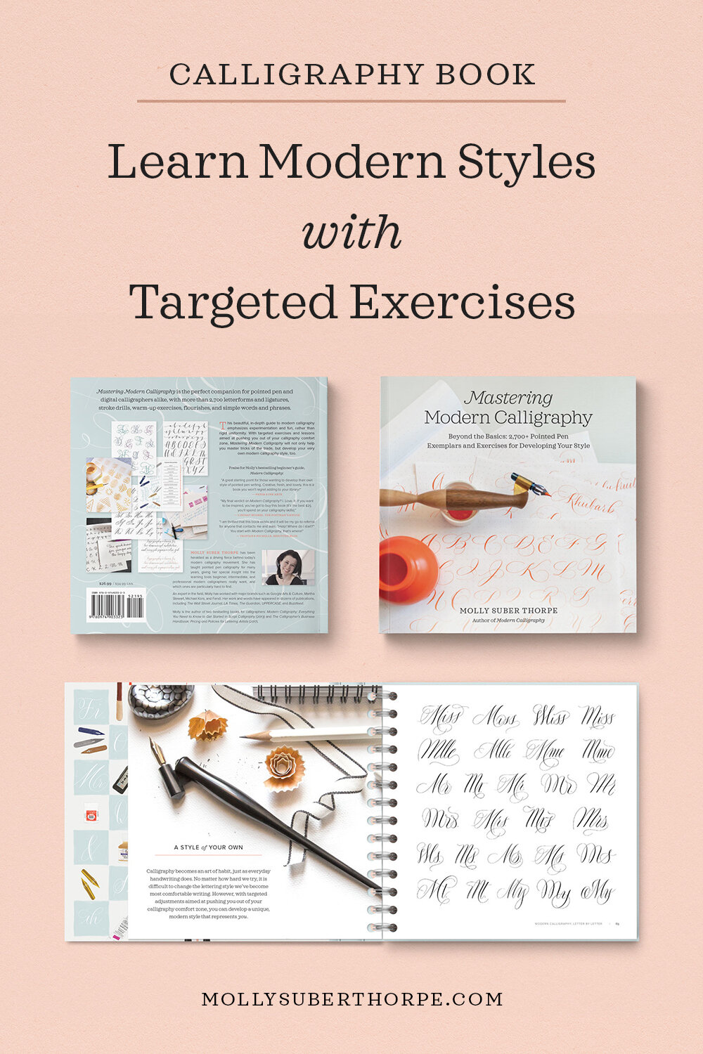
The cover of my first book, Modern Calligraphy, was designed by my publisher.
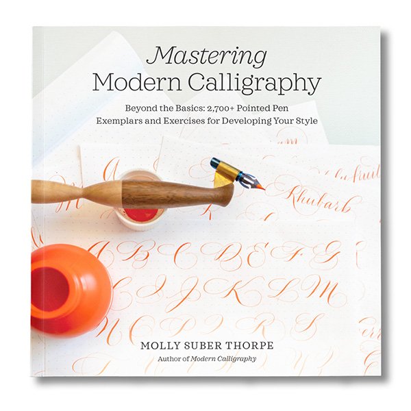
I designed the cover of Mastering Modern Calligraphy, as well as the interior.
The book cover is the last thing that gets designed. And it’s no easy task.
I spent a full year writing, researching, calligraphing, illustrating, and photographing Mastering Modern Calligraphy. By the time it was submitted to the publisher and we’d passed through edit rounds one and two, it was time to turn my full attention to the front cover. The marketing team told me that red-orange was “the color of the season” so I should try to incorporate it in some way. It could increase the chance of the book appearing in merchandise displays, they said. This is a great example of something I would never have known without their insight, and a way that collaboration can make for a much stronger end product.
I remember feeling confident about my initial cover concepts. I had a lot of photography to choose from, and with the title finalized, I felt it was just a matter of pairing a photo with a font. I look back on that and laugh.
The first surprise I encountered was that my publisher’s marketing team and I were not on the same page about what the cover should convey.
For me, the book’s primary selling point is that it’s all about practicing calligraphy; about lettering exercises and letterform drills; about style critiquing and alphabet evolution. It’s a deep dive into thousands (literally) of modern calligraphy styles, shapes, and lettering techniques. As such, I wanted the cover image to depict practice sheets! Beautiful ones, but unfinished work nonetheless.
My publisher was not keen on this. And I understand why. To non-calligraphers—marketing experts at that—I get that a picture of imperfect calligraphy practice papers doesn’t seem as inspiring as one of a polished, finished wedding invitation suite or a calligraphed manuscript. Will practice sheets really entice the target audience? My publisher wasn’t as sure as I was.
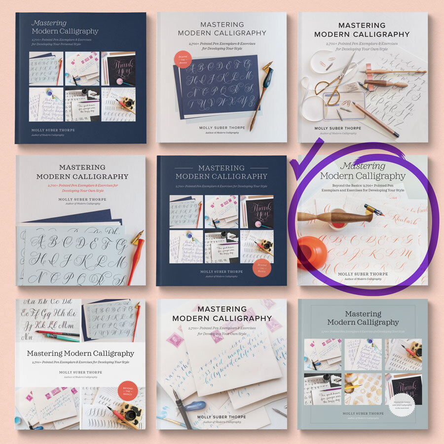
I ended up making over 90 versions of the cover.
Here is just a sampling of the designs I explored:
Click to enlarge.
I made covers with messy calligraphy practice sheets and with “cleaner,” fancier ones. I designed versions with multiple photographs, offering a greater peek at what’s inside. I made some showing finished products, like calligraphic envelope addressing, but then retracted them because I knew they just weren’t the right fit.
Ultimately, the process took about two months, but it was very enlightening.
It really showed me just how varied the interpretation of a single image can be, and how important it is to consider these perspectives when marketing my work. There was never a question from any of us that the book’s target audience were people who want to learn more modern calligraphy styles, master principles of hand lettering, and take their designs to the next level. The question was which single image could best convey all these things.
You can see that many of my cover drafts are very similar, but even the smallest layout choices were scrutinized—by me as much as by my publisher. (You can also see that More Modern Calligraphy is another title we explored right up until the end.) Should the title be left-justified or centered? The same font as Modern Calligraphy’s title, or a fresh, new one? Should we use a variety of photos or just one? Should it depict multiple lettering styles or would that be too busy? Does lots of negative space or full-bleed have maximum impact? Would a starburst or bookmark icon with more details about what’s inside distract or attract? How much orange is too much orange?
Ultimately, all the time spent agonizing over the details was 100% worth it. I love the cover we came up with. It was a true team effort, and I can safely say that had I gone with my first instinct, with no outside input, it would not be as successful.
Curious about what’s inside the book? I made a video about that!
Look inside Mastering Modern Calligraphy ➺
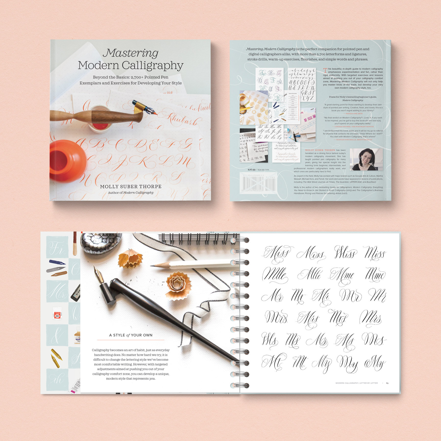
With the interior layout complete, the back cover came together much faster than the front. It merges design elements from the interior with the same pop of orange from the front.