Look Inside My Book: Mastering Modern Calligraphy
My third book is a comprehensive guide for taking your pointed pen calligraphy skills to the next level and developing your very own modern style. It’s the perfect companion for pointed pen and digital calligraphers alike. It has more than 2,700 letterforms and ligatures, stroke drills, warm-up exercises, flourishes, simple words and phrases, and an entire appendix of grids sheets! Learn even more about this book, read reviews, and find places to buy it here.
Watch the video to learn all about Mastering Modern Calligraphy, or read the transcript below it:
Video Transcript:
Today we’re going to do something a little bit different, which is to take an in-depth look inside my latest book, Mastering Modern Calligraphy. Before we dive in, I want to give a little bit of background about why I wrote this book. In 2013, I published my first book, Modern Calligraphy, and it did so well that I decided to write a second how-to guide.
The target audience of this new book is what I would call early intermediate through advanced calligraphers. You don’t need to be a professional calligrapher to use my new book, but you do have to have a basis in the technical skills of holding and using a pointed pen, and a little bit of practice under your belt already. If you already own my book, I hope that this video helps you make the most of it, and if you’re thinking about whether or not to buy it, I hope this helps you make your decision.
Spiral binding
I was insistent with my publisher, St. Martin’s, that I make this book spiral bound. My first book wasn’t, and it was something that I had always wanted. But, you know, my publisher had taken a gamble on me. It was my first book. Understandably, the investment of spiral binding wasn’t something that they wanted to pursue my first time around. But this time, I was able to insist, and they were very open to it. I’m grateful to them because I really think it adds a lot, having the ability for the book to lie flat, and to be able to work with it for either tracing the letters or, when copying freehand, not having to hold the book down as you go.
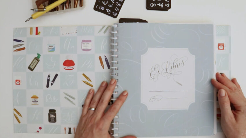
Lay-flat spiral binding
Refine your calligraphy and create a unique, modern style
Ultimately, the goal of this book for me was to help people refine their pointed pen calligraphy and create their own modern style. There are so many amazing calligraphy books out there on traditional, ornate script styles. They are really fantastic. But that’s not the style that I do—and it’s not the style I teach.
I have a much looser approach to calligraphy, which is, honestly, that there are no rules so hard-and-fast that they can’t be broken. So my goal with this book is to help you break out of bad habits and create a unique style that is a reflection of your personal aesthetic.
Chapter One: Methods for Effective Practice
We start out here with “Methods for Effective Practice” (p. 17) because a lot of us, myself included, can get into bad habits! Whether it’s how we hold our pen or how often we practice, it’s helpful to revisit those foundational techniques to get on the right track in your practice.
I lay out what I have come to understand over the years as the principles of modern calligraphy styles (p. 20)—the many ways we can take those traditional rules and letterform principles and apply them to a flexible, modern approach.

I break down in-depth the ways that, as you work through the book, you’ll be able to take each letterform that I show you and tweak it in intelligent, targeted ways to achieve whatever new and different aesthetic you may be after.
Letter Guide Anatomy
I wrote this book based on years of questions I received from my own students in the calligraphy workshops I teach. A very common question that I’d taken for granted was how to use letter guides! What do all of the lines mean, when should you follow them, and what guide should your choose for different calligraphy styles? So I go into great depth about the anatomy of letter guides and grids (p. 24), both at the beginning of the book and at various points throughout.

Choosing the Right Nib
At the end of chapter one, I also answer the question of what nib is right for different styles, and which one is right for you (p. 26). It’s a bit like driving a car. Different cars have different brakes, acceleration, and sizes, so it’s a personal decision which one best suits your needs and makes you the most comfortable. Likewise, with nib, flexibility, shape, and size play important roles. I break down the most popular nibs and what the benefits—and potential drawbacks—of each one are.
The same goes for my favorite tools and supplies. I share with you my own go-to inks, papers, and pen holders (p. 29). My goal is to help you make a tool kit that is built of items that aren’t necessarily the universally agreed-upon “best” ones, but items that are the best for you.
Chapter Two: Warm-up Exercises & Drills
In my view, no book about calligraphy practice would be complete without an extensive section about warming up and doing exercise drills (p. 37). This is really important for me to do every single time I sit down to do calligraphy. Especially for those of you who are learning and still training your hand, getting that muscle memory in place, it’s crucial to force yourself to step back from making pretty letters and take time in your daily (or weekly, or monthly) practice to revisit the basic shapes and curves.
I recommend using a pencil for your warm-ups first, then moving into ink, to really get the test driving of your different nibs going. This also builds muscle memory for the various shapes.

Chapter Three: Modern Calligraphy, Letter by Letter
Next, I show you what I consider to be a very basic, modern calligraphy alphabet (p. 49). This is a style that you really can’t go wrong with in terms of modern script pointed pen. It’s also one that is very flexible for doing letter variations. Many of the techniques I share in the book, about how to adjust, tweak, push, and pull letterforms, can be applied to this foundational alphabet. This is why I break down each stroke of every letter and devote a long section to it!
Follow the Colored Stroke Arrows
For those of you who are starting out and wanting to learn the ropes from the start, I added arrows to each letterform that has a unique stroke pattern. I’ve color-coded them to show the first stroke that you should do, where you should lift, and—where applicable—when the second or third stroke should start and end. I included a helpful color code key (p. 52) to help you recognize which arrow applies to which stroke.
Modern Variations: Letters, Numbers & Symbols
When I wrote the proposal for this book to my publisher, I had to tell them why I thought this book was needed on the market and why I was excited to write it. I think I literally used the sentence, “I wanted to overwhelm readers with inspiration for letterforms.” I told them I wanted to throw so many letter variations at readers that they would feel like they could practice them for years without running out!
With that as my goal, I started the letter variation section (p. 59) by taking the basic modern alphabet that I showed you before and sharing page upon page upon page of how you can take those basic letters and vary them. These range from simple adjustments to complex ones—extending a tail, increasing an x-height, adjusting the slant—all to create a completely different look and feel.
After the lowercase letter variations, I provide variations of uppercase letters as well (p. 64), then numbers, symbols, etc. (p. 73).

Calligraphy Ligature Variations: How Letters Interact
Next, I go into ligatures (p. 74), because, for me, there’s nothing more personalized and unique about a calligraphy style than how your letters actually interact with each other and connect.
How do you make it look like your letters aren't simply one coming after another after another – like a digital font – but that they were really thought out, with intention, and connect in a way that is unique to your style? Well, I show you a lot of ways that two or more letters can become one continuous shape.
You will find dozens of examples of lowercase ligatures, then uppercase-lowercase combinations (p. 81). I chose letter pairs that are the most common in English. I picked the ones that I thought would be the most useful for you, but there are, of course, infinite letter combination possibilities!

Chapter Four: From Letters to Words
After individual letter connections, I move from letters into words (p. 93). This is my favorite part of the whole book. I begin by sharing an exercise I do with my intermediate and advanced calligraphy workshop students. It’s a method that has helped me personally come up with my own different styles.
Exercise: One Change at a Time
This exercise (p. 94) takes any calligraphy style you’re already comfortable with and guides you in finding a way to get here to get to a completely different style. This is not about creating styles that will look like mine. It’s about making targeted exercises and changes.
I ask you to write out a word or phrase in the calligraphy style that you are most comfortable with, then write it again with just one change—for example, adjusting the slant—then take that version, and write it again with another single change—this time, say, decreasing the x-height.

I provide a number of different adjustment prompts for you, as inspiration for making targeted changes, and I give you lots of examples of ways that a single letter can be adjusted through these targeted variations.
By practicing this method a lot, you’ll ultimately be able to go from a modern calligraphy style you’re already comfortable with to a new style you may never have been able to come up with if you were trying to go from here to here.
I also teach a Skillshare tutorial about this exercise! Register for Transform Your Modern Calligraphy Style One Step at a Time and get two months of Skillshare Premium free!
Chapter Five: Five Complete Alphabets
Lots of calligraphers like to practice complete alphabets, and I understand why. Personally, I am someone who likes to combine letterforms myself, playing around with letters to see how they complement each other. Still, I wanted to provide you with a variety of complete modern alphabets. So I’ve given you five complete alphabets that have upper- and lowercase letters in the same style: Quip (p. 107), Nautica (p. 115), Cream Soda (p. 123), Dalliance (p. 135), and Blackboard Monoline (p. 143).

Based on the feedback I’ve gotten from the book, Nautica is becoming one of the most popular. It guides you in making a really loose, whimsical, freehand calligraphy style. Even though flowing calligraphy is pretty popular nowadays, it can be difficult for calligraphers who have a foundation in traditional styles to “let go” and make styles that are so freeform.
As the name suggests, Blackboard Monoline is, well, a monoline stroke style. (I’m getting more and more into monoline calligraphy. I absolutely love it! It has such a fun, retro look.) It’s also a backhand style, which means the slant points to the left, not the right. There are some great monoline pens dip pens, and if you don’t already have one, it’s a really cool investment. I suggest specific ones in the monoline nib section (p. 29).

Chapter Six: Majuscules & Monograms
In the next chapter, I present three uppercase calligraphy alphabets that are perfect for things like monograms and drop caps (p. 153). Basically, they’re really fancy uppercase letters. Practicing them is a great way to learn about creating really, really flourished individual letters.
These calligraphic monograms all require multiple strokes, so remember that I’ve drawn arrows for each different stroke: where they start, where they stop, and where you should lift. I know that when it comes to flourishes, one of the tricky parts for people who are learning is knowing where to start your strokes.

Chapter Seven: Small Layouts
This chapter on calligraphy layout design (p. 175) is aimed at intermediate to advanced calligraphers. I dive deep into my techniques, many of which I learned as a graphic designer, even though they weren’t specific to hand lettering. A lot of the principles of successful layouts apply to hand lettering as much as digital type! So I walk you through the steps that I personally use when I create an initial draft of a layout, all the way through the final, fancy, flourished design.
Critique Your Work Productively
I go in-depth about how to critique your own work. It’s a very important point I drive home throughout the book: how to have a critical eye with your work without being down on yourself. What I tell my students all the time is that every calligrapher you admire started out somewhere—and every professional calligrapher still makes what they would consider to be “ugly calligraphy” once in a while. You know, you’re not looking in their recycling bins. You’re looking at their Instagram feeds, or their portfolios. So don’t be too hard on yourself.
Try to find a way to say, “Okay, I don’t like the calligraphy that I just made, but instead of stopped there, let me figure out what exactly I don’t like”. Rather than simply saying “I don't like it” and continuing a trial-and-error approach to create something you do like, figure out what you don't like, how you would like it to be different, what you would like to change. Once you change to this mindset, you can make targeted approaches that get you to the finish line much faster.

Calligraphy Envelope Addressing
Next, I have a whole section on envelope addressing (p. 184), which is the bread and butter of most calligraphers and the skill that we usually all start out doing in our calligraphy careers. (I certainly did!) Here, I take a lot of the styles that I’ve already shown throughout the book and I put them in here in different envelope layouts.
I also give you three all-caps, print alphabets that I like to do sometimes, for contrast. I often combine multiple styles into single layouts.

Chapter Eight: Flourished & Borders
Then, of course, what everybody asks for: flourishes (p. 190). Just as with letterforms, and those exercises in pencil and ink that I share in the beginning, exercising flourishes is super important before you go into adding them to letters. So I’ve provided you with a ton—a ton!—of flourishing exercises that take you through flourishing of all different types: vertical, diagonal, curved, horizontal….
This will help you get some of the foundational flourishing principles down before you move into the larger flourishes, especially those that connect to letters and popular designs like wreaths, banners, and florals.

Additional Resources:
Letter Guides, Glossary & Shopping for Supplies
I wanted to leave you with additional resources for your continued practice, for your business, and for your toolkit.
Appendix I is a collection of grids and guides (p. 204). Here, I give you thirteen completely unique letter guide sheets that apply to thirteen different styles of modern calligraphy. Each one gives you the ratio of the different lines, the slant angle, and a description of the type of lettering that I would use this grid for. I even provide you with the grid that I use for all of those flourishing exercises so that you can have those exact outlines for your flourishing exercises.
For example, I tell you that Guide No. 1 is for “equal proportioned, medium-sized letters at a moderate slant,” because I know it can be hard to just look at a blank grid and envision what the letters that are placed on it might look like.
The guide sheet section is almost endless! I’ve been asked, “Am I supposed to write directly on these grids?” No. This section is about giving you inspiration that you can either trace from or photocopy for personal use and use them over and over and over. Then, for a more advanced step, I show you how to make your own grids.

Appendix II is a glossary of the most common terminology for hand lettering and supplies (p. 221).
And Appendix III is about shopping for supplies (p.229). Possibly the most commonly asked questions I get are, “Where do I shop for good calligraphy supplies? What supplies do you most recommend? I don’t live in the United States, so where should I go for _____?” That’s why, in this section, I’ve given you a list of my favorite suppliers and shops all over the world. Most of them do ship internationally, but still, I wanted to give you a wide range around the world so that you can have your pick!

I hope that you can make the most of this book now, if you do already own it. And if you don’t, I hope that this has helped you make your decision about whether to buy it or not.
If you have any questions about this book, please leave them in the comments, or contact me.
If you’d like to download some free calligraphy resources, you can check out my Free Lettering Toolkit, where I offer lots of things from practice sheets to lettering guides to Procreate brushes. There are no strings attached—it’s really, truly 100% free.
If you found this post useful, consider sharing it. That’s the best, free way to support artists and authors you appreciate.