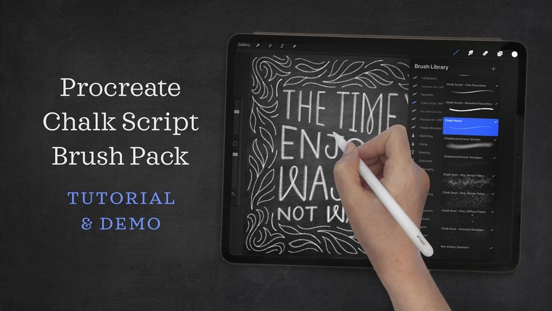
Video Tutorial: Procreate Chalk Brush Lettering Brush Kit
Chalk is deceptively, notoriously difficult to emulate with digital brushes. The texture, the grainy edges, the varied translucency, the erased smudges, the rough chalkboard behind it. I love analog chalk lettering—nothing compares to its tactile experience. But I also like working digitally, especially for work that will appear only online or would need to be digitized for clients anyway.
The trick for realistic digital chalk writing is layers.
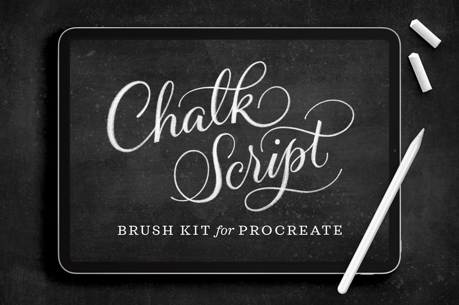
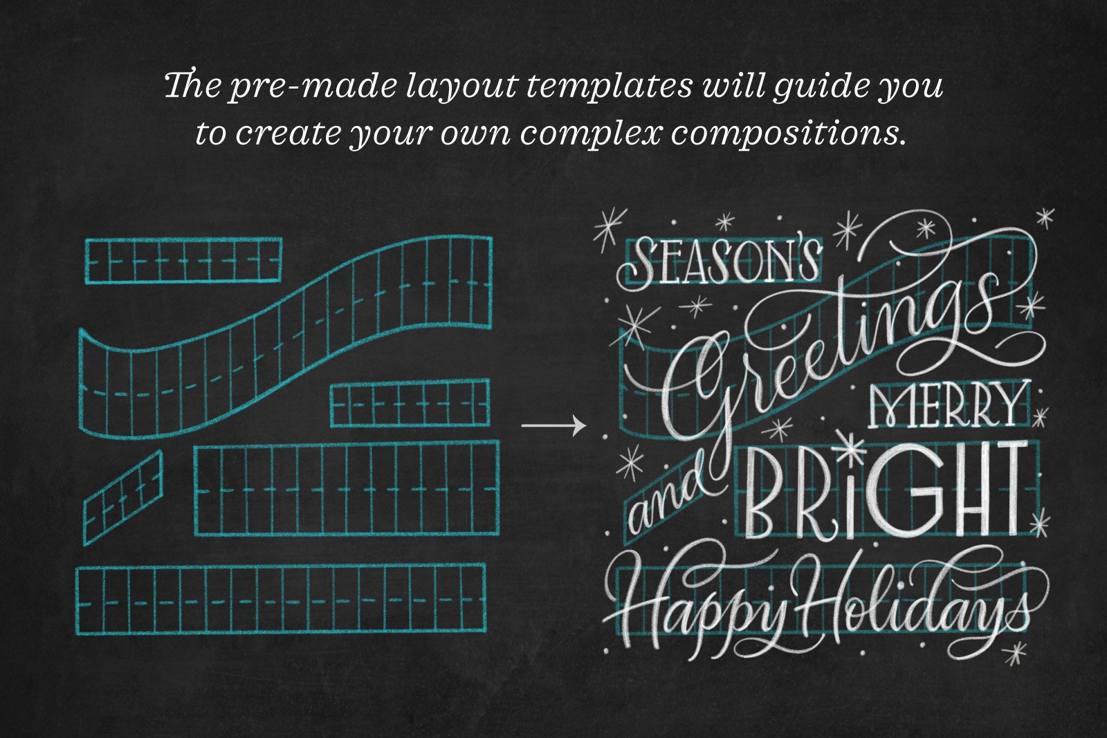
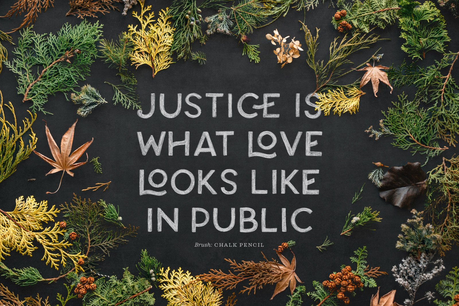
This tutorial covers the step-by-step process using my Chalk Script Procreate Brush & Template Pack. I work through two complete designs—a short quote layout and a holiday card—showing how the same brushes can be used for both script and print lettering styles.
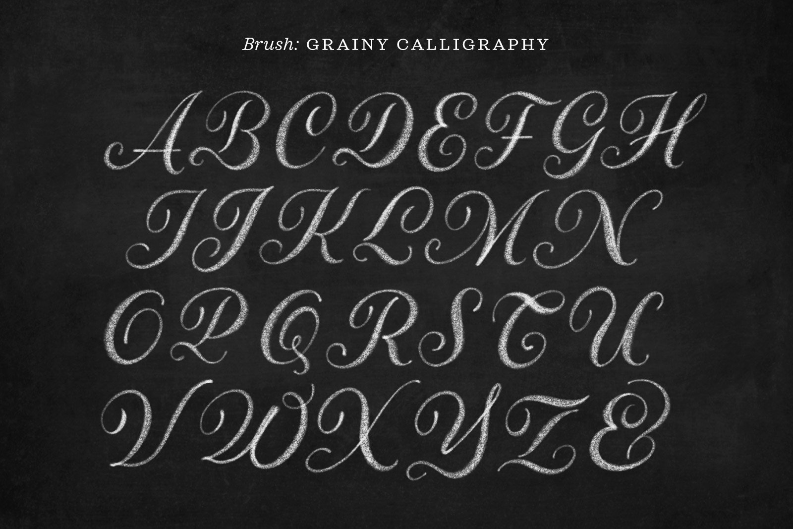
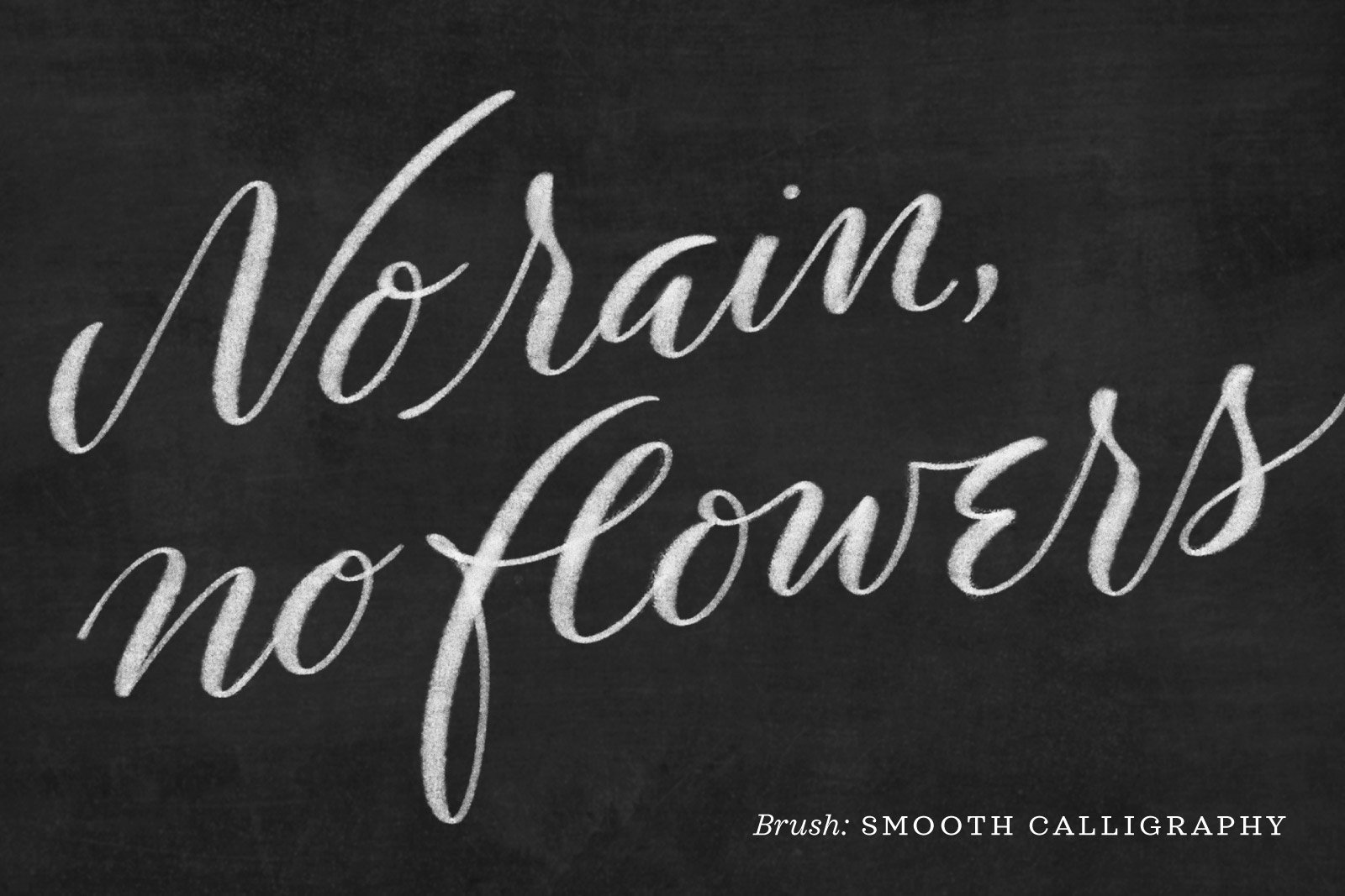
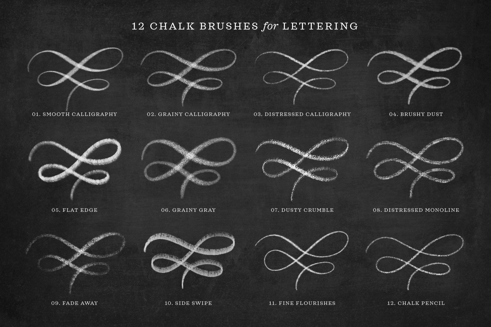
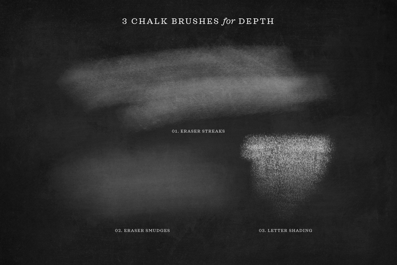
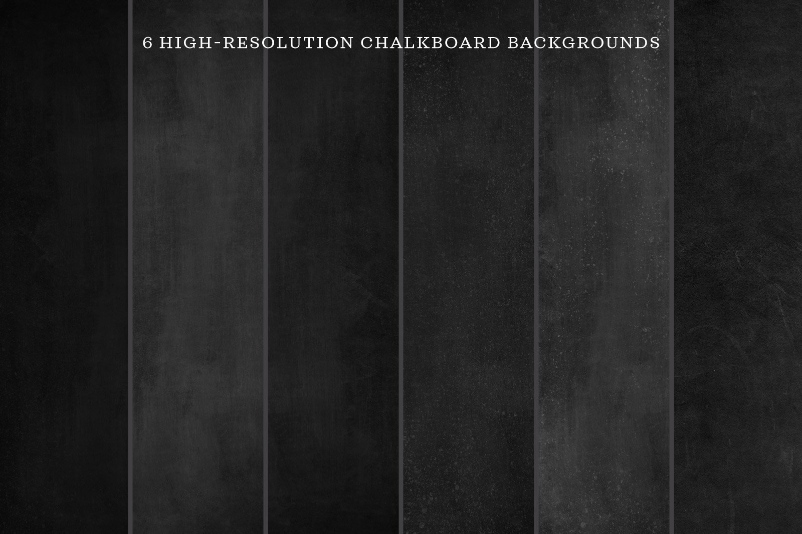
You also get a tour of what’s inside the brush pack: its 25 chalk brushes and 17 chalk lettering layout templates. The brushes are optimized for drawing letters and flourishes with realistic chalk texture. With the addition of flourished borders, sprinkles of chalk dust, and hi-res chalkboard backgrounds, you have the digital tools for infinite chalky, textured compositions.
Video Tutorial
Written Tutorial
This is a lightly-edited transcript of the video above.
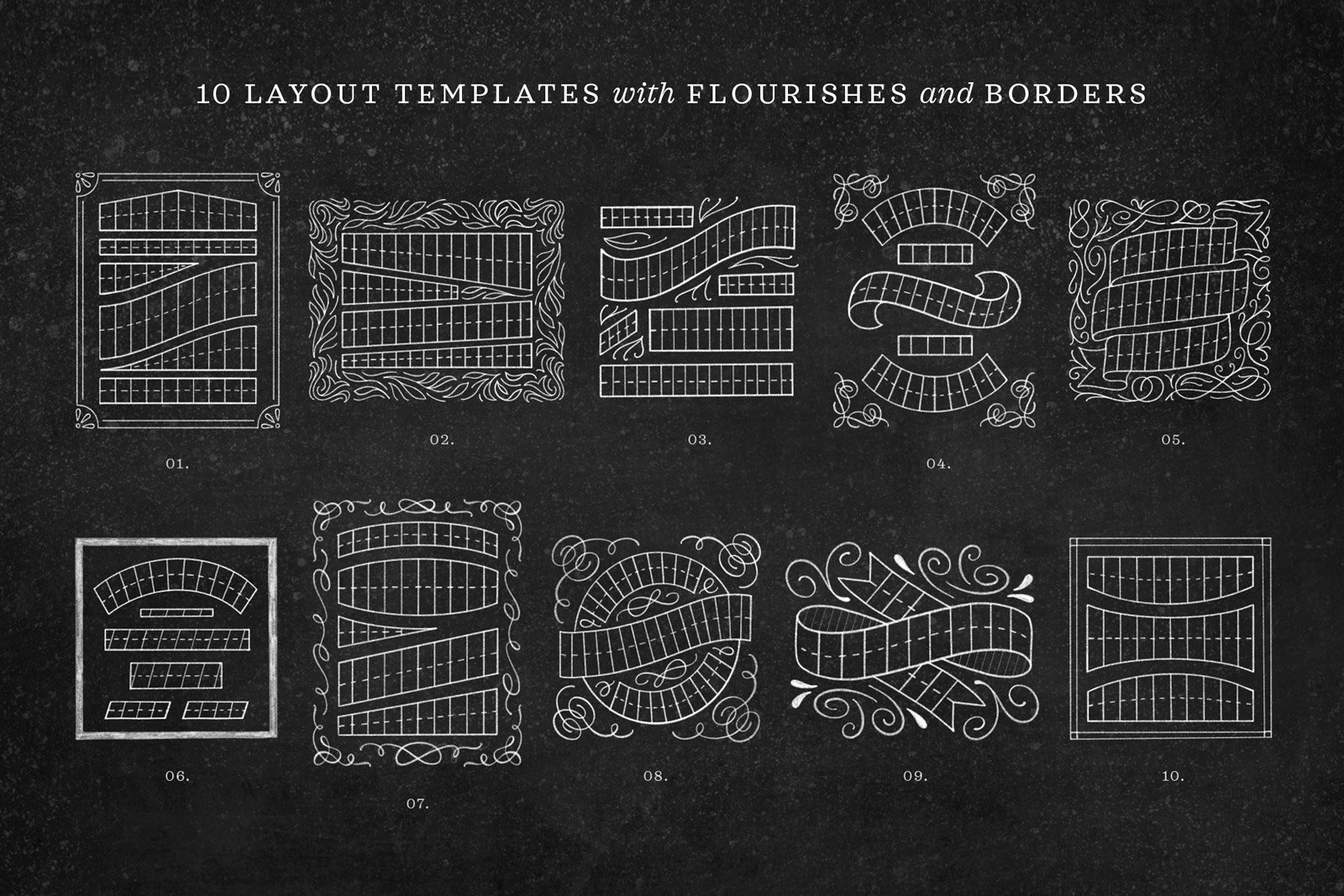
Pick a chalk letter guide template.
I’ll be demonstrating my Chalk Script Procreate Brush Set by creating a chalk lettering layout using one of the many layout templates that comes in the kit. While we do it, we’re going to look at the chalk brushes that come in the kit.
I have opened one of the horizontal template files with a flourished border and blank template lettering grids within it, so that you can fill in your own quote and customize it into a layout that you like.
To get started, I’m enter my layers palette and reduce the opacity quite considerably on those internal letter grids.

For the moment, I’m also going to turn off the little flourish in the middle of the template because I’m not quite sure if the lettering layout that I’m going to create will allow me to keep it in there.
Now I’ll make a blank layer and open my color palette to make sure that I’m on white. Chalk itself is slightly gray—or translucent white, if you prefer to think of it that way—so it doesn’t matter if you pick the truest white or not. Just choose a white-ish color from your palette.

Sketch your lettering into the template guides.
Now I have my Chalk Script Brushes open, you can see lots and lots of options. In fact, the kit comes with lots of cool texture brushes like chalk flakes, chalkboard smudges, and eraser streaks. But for sketching lettering layouts, I’m going to choose the Chalk Pencil brush. I’ll tap it once to open brush settings, just to make sure that Streamline is turned off (it should be by default).
Normally when I do sketching, I like to keep Streamline turned off so that I can really quickly move and the flow and stroke of the brush doesn’t lag behind at all.

On my blank layer above the template, I’m going to quickly sketch out the quote I have in mind, and make sure that it fits in the space. Oh, and of course, I’m following the slant and the center line of this template.
So that means, for example, with this E, the bottom of the E has adhered to the diagonal baseline, whereas the top of the E is horizontal. That might look a little weird to you, but when we turn off the grid lines, if you really adhere to these lines, it’s going to work—trust the process!

I want to use the quote, “The time you enjoy wasting is not wasted time”. I think those first three words can fit on the first line, but I want to fill in the end first: the word “you.” I’m going to put that last word in then write the rest backwards.
I know right away that I have to make adjustments. My E is too large, and my U could also be much skinnier. And I can move the T further to the left.
Now, I’ll try to fit the word “enjoy” onto the second line, where I can stretch it out quite a bit.
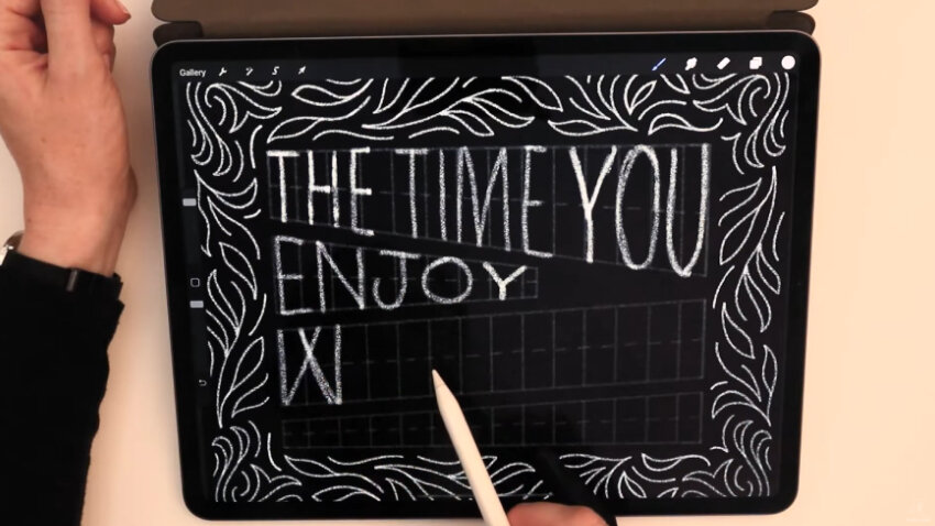
Even though “wasting” is our next word, and that W would normally have slanted line on either side, when I turn off the grid, I want the impact of the text block to be squared off. So I’m going to create a W that has straight left and right sides.
Putting “wasting is” on the third line works out pretty perfectly. Note that I’m going to cross my A just like the crossbar of my E, along that waistline—the center line—of the grid.
For the fourth line, “time” is the last word, so I’m going to work backwards with it a bit. I make the W match the previous W, too, I can already see that I’m going to need to make it smaller. I don’t bother erasing my work perfectly at this stage because I’m going to go over this sketch again anyway.

Evaluate your draft and make edits where needed.
I turn off the template layer now to see where we stand. I think the layout and spacing look great so far, and that eventually I’ll be able to turn back on the little ornament—it’s going to fit in there perfectly.
The one quick thing I'm going to do first is fix the final S on the third line, because it looks bizarrely tilted. So let me come in, erase it, and redraw it.

Next, I want to put top and bottom bars on all of my I’s, so I’ll now make sure that I have those where they need to be. And the middle S is probably going to end up being a bit fatter.
That’s good enough for now, for my first draft. I will reduce the opacity of my draft layer quite a bit and turn back on the grid.
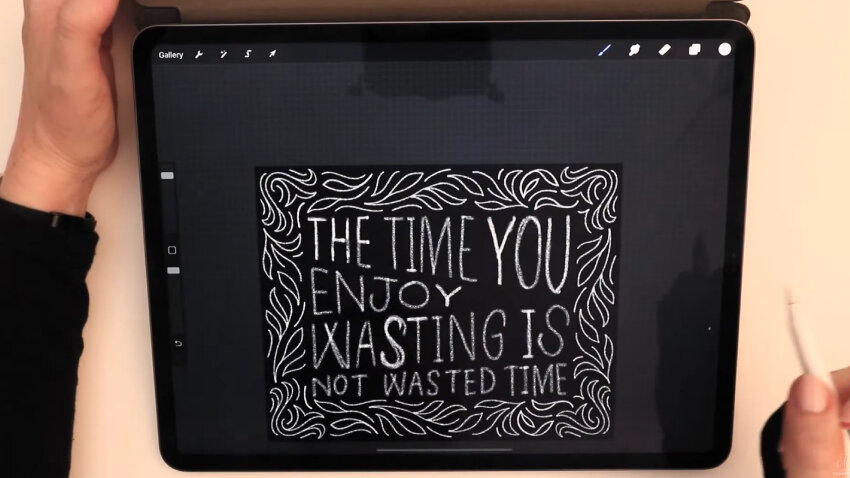
Draw a polished version of your chalk lettering using your draft as a guide.
When I designed this Chalk Script Kit, I really wanted to create something that had a realistic look in even the finest lettering stroke. If you’ve ever tried your hand at analog chalk lettering, you’ll know that very often if you’re trying to make a polished, finished design, you have to go over the lettering quite a few times to create sharp edges. (Or, as sharp as grainy chalk can possibly be on a chalkboard!)
At this point, I like to turn Streamline on in my chalk pencil, in order to do my first pass over my final lettering. Then I’ll go over it again with another of my chalk brushes. That layered effect of multiple textures creates the most realistic chalk texture.
Again, on a new blank layer above all the rest, I’ll start going over my drafted letters in slower, more refined strokes.

You may or may not know this hack, but if you draw and hold a line in Procreate, it snaps into a straight line. Depending on your writing style, you may find that’s a helpful trick if you want to create straight lines adhering to the template guides.
I make the thick downstrokes of all of these letters the width of 2–3 pencil strokes. And again, I go over them a couple times. This is already creating a more realistic texture. Every once in a while, I turn off my background draft just to make sure that I haven’t missed any spots.

To complement the flourished border, I’ve decided to adjust my M to have a cooler center crossbar, with an elliptical loop.
You can see already that we’re getting a lot of grain in there after just our first pass.
For the next pass, I’ll make a new blank layer. That will just make it easier if I need to tweak one texture layer or another.

I frequently zoom out to view the whole composition. Here, I want to see if I like this W, or if I want to make it match my updated M. I think I want to make it match the M, so I’m going to give it a new center stroke. Yes, I like that better!
I’ll turn off the grid here, turn off my draft sketch, and turn on the little ornament I turned off in the first step. Y
One option is to stop right here. This already matches quite well the chalk strokes of the border. One way to make it look a bit more realistic, like a more distressed chalkboard, would be to reduce the opacity of your letters.

Play with the opacity of your lettering layers for a more realistic chalk effect.
Now I’m combining all of these layers into a group, then tap the group and swipe left to duplicate the whole group. I turn off the original group to save them as a backup in case I need them later. And I tap the duplicated group and choose flatten, to make it into a single layer.

Add a chalkboard background.
Now I’ll show you how to insert a chalkboard background. I’ve provided you with lots of chalkboard background images in this pack, so you’ll also have access to those if you get this brush kit. I’ll throw one of those in here as a placed image.
I now have my chalkboard background placed in here. I’ll enlarge it a bit to fit the screen and drag it down to the very bottom. That makes such a massive difference. You see that my graphic of a chalkboard already has all these cool old eraser streaks and little stains on it.

Add more chalky, smudgy texture.
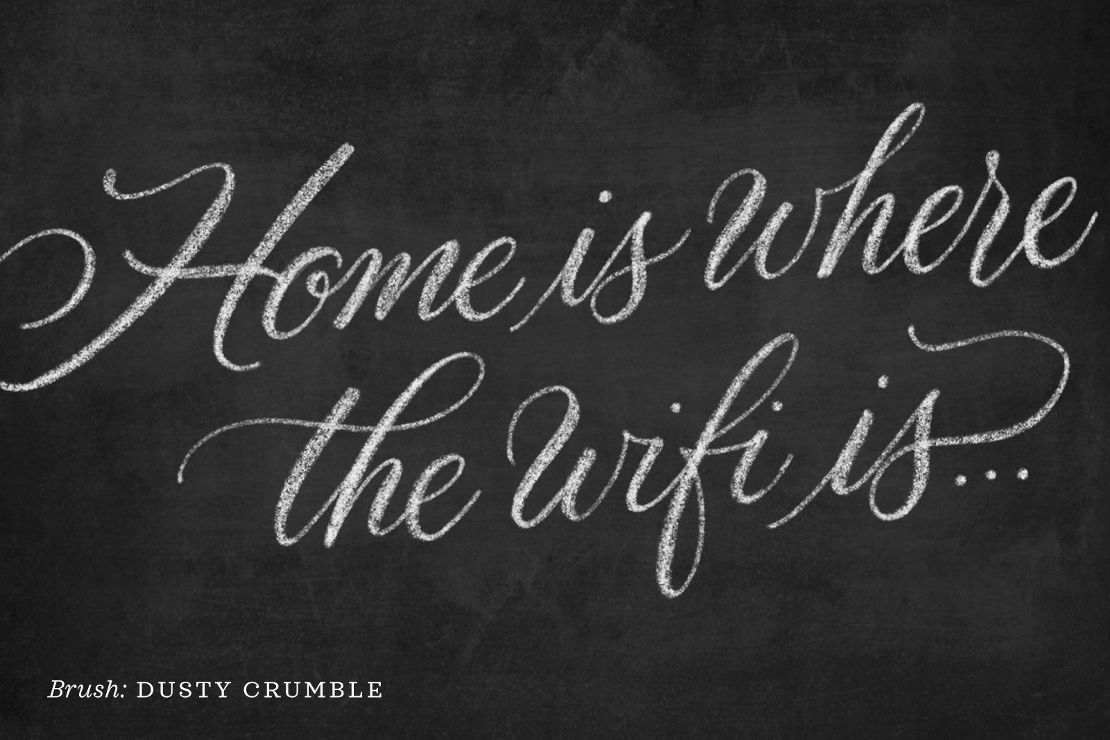
Making a new blank layer, I’m coming up to my brush palette and selecting a very different brush. I want my design to look grungier, a little less perfect. So let’s try the Dusty Crumble brush.
While on my blank layer, I’ll zoom in and increase the brush size to roughly match the width of my thick strokes.
I’ll go over my letters again, pretty haphazardly, to see what I think of it. I’ll do this to a few letters and then zoom out to see if I think it’s an improvement by turning the layer off and on. Once I reduce this Dusty Crumble layer’s opacity a bit, I like that a lot. Reducing the opacity makes it look like there's just some faint smudges around the letters.

I’m going to keep going to the next lines. I won’t need a new layer for each line of text. Well, I think it looks grungier and even more realistic now.

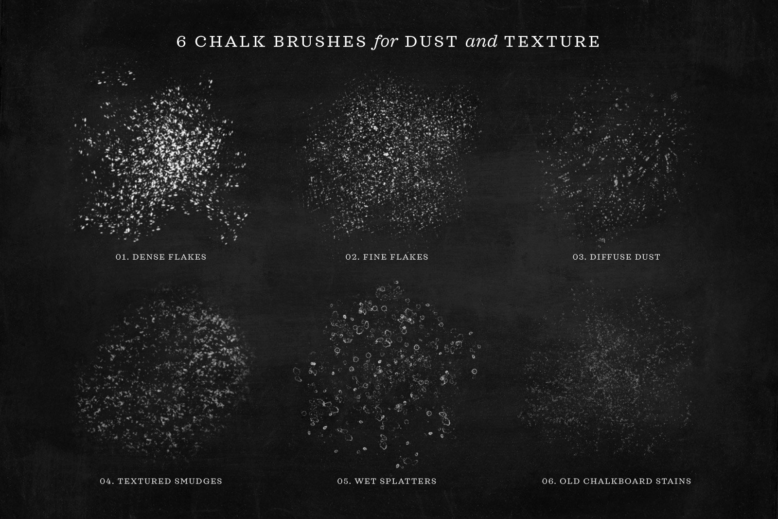
Add chalk dust over the entire composition.
The last thing I want to do is add some more grunge to my entire canvas. On a new blank layer, I scroll down in my brush set to find a few flakes. There are lots of options for making it look like you have chalk dust on your image. I’ll play around with a few of them first.
I’ll turn off the lettering to show you how these look. Here is the Chalk Dust brush at full scale. I can sweep this across the page and then reduce the opacity to the desired brightness. This is a pressure sensitive brush, meaning I designed it so that the harder you press, the more speckles you get. Pressing really hard yields lots of chalk flecks, but pressing really lightly gives me fewer.

Add chalky water spots.
Let’s see about adding even more texture. This is the Wet Chalk Splatters brush. It’s a much more subtle effect, especially at low opacity—wet, white splotches.
Let’s turn the lettering back on and swipe this brush across the screen in a big sweeping motion. I like that but there’s a dark spot in the background so I’ll throw some extra splatters it in there.

Chalk lettering holiday card design.
Before you go, I’ll walk you through another design I created using a different chalk template from the kit: holiday card.

Here it is when I added my words. You can see that I combined some all caps lettering with other words in script. I combined a lot of different styles here and then added cute little stars all around.

Even though I really designed these brushes as a a script lettering set, they work with all types of lettering. (Flourishes really work well with this pack because of the pressure sensitivity!) You can do so much with this set. It’s very versatile as you can make it look as polished—or unpolished—as you like.

In this holiday card, I chose not to use a chalkboard background because I feel like it looks nice being crisp. And if I use this as like a digital greeting, I like it better without the chalkboard background.

Tag me in your work if you use these brushes.
I hope that you enjoyed this little tutorial about using my Chalk Script Brush Pack templates. I would love to see what you create using my brushes so please tag me on Instagram (@mollysuberthorpe) if you make something with my tools or based on any of my tutorials.
If you found this tutorial useful, consider sharing it. That’s the best, free way to support artists and authors you appreciate. You could also buy me a coffee, if you wish.

