My Favorite Calligraphy Tools & Books
I earn small commissions for purchases made through links in this post. Proceeds help me to continue producing free content.
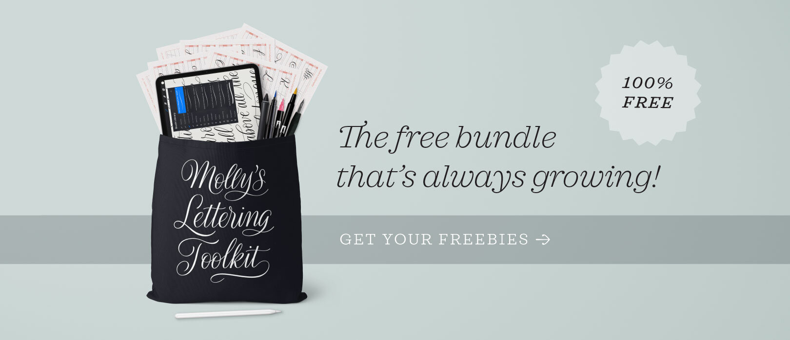
This article was originally sent as a weekly newsletter. My subscribers get access to my free lettering toolkit, plus weekly dispatches packed with product releases, tool recommendations, tutorials, and more!
Now that August has arrived, it’s time for the next edition of my monthly favorites.
In July, I added a number of cool things to my toolkit, and I rediscovered some old favorites. Today I’ll tell you about this grab bag of miscellaneous items – new and old – that I so enjoyed using over the past month.
In June, I shared a compilation of my favorite learning tools for calligraphers at different levels. (If you missed that email, you can browse my archive of Favorite Things posts.) Most of my newsletter content is exclusive to my subscribers, but I will be posting my monthly favorites series here on my blog!

J. Herbin
If you’ve not yet had the pleasure of using a glass dip pen, you don’t know what you’re missing! A good glass pen smoothly glides across the page, creating a perfect monoline stroke. I absolutely adore true monoline lettering, and I think it’s highly underrated!
This is a relatively new pen in my collection. It’s the Spiral Glass Pen by J. Herbin, named for the spiral nib which helps the ink flow evenly. It has a really long handle, which I love, and the grip is formed from two blown glass beads. It is absolutely beautiful and, more importantly, has a very smooth nib.
The tricky thing about using glass pens is ink consistency. The right thickness is very important. Since you can’t exert pressure on a glass nib, the ink needs to flow without any help. This means that high viscosity inks absolutely won’t work, so when in doubt, use a thinner ink than you might choose for a metal dip pen. Fountain pen inks work beautifully, provided you have a paper that doesn’t bleed!
I published a YouTube demonstration of this pen.

J. Herbin
Here’s another new product to my toolkit: J. Herbin perfumed ink. Mine is violet and yes, it really does smell like flowers! Straight from the bottle, the scent is really concentrated and I would not call it pleasant. However, when you write with it and the ink dries, it has a very subtle, sweet scent.
This has a consistency that doubles as calligraphy ink and fountain pen ink. That means it’s on the watery side, and results in translucent, watercolor-like lettering. (I also used this ink in my YouTube demonstration!)
I now have all the other scents/colors from this line on my wish list, but am especially eyeing the green apple and lavender!
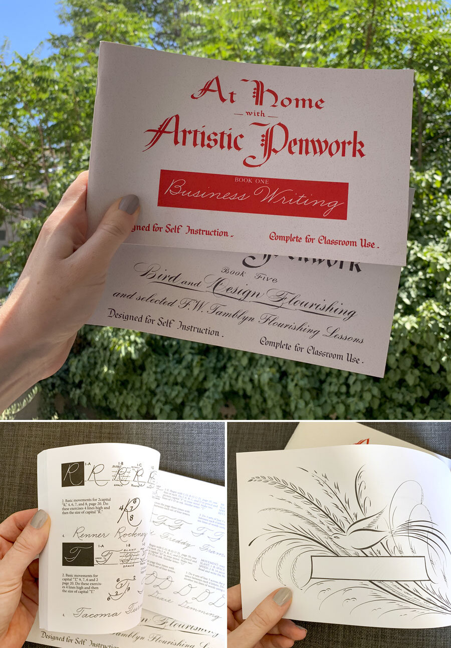
Stephen A. Ziller
The At Home with Artistic Penwork series comprises five cute little books, each one covering a different style of calligraphy. They were created by Stephen Ziller back in the 1940s, but offer excellent instruction and inspiration eighty years later!
I’ve owned the whole set of five for years now, but I turn to these two most often: Business Writing (Book One) and Bird and Design Flourishing (Book Five). The former teaches the most wonderful “business” cursive styles, like those that secretaries were trained to use 80 years ago. While they must have seemed very modern looking back then, today they have a midcentury retro vibe that I absolutely love. I genuinely want to retrain myself to have 1940s business cursive as my everyday handwriting!

Luthis
The folded pen is one of my favorite calligraphy tools, and the Luthis “Dragonfly” pen is my favorite of them all. Hand lettering with folded pens is great fun because the results are unexpected and imperfect. It’s as if the pens have a mind of their own!
Folded pens come in lots of shapes and sizes, and experimenting with different ones can be the most fun part. Luthis has lots of models, but the dragonfly is the one I like best.
Earlier this month I released a YouTube demonstration with this Luthis pen, so have a look if you want to see it in action.

Canson
I prefer practice paper that is translucent enough to see a guideline sheet through it, heavy enough that it won’t tear when wet, and smooth enough that my pen won’t snag. Vellum paper checks all these boxes, which is why it’s always my go-to paper, even when I’m not using a guide sheet under it.
You can find affordable vellum paper all over, and I now buy mine at a local art shop. If you want a specific recommendation, though, I have always liked Canson Vidalon Vellum.
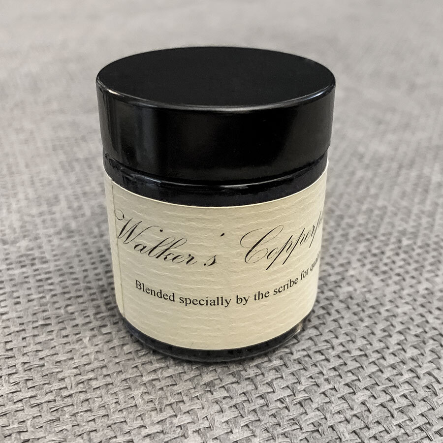
Brian Walker
I recently added this iron gall ink to my toolkit. Created by Master Penman Brian Walker, this ink is made according to a nineteenth-century recipe, and produced in small batches.
I bought it without doing much research, assuming it was probably like all the other iron gall inks on the market. Boy was I was wrong! Walker’s Copperplate Ink fades into a beautiful, watercolor-y gray when it dries. If you buy this expecting a true black, as so many iron galls are, you will be disappointed. I, however, was pleasantly surprised the first time I used it because a good gray ink is not easy to find.
July Roundup
This month I released a number of new videos, lessons, products, and freebies. In case you missed them, here’s a quick roundup:
Relaxing calligraphy demonstration videos:
Procreate tutorial videos:
Skillshare class:
Transform Your Modern Calligraphy Style One Step at a Time
Use this link to get 2 months of Skillshare Premium free
Blog article:
Products:
Calligraphy Composition Maker for iPad
Procreate templates, practice sheets, and moreUltimate Lettering & Calligraphy Procreate Kit
My all-time bestselling Procreate brush pack
Freebies:
Well, that’s it for today! Enjoy your weekend, and as always, tag me in your work on Instagram (@mollysuberthorpe) so I can take a peek!
Until next time—
Molly
Subscribe to my newsletter to get content like this to your inbox each and every month.
Full disclosure: this post contains some affiliate links. Proceeds from these help me to continue producing free content and maintaining Calligrafile. My dedication to providing you with my top-recommended resources is not affected by these affiliate associations.