Procreate Letter Guide Hack
Procreate has built-in drawing guides which are very useful, but they only give you perfectly-upright grids—not the slanted guidelines that calligraphy and italic script require. In this tutorial, I show you a quick hack that solves this problem in under two minutes, using nothing but tools are already built into Procreate. You can make endless calligraphy guides of your own this way, with customizable slants and baselines.
This tutorial is available as a video and as written instructions. You can follow along in either format—or both. Watch the video below, or continue scrolling for the transcript with step-by-step photos.
Video Tutorial
Written Tutorial
This is a lightly-edited transcript of the video above.
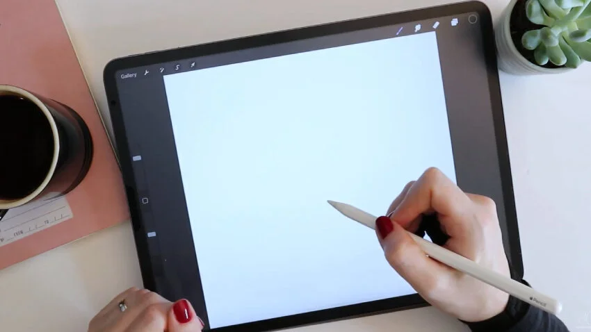
Set up your canvas
It doesn’t matter for this demonstration what size artboard we create. I’m going to make a new one by tapping the plus sign. Let’s make it 8 inches by 8 inches, then hit create.
Create your initial guides
Let’s go to our Layers palette and make sure that our background color is set to pure white. And then come up to the Settings (wrench icon), and under “Canvas” turn on the drawing guide. I’ll immediately click “Edit drawing guide” and choose a color that’s dark enough to produce a high contrast between the background and grid lines.
At the bottom of the guide settings screen, I won’t adjust anything else except for the grid size. Air on the smaller side, rather than larger. You’ll see that we’re going to be able to magnify it a little bit—but you can’t ever shrink it! When you get a grid size you’re happy with, hit “Done.”

Make slanted guidelines
If we work straight from this grid, we have very upright vertical lines. But I want slanted lines because calligraphy has that nice italic slant to it. So to quickly create a grid like that, I’m going to take a screen capture of my iPad screen. To do that, press the power and volume-up buttons simultaneously.
With a screen capture taken, I’ll go up to my wrench icon and turn off drawing guides, and then go to Add > Insert a photo, and insert the screen capture that I just took.
With uniform and magnetics both turned on, I’ll enlarge the screen capture so that the grid itself basically fills the screen, and then hit the selection arrow tool to deselect. You see that in my layers palette, I now have this grid image placed. I’ll rename the layer “Grid.”
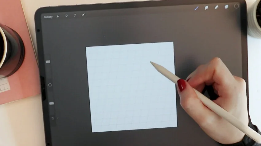
I reselect the grid layer so that now the selection just includes what’s on our artboard. And I come over to “Freeform” and tap and hold the top center dot in the transform selection. I’m able to drag it over to the right now.
Since magnetics is turned on, I can drag it without it moving up and down. And I can stop at whatever slant I want. I don’t want something too extreme—that’s maybe a bit too formal for me. So when I’m happy with the slant, I’m going to click the top-left dot and drag it out so that the image again fills the board quite nicely. I’ll now hit my selection arrow tool to turn it off. Now I have this nice grid!
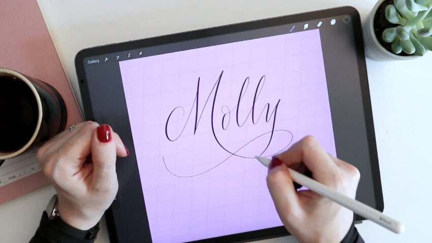
Change the background
Because the background layer was perfectly white to begin with, I can tap my layer and change the opacity to multiply. What this does is knock out any pure white color. So if we change our background color now, we can have any background color, with a grid over it, customized to our particular drawing.
You can also reduce the opacity of this grid so that when you’re writing over it, the grid lines are not as distracting.
If I create a blank layer above the grid layer, and I choose, say, my fine point calligraphy pen, I can create any sort of design, then turn off the grid, and nobody will be the wiser.
If you found this tutorial useful, consider sharing it. That’s the best, free way to support artists and authors you appreciate. You could also buy me a coffee, if you wish.