How to Animate Hand Lettering in Procreate
Animated hand lettering is always eye-catching and impressive, but it’s also surprisingly quick to learn. Once you know the process, a start-to-finish animation can take as little as five to ten minutes, using and iPad. The technique uses the Procreate app’s Animation Assist function, combined with the principle of traditional animation that slight variations combine to create movement. In this short tutorial, you’ll learn how to design your own, from blank canvas to exported MP4.
This tutorial is available as a video and as written instructions. You can follow along in either format—or both! Watch the video below, or continue scrolling for the transcript with step-by-step photos and links to the tools I use.
Video Tutorial
Written Tutorial
This is a lightly-edited transcript of the video above.
1. Create your square art board
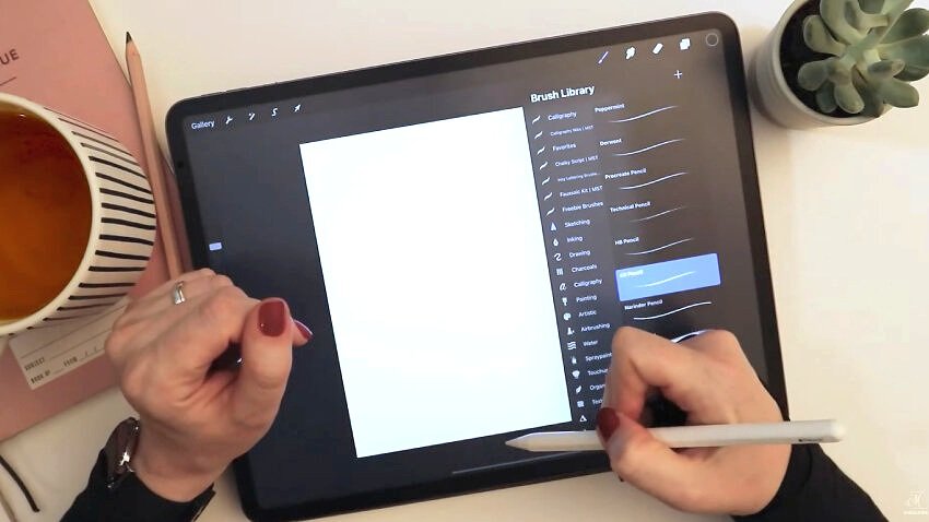
I start by creating a new art board by tapping the plus sign in the upper right and then tapping the plus sign icon to create a new custom-sized canvas.
Because this will be an animation, I don’t plan to print it—I’m only going to use it digitally online. This means it doesn’t have to be a super high resolution file. But I don’t want it to be too small, either, because zooming in and having crisp strokes while I work makes the process more enjoyable.
Making sure that dimension is on pixels, make the width 2400 x 2400 px, and set the resolution to 300 DPI. This is bigger than you’ll probably ever need for online use.

2. Select a Procreate pencil brush for sketching
I usually start with really quick sketches. And for that, I like to use either the pencil tool that comes with Procreate, or any brush that I can work with quickly to determine the layout parameters: the number of lines, the number of words per line, and a nice margin.
In your brushes palette, go over to the Sketching brush set, which comes free with Procreate. I’ve chosen the 6B pencil. By tapping it once, I open the brush settings and make sure that Streamline is turned completely off. That way, I have full control over the pen and there’s no stroke correction or lag happening when sketching.
3. Start by sketching your lettering layout
Let’s use a very fun lettering style that will be easily readable even when it’s read at a small size. There won’t be flourishes. There won’t be strict adherence to baselines or italic slants. We’re just going to have fun and throw some letters down on the page and see how it looks, because the animation itself, as you’ll see, is going to add a lot of whimsy to even the plainest letters.
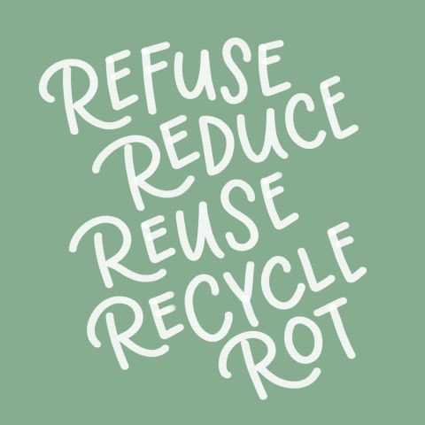
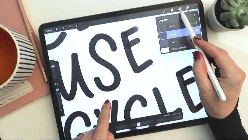
On new blank layer, I start sketching out your words. I've chosen a simple, eco-friendly message so that even if the design itself is whimsical, hopefully it will also be inspiring or thought-provoking.
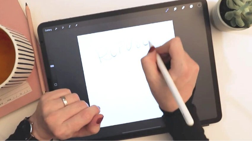
I put each word on its own layer, so that when I rearrange them it’s be much easier to work layer-by-layer instead of having to draw a selection around each word.
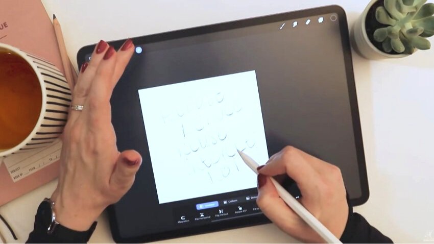
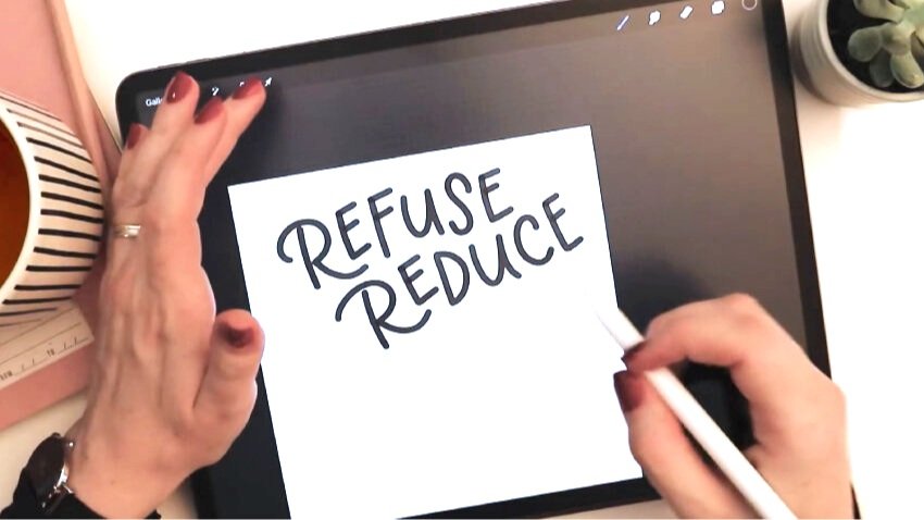
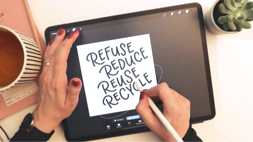
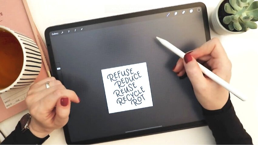
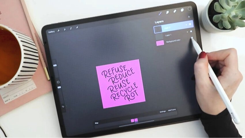
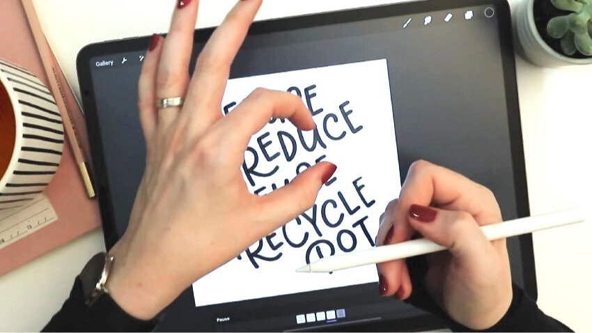
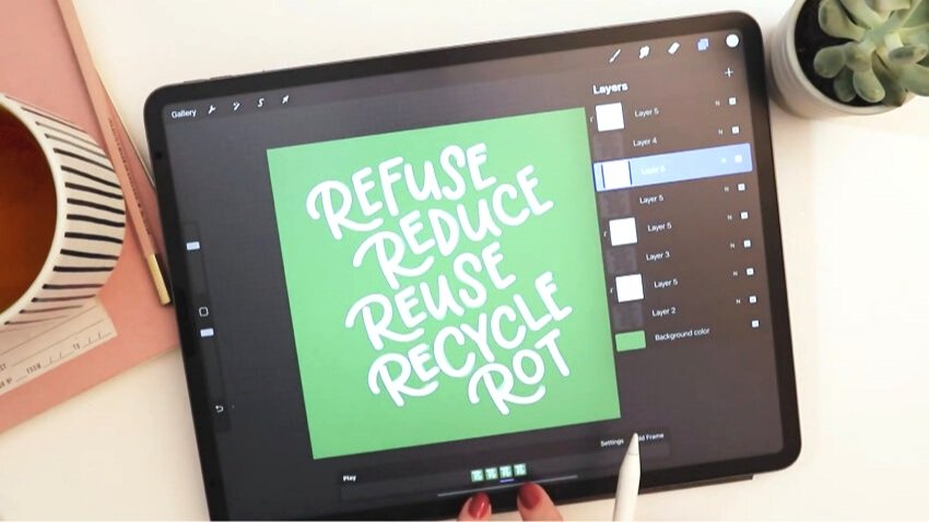
My quote starts with “Refuse.” After this word, I make a new layer. Then, “Reduce”—and a new layer. (I'm not even trying to make these letters look good yet. I'm just putting them out here to create a layout!) By the end I have “Refuse, Reduce, Reuse, Recycle, Rot” (as in compost) in very rough pencil.
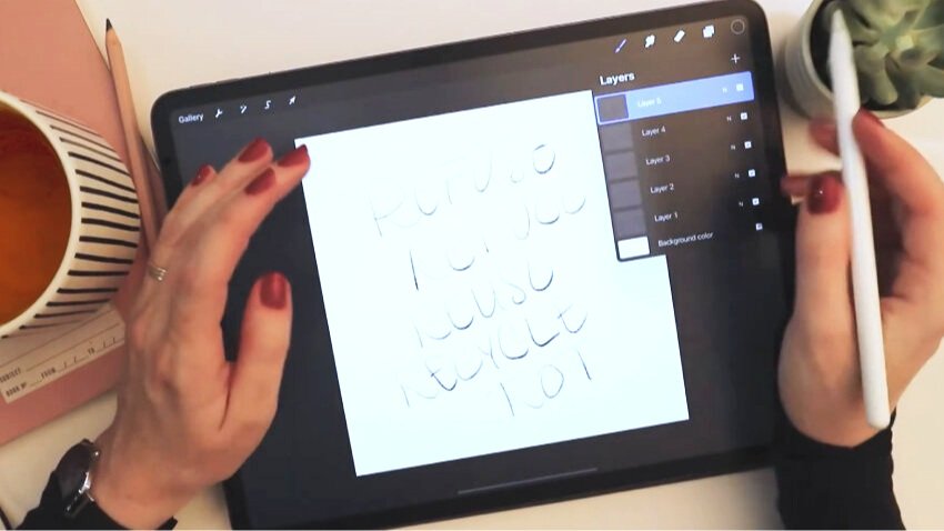
My word layers are reversed from top to bottom in my layers palette. You may want to tap, drag, and rearrange them to be in the right order from top to bottom—that’s up to you.
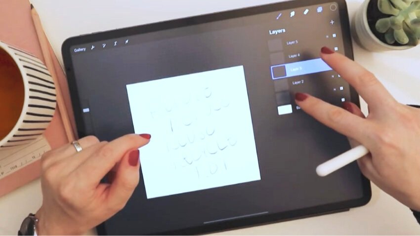
4. Rearrange your words and layers to create the perfect layout
Selecting Layer 1, tap the selection cursor icon. Go through your layers and move them around until they’re arranged how you like them. I turn “Magnetics” off in the bottom toolbar so I have full control over the movement. I suggest turning the words, tweaking them, and angling them so that they’re approximately in a similar slant—but also in a layout that’s whimsical and loose—sort of running diagonally down the page.
5. Merge your sketches into a single layer
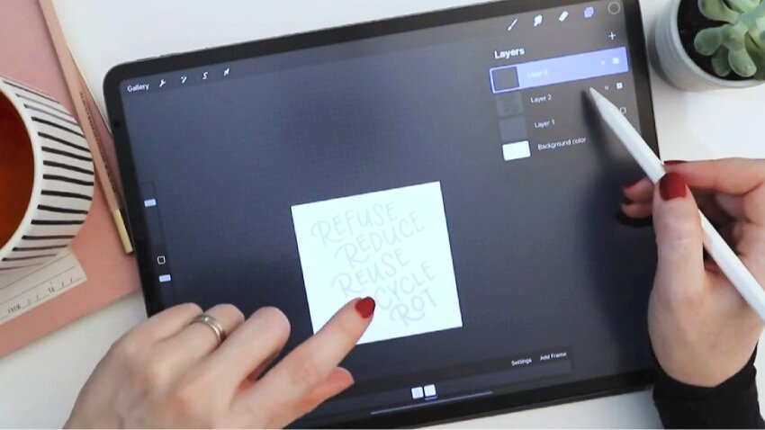
Now you can merge all your word layers together into one layer. This is your rough draft layer—we’re about to refine and refine and refine.
The quickest way to merge a bunch of layers in Procreate is to pinch them together with two fingers. Sometimes this takes a couple of tries, but once you get the hang of the movement, it’s a big timesaver.
With my sketch on one layer now, I can again choose my selection tool and move the entire layout as one unit.
6. Select a marker brush and draw a polished version your layout using your sketch as a template
I reduce the opacity now, and I create a new layer on top of the sketch layer.
I select a brush pen that’s more like a marker—first experimenting with what pen I want to use for my final design. There are many cool drawing and inking brushes that come with Procreate as part of the default brush sets. I have picked one from my Inky Lettering Brush Pack, though—specifically, the “Watery Ink Brush.”
Keep the ink color black because we haven’t gotten to the color choice step quite yet.
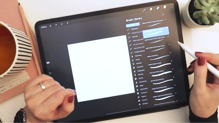
After testing that brush, I realize it’s too tapered for the look I want. Instead, I select my Monoline Watercolor Brush, from the same Inky brush pack. I turn off my sketch layer temporarily so it’s not distracting. I can tell you that this will be a good brush to use in an animation.
After writing the first word on its own blank layer, using my sketch layer as a template, I do a bit of refining on the spacing of the letters. Then I’ll turn on my sketch layer again and keep going.
I no longer need a new layer per line because I’ve already set up my layout in the previous steps.
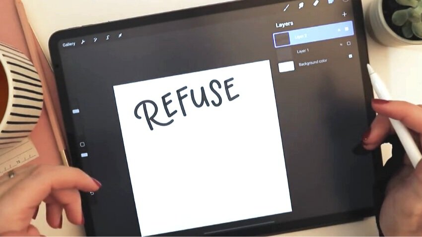
You’ll probably find that as you go, making the letters prettier than your sketch, you’ll stray from your initial design a bit. This means you may have to do some tweaking and moving as you go!
For example, my second word began to collide with where my third word was supposed to go. So I just moved my sketch layer down a bit, rather than redo my inked layer. (We’ll recenter and resize everything later, if needed!)
7. Adjust lettering and line spacing, and overall margins of the artwork
I need to slightly change the orientation of the word “Recycle.” To do that, I tap the selection tool and draw a selection around the word. Once I close the selection, I can adjust the word I selected.
I now turn off my sketch layer. I could probably delete it because most likely I’m not going to use it again, but I just turning it off for now.
I want a bit more margin around the whole design. So, again, I tap the selection tool, reduce the size of the art, and center it a little bit better.
8. An introduction to Animation Assist for animating lettering
So now the fun part comes: the actual animation. Go up to the gear icon and turn on Animation Assist. Down at the bottom, you get a new toolbar. The layer that we’re on right now—the layer that we have turned on—appears down at the bottom as a small thumbnail. If I turn on the sketch layer, it would also appear as a thumbnail (but leave the sketch layer off).
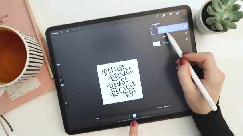
The order of your layers from bottom to top will appear in this panel from left to right, with the exception of the background layer color, which is considered to be a consistent layer throughout the animation.
When you change the background color, it changes for all of the layer thumbnails in the animation toolbar. That’s because these art layers are transparent (they have no backgrounds of their own).
8. Draw traced versions of your lettering design for the animation slides
Make a brand new layer at the top of your layers palette. This is a blank layer that you’ll write over again. You’re going to retrace our design multiple times—let’s say four or five times. Each time we hand letter the same design, there will be very, very slight differences from the original. No matter how much we try to copy it exactly as we previously made it, the slight differences are going to be just enough that, when we animate them by making the frames play in a loop, they’re going to sort of jiggle and make a cute animated design.
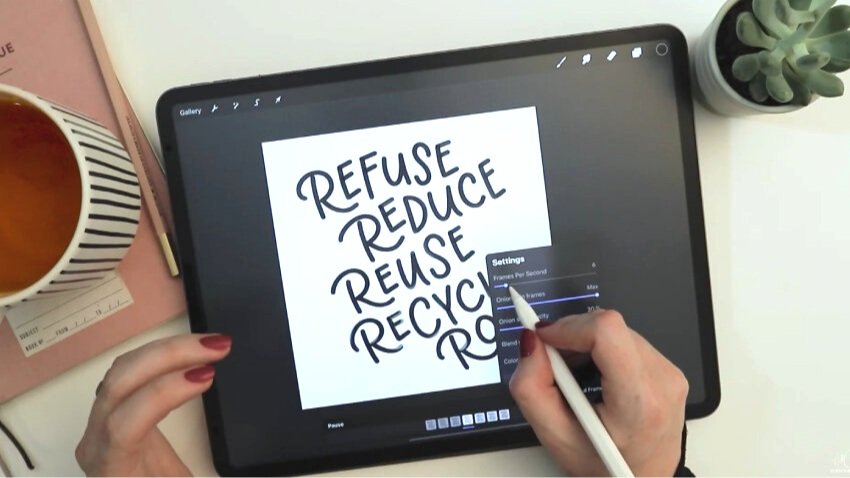
When working with in animation in Procreate, when you create a blank layer over your previous layer, the previous layer turns into what’s called an “onion skin.” That simply means that it gets lightened a lot so that you can trace it, which is a very common technique in animation. I personally think that the onion skin is too dark. If I want it to be even lighter for my tracing, I go to Settings in the animation toolbar, where onion skin opacity is at 60%, and I reduce it quite a bit. I choose 30%.
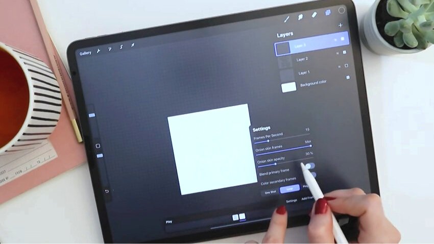
Ignore the rest of the settings until we’re ready to actually animate.
Going back to the brush, stay on your new blank layer and redo the entire design again, tracing it relatively closely, but not really stressing if there are some differences.
Do you see how the onion skin and your new tracing drawing are slightly off? That’s what we want!
When done with the second layer, instead of turning it off, we can preview the beginning of the animation. Because we have Animation Assist on, if you’re on your newest layer and then tap on the one below it, that one turns on. Tapping back and forth between them is fun, but you can even push Play down in the animation bar.
So rather than turn off your layer, just add another. The onion skin will appear, and you’ll see that right now, both onion skin and the previous two layers appear. If you are bothered by that, all you have to do is temporarily turn off the visibility of one of the layers.
Keep going, repeating the tracing step two to three more times.
9. Configure the animation slide settings
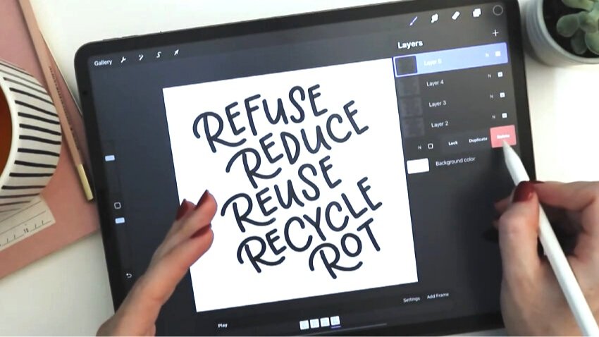
I now have four versions of the same design so I’m officially going to delete my draft layer so that it’s not there to cause any confusion among the animation slides. I’m definitely not going to need it again. If for any reason you ever want to switch the order of frames, all you have to do is move around the order of your layers. In this case, it’s not going to matter because our animation will just cycle through four very similar designs.
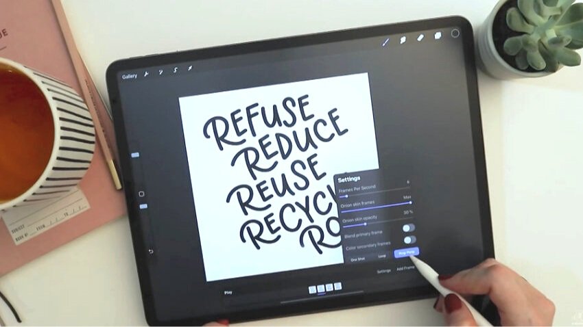
Check how the animation looks so far by hitting play. I bet it’s pretty cute now, but we can still play with speed by adjusting the frames per second. The more you increase the frames per second, the more the animation will have a frenetic jiggle. I never want mine too slow—that's boring—so somewhere in the middle is kind of nice. This final number will be based a little bit on how many layers you do and how intricate and varied your design is.
10. Choose to animate as a loop or with a ping-pong effect
I have chosen six frames per second for mine. Then I choose the “loop” option, which means that it goes from the beginning to the end and then starts again at the beginning and goes again back to the end. You could also choose “ping pong,” which means it goes from the beginning and back again, beginning and back again. Note that you have to have the animation turned off in order to make that switch. When you’re done, hit play and you’ll see that the ping pong setting takes effect.
In this particular case, the difference between loop and ping pong is barely noticeable. But if you're making an animation that actually shows movement, like a ball moving across the screen, you don't want to have your ball moving from, say, bottom to top, so the animation looks like it’s moving upward and then starting again from the bottom. If you want the ball to look like it’s seamlessly moving back to the starting point, you would choose ping pong so that the frames would then reverse their order when they reach the end.
11. Add color to your letter animation
Now let’s change the colors to something other than black and white. If you’re sure about your colors, you could have chosen them at the beginning. But it’s so easy to change colors at this point that I’m going to do it that way. Start by choosing a background color that’s a bit more fun. I pick green because, well, it’s more appropriate to my message. But now the black of the letters is too low contrast….
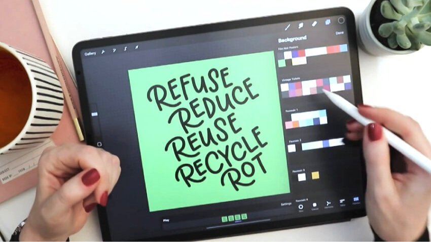
I suggest turning off the other art layers so you can just look at a single lettering layer for a moment.
First, I’ll explain the “destructive” way to change the color of the lettering (meaning, not easily reversible down the road). Many people will choose a color that they want, tap the layer, and hit Select, then tap the layer again and hit Fill. This method works fine, and allows you to change the color in a matter of a couple of clicks.
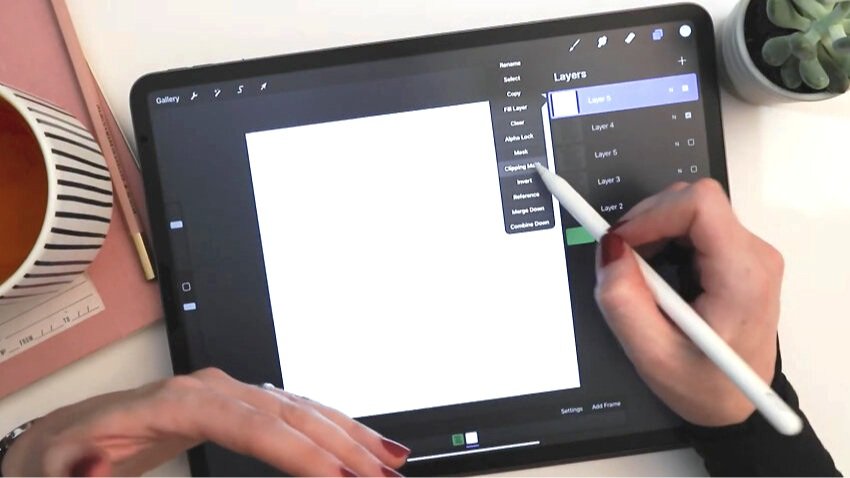
But that’s not the method I prefer. The non-destructive way of changing the color of a layer is to use a clipping mask to clip a solid color layer into your art layer.
Make a new layer. Tap it and hit Fill to fill it with your new color. Next, tap the layer again and click Clipping Mask. This is the same number of steps as the destructive way, but now you can turn this fill layer on and off and still have your original color. This may not be important to you for a design like this, but for intricate designs, this non-destructive method really comes in handy.
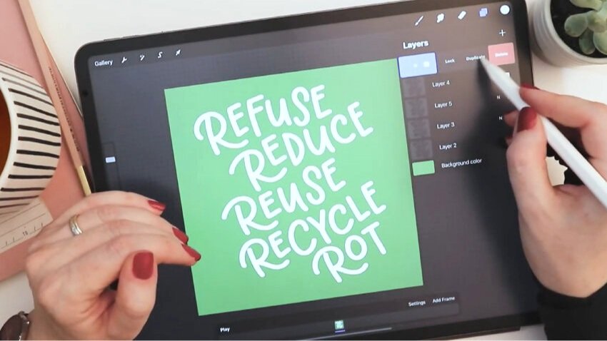
Now all you have to do is apply a copy of the clipping mask to the other layers in the file. There are only four total layers, so you only have to duplicate the color fill layer three times. Swipe left and duplicate three times. Then drag each one above the next art layer below it, tap it once, and select Clipping mask.
You’ll see in the animation settings that clipping mask layers do not appear as their own layers. They are considered to be grouped with the art layer.
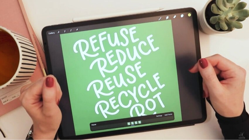
Now when you hit play, you should get a cute little dancing white illustration on a darker background. Because I chose a brush that has a bit of translucency, the opacity still shows with the clipping mask, and it shows up even more in white than it did in black. I kind of like that.
But if you want to change the colors from white again, all you do is you choose a new color—let’s say this bright yellow—and then just tap fill. Tap, fill, tap, fill.
12. Export your final animation for web and video
Time to export this for different types of use. You might initially think that an animated GIF is what you need here. But if you’re wanting to post this on Instagram, which is a pretty common use, you’re actually going to need to have an MP4 file—a real video file, not a GIF.
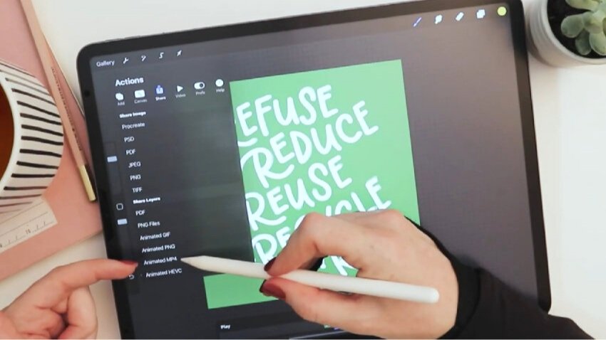
Under the wrench tool, go to Share. You’ll have the choice of four different types of animation. An Animated MP4 is, like I said, the video file to use for Instagram. It’s also possible to upload an MP4 to any video platform or software, whether it’s YouTube or a video editor.
The Animated GIF and Animated PNG options can have transparent backgrounds, though. So the main reason that I would ever want to choose an animated GIF or PNG is for the transparent background feature, if I want to overlay it on something else.
So export this an animated MP4. Keep frames per second at 6—or whatever number you previously chose—and hit Export.
There you have it! A cute little animation made from your hand lettering. All told, this could take you five to ten minutes, depending on how many layers you make and how intricate your design is.
Share your animation and tag me so I can have a peek.
I love seeing the designs that you create from my tutorials and books. If you post this to social media, please tag me so that I can take a peek (@mollysuberthorpe).
Below, you will find links to things like my touch screen glove—which I always get questions about—as well as the Procreate brushes and other tools.
If there’s a specific tutorial you’re looking for in Procreate or any type of lettering, leave a comment to let me know. I collect your ideas to give you the content you most want to see!
More Resources:
Brushes Used:
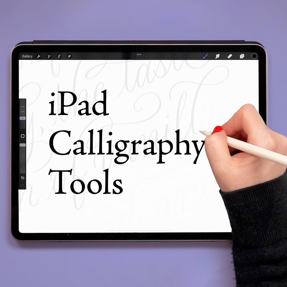
iPad Tools Used:
Procreate App
13-inch iPad Pro
Apple Pencil Pro
Touch screen glove
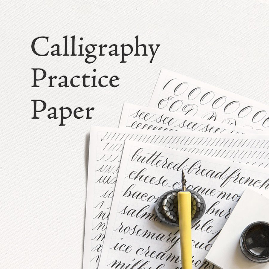
Get my free practice sheets, guidelines, and Procreate brushes here.
More tutorials you may enjoy:

If you found this tutorial useful, consider sharing it. That’s the best, free way to support artists and authors you appreciate. You could also buy me a coffee, if you wish.