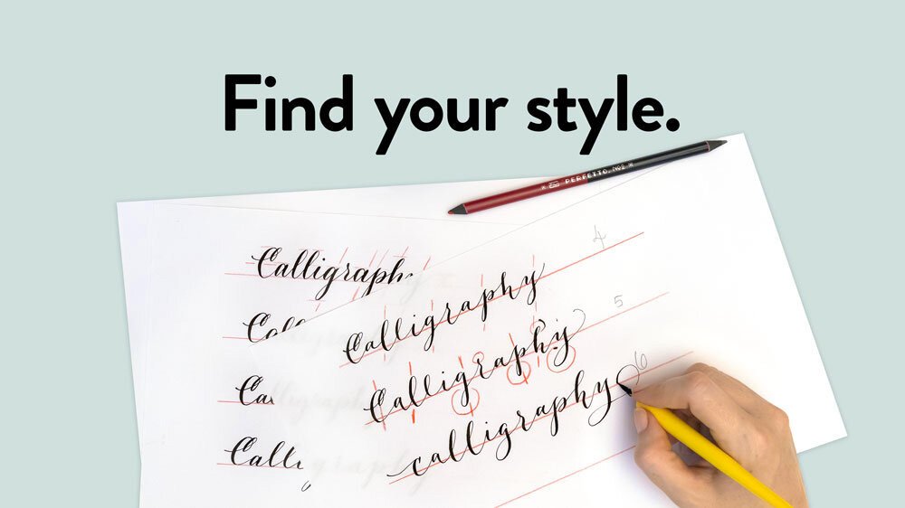
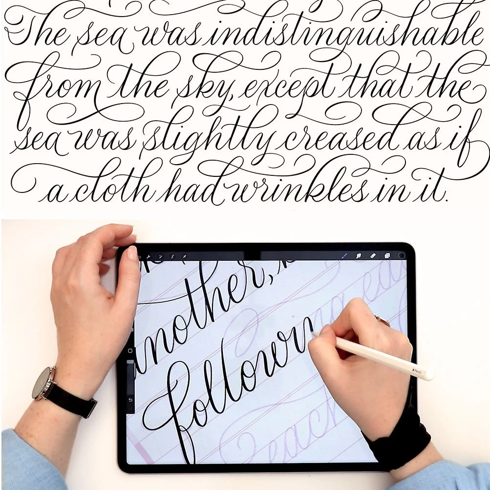
Find Your Calligraphy Style: An Exercise to Transform Your Lettering
In this practical and fun tutorial, you’ll take a calligraphy style you already know well and transform it with intention. Just as effective for pointed pen calligraphy as for digital lettering, this is my favorite exercise to help calligraphers move beyond imitation, break habits preventing them from being experimental, and create a unique script style all their own. It’s all about learning how to critique your work productively.
Step by step, you’ll start with calligraphy you already know well and alter it with intention, until a new style emerges that you can add to your repertoire.
I created this exercise for my intermediate and advanced workshop students, asking them to adjust stroke weight, connector spacing, slant angle, and the ratio of one letterform to another. These are the elements that give a lettering style its mood—and what can change a style immediately and dramatically.
Ultimately, my goal is for you to have a lot of fun. The goal is not to copy the styles I create in the video. And transforming your lettering does not have to mean forever abandoning the style you have already built. The point is to learn how to look carefully at your own work, identify what can be changed, and make those changes deliberately.
The Video Tutorial
Written Instructions
Click on an image to enlarge it.
Getting started
I have here just four basic grid lines that I’ve drawn with my transparent ruler. I am not using a calligraphy grid today, because the whole point of this exercise is not to adhere to specific slant lines, x-height lines, cap height lines, etc. In fact, this exercise is really about breaking free of habits and finding new modern calligraphy styles that you might not have found if you had otherwise tried to create them just from trial and error.
So I’m going to get started by writing out a word in a style that I'm most comfortable with. I’m writing it in whatever style comes most naturally to me without thinking too much through it. If you know me, my modern calligraphy style is already quite loose and varied, but I’m just going to stick with the basics now and write out a single word: calligraphy.
The baseline
I wrote this out with slightly varied distances between the letters, but I stayed fixed to the baseline. So there is, among other things, a consistent line adherence and a relatively consistent ratio of cap height with ascender height.
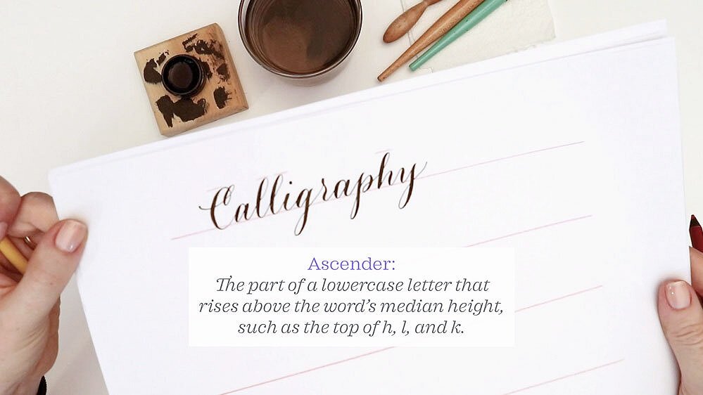
Height uniformity
What I mean by that is that the top of the C and the tops of the l and h reach up to the same line. Same goes for my descender length—my g, p, and y are roughly the same length.
Even though I wasn’t adhering to gridlines, I did keep my letters at the same italic slant because I can see that the axes of my letters match.
Let’s look at x-height
The x-height is the distance from the baseline to the top of any lowercase letter which does not have an ascender. Traditionally that’s a lowercase x, but in this case, my a, i, and the top bowl of my g all come to my x-height. In this particular version, I made a pretty consistent x-height. My i’s are roughly the same height. The bowls of the g and the p, as well as the overturn of the h, are all roughly the same height, too.
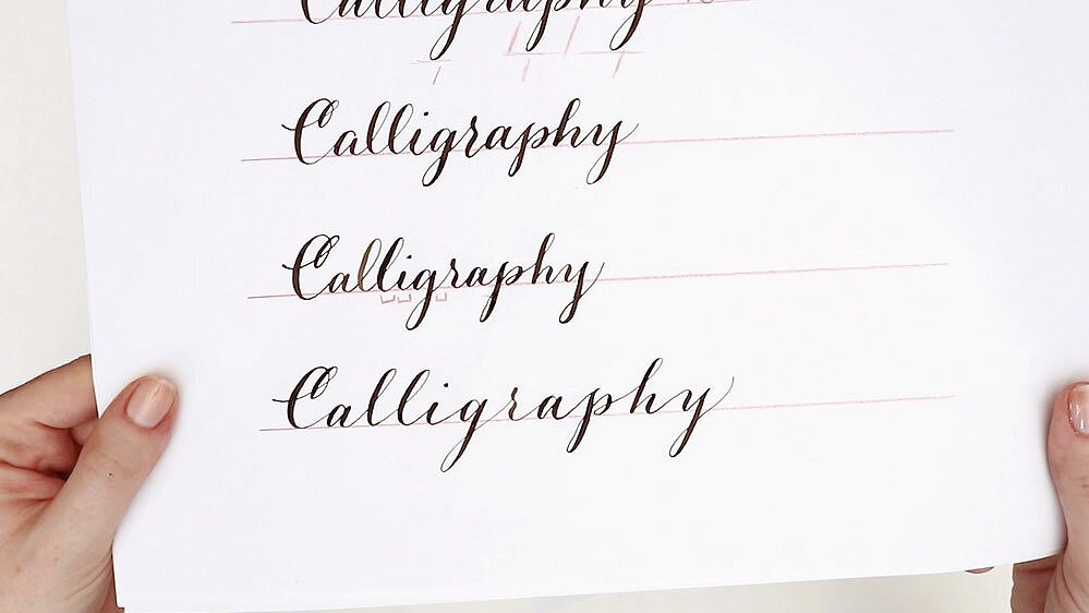
Change #1: Decrease the x-height
Now I will begin to make one targeted change to my lettering each time I write it.
The first change will be to decrease the x-height. I’m going to aim to keep the same italic slant, the same distance between the letters, the same pressure on my pen (so I get the same boldness), and the same uniformity in ascender and descender heights. The only change will be to decrease my x-height.
Let’s see what that does to the overall look and feel….
Close, but not quite there…
My attempt at uniformity with the first version was pretty close. I do have a slightly lower x-height now, which did make my word and shorter in length—because a lower x-height means that the letters shrunk a little bit, too.
Decrease the x-height even more
Let’s get dramatic! I’m going to make another version where I further decrease the x-height. It can be hard to write this small with such a thick nib as what I’m using—a Brause EF66—but you can see how even though the height of my C’s are the same, and my ascenders and descenders all come to the same size, the second version already looks more formal, just because the x-height is lower.
Change #2: Extend the connector strokes
As part of this one-step-at-a-time exercise, we’re always going to take the last version we made—provided that we kind of like it (if you hate that version, you can go back a step)—and continue applying a single change at a time.
This time, I wanted to spread out the letters and lengthen the word. This means I’ve extended all the connector strokes really dramatically, so we can see a huge difference right off the bat.
You can see what an immediate difference is created just by taking the same letterforms, the same shapes, and the same stroke patterns, and increasing the connector strokes.
Change #3: Vary the baseline for a bouncy effect
What I’ll do now is vary the baseline, because so far I’ve been adhering quite closely to the baseline and I want to see what happens if I make the letters bounce above and below it. Again, I’ll keep everything else from this version the same.
One tip is that if you’re doing bouncy baseline text and you keep the first letter and the last letter at roughly the same baseline, then the word itself won’t look like it’s tilted or moving up or down the page. It will have anchor points on the left and right sides where only the letters in the middle look like they’re bouncing.
Change #4: Vary the italic slant
I’m starting to like this! If I compare my first version to this version, it’s cool to see that with just four variations, I’ve made such a dramatic change. So now that I’ve focused on connector strokes and baseline, I’m turn my attention to slant.
I’ve kept a pretty even axis in all of these letters. But what I want to do now is vary the slant a lot. That’s going to mean that some of my letters will be more upright and some will be more slanted than they already are. The result is lettering that looks much more playful and funky.
Change #5: Change letter case and loops
I think this time I’m pretty close to the final style that I want to achieve. I’m going to try making the first letter lowercase, and add a little bit more flourishing as I go. By that, I just mean more loops. For example, I’ll probably put a loop at the top of the r, and maybe increase the loop sizes of the ascenders and descenders that have natural places for flourishing.
Five steps to a completely new style
I think you can see now just how different that is, and how we’ve ultimately achieved an extremely whimsical, fun style when we bring back our first design for comparison. Through just five targeted changes, I have created two wildly different calligraphic styles.
I would really love to see how you do this exercise on your own. If you undertake it and you post it on social media, please tag me (@mollysuberthorpe) because I’d love to have a peek!
Unlock 4 weeks of unlimited learning free
I originally published this as a Skillshare class, but I’ve chosen to share it on my YouTube channel for free. I have a lot of classes on Skillshare, though, most of them longer and more in-depth than this one. So if you’re interested in learning calligraphy flourishing, the ins and outs of iPad lettering, or how to design publish your own coloring book, I can offer you a 4-week free trial of Skillshare Premium. Click here to start learning.
Resources
My Calligraphy Supplies:
Brause EF66 nib
Deleter penholder
Sumi ink
Wooden inkwell
Layout bond paper
Clear ruler
Editing pencil
Free Learning Resources:
Get my free practice sheets by signing up for Molly’s Lettering Toolkit.
Get a 4-week free trial of Skillshare Premium to watch unlimited classes for a month.
You might enjoy these tutorials, too:


If you found this tutorial helpful, please consider sharing it with others. That’s the best, free way to support artists you appreciate.
You could also buy me a coffee, if you wish.